The network for creativity
Join 1.25M professional creatives like you
Connect with clients, get discovered, and run your business 100% commission-free
Creatives on Contra have earned over $150M and we are just getting started
Back to feedPost

🎉 v1 of my cafe menu style portfolio is complete! after 8+ years in the industry and compiling all my works put into one, I always get major design decision fatigue on how to present my work🧠
Combining my love for brewing cafe drinks at home, I decided to why not put my portfolio into a cafe style menu. Safe to say, I am quite pleased with how this turned out! 😊
Starting my journey out on Contra, what do you think?


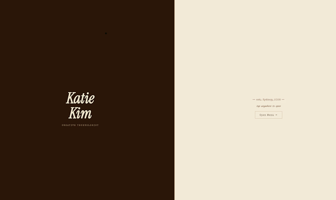

This is solid, it feels both clean and engaging. If someone wanted to create something at this level, what would you say matters most in your process?
The network for creativity
Join 1.25M professional creatives like you
Connect with clients, get discovered, and run your business 100% commission-free
Creatives on Contra have earned over $150M and we are just getting started





Related posts

Take a vampire, a grim reaper and a bat for a midnight ride through a haunted town. Hold to boost over broken track, brake before the big hills, and grab candy to refill your boost. Push your luck too far and your passengers end up splattered across the screen.


Cute!!



Professional work

Good COFFEE - True 3D Product Animation
Converted a simple coffee cup concept into a premium true 3D animation for DTC brands.
What I focused on:
• Smooth 360° rotation with realistic depth
• Studio lighting + subtle steam for premium feel
• Clean black background for ad-ready look
• Optimized for social ads and product pages
Tool: Blender-style 3D workflow
DM if you need similar clean 3D product visuals for your brand!


Nice