The network for creativity
Join 1.25M professional creatives like you
Connect with clients, get discovered, and run your business 100% commission-free
Creatives on Contra have earned over $150M and we are just getting started
Back to feedPost

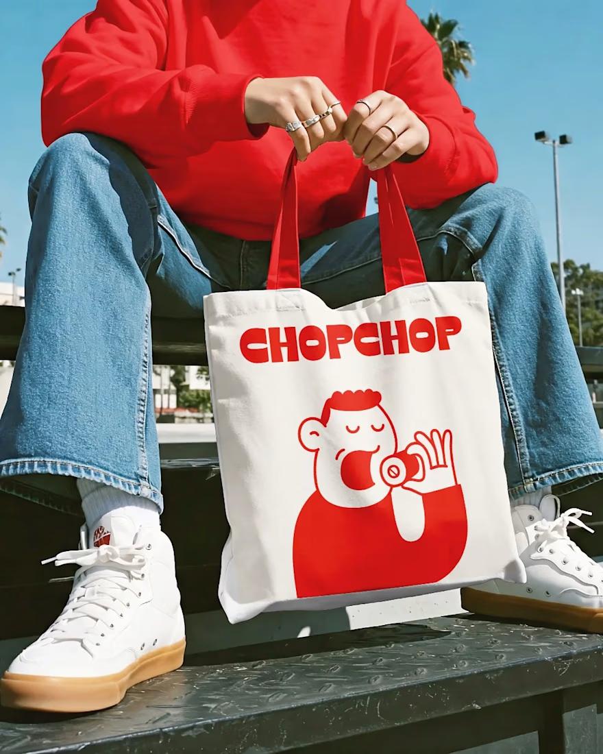
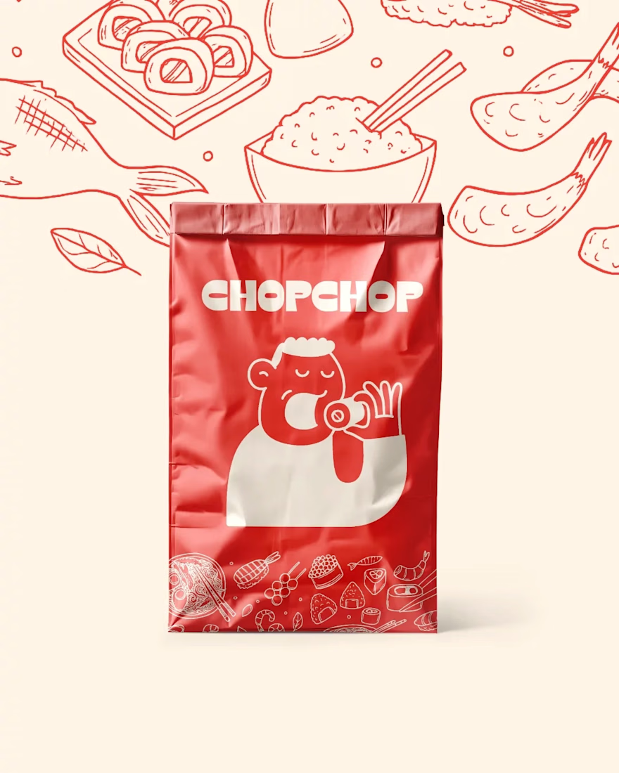
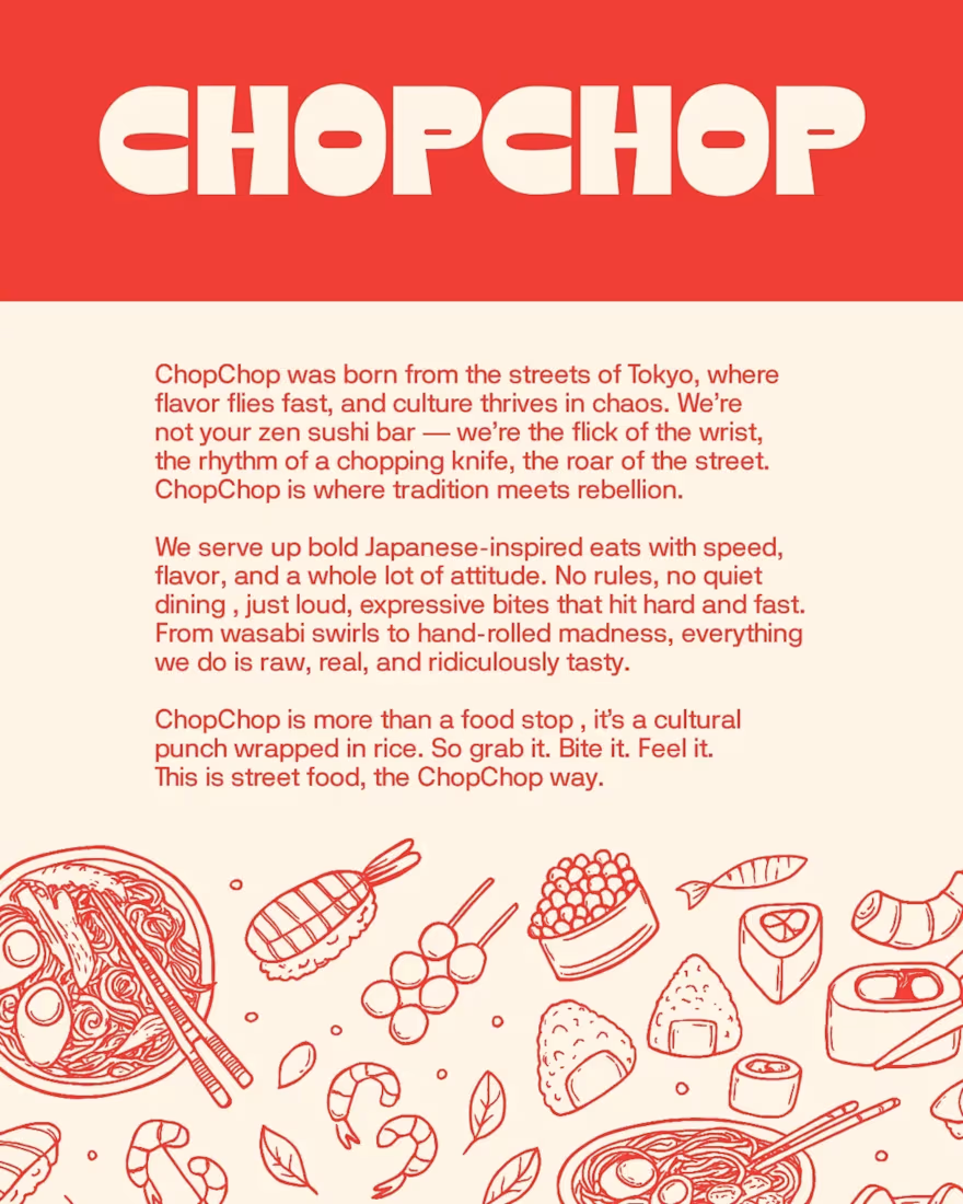
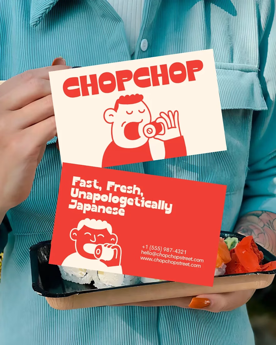
CHOPCHOP - A Japanese street food brand concept that is bold and unapologetically modern.
The goal was to create a simple yet recognizable logo that feels fun and lifestyle-driven. It wasn’t about just food branding, but a brand people can wear and represent.
I built a full visual world around a playful mascot character with high-energy typography and a vibrant red palette. The result was a brand with instant personality that stands out in a crowded food market.


The network for creativity
Join 1.25M professional creatives like you
Connect with clients, get discovered, and run your business 100% commission-free
Creatives on Contra have earned over $150M and we are just getting started





Related posts


Teams spend weeks choosing a font and zero time defining the system around it. Scale, weight, line height, spacing, pairing rules. The font is 10% of the work. The system is what makes it usable.

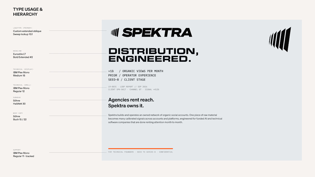

The system is what makes it usable!

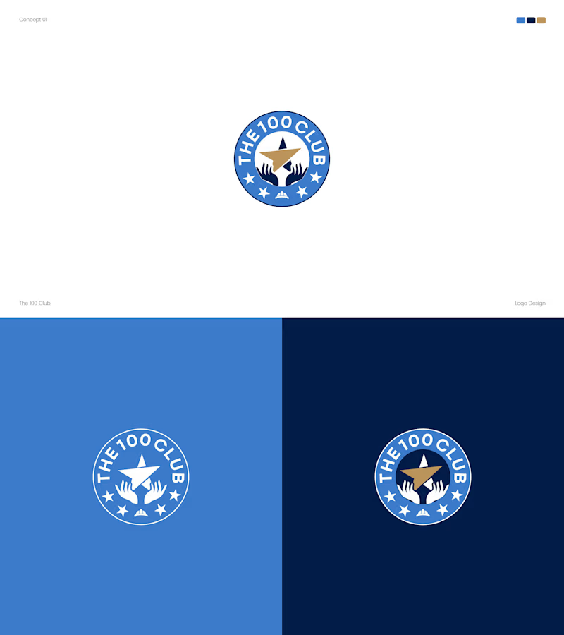
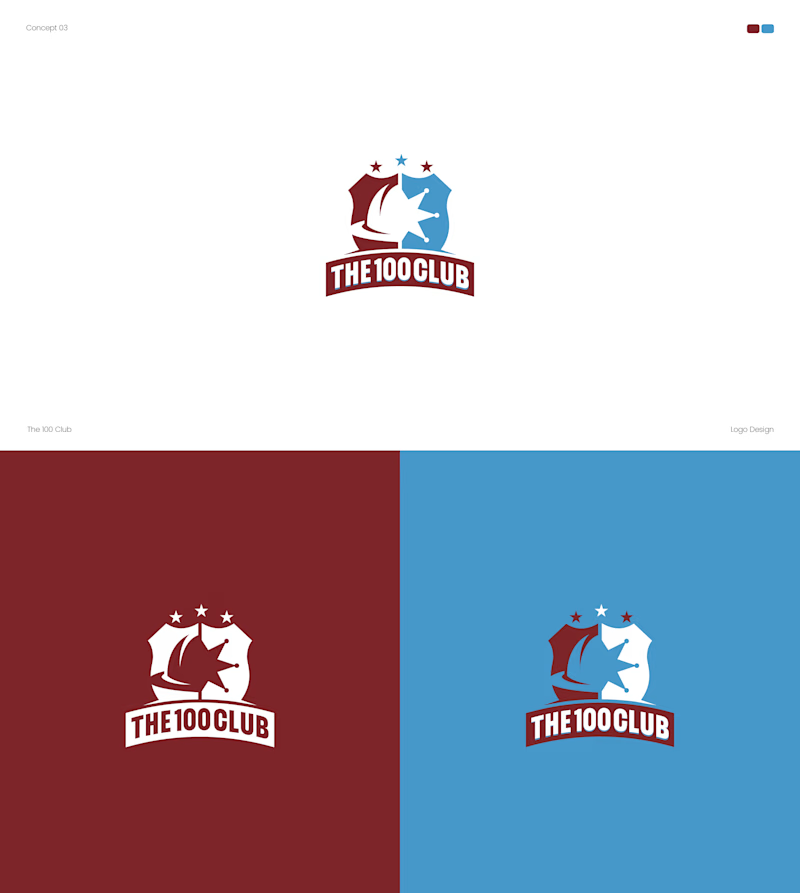
Working on a logo for The 100 Club. Two very different directions.
Concept A: Badge style, blue and gold, hands holding a star.
Concept B: Shield crest, red and blue, bold and sporty.
Which one fits a club identity better? A or B? 👇
4 voted
25%
12 voted
75%
16 votes
Closed


Both options turned out amazing

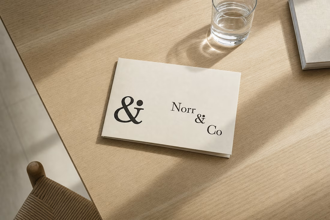
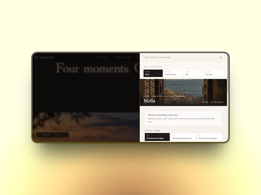
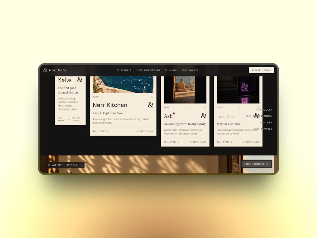
quietly finished a full brand system for a fictional hospitality group — one parent identity, four sub-brands, each tuned to a different hour of the day but sharing the same DNA underneath.
a single dot that changes meaning depending on the moment. a mark that knows when to stay quiet and when to take up space.
case study dropping soon