The network for creativity
Join 1.25M professional creatives like you
Connect with clients, get discovered, and run your business 100% commission-free
Creatives on Contra have earned over $150M and we are just getting started
Back to feedPost
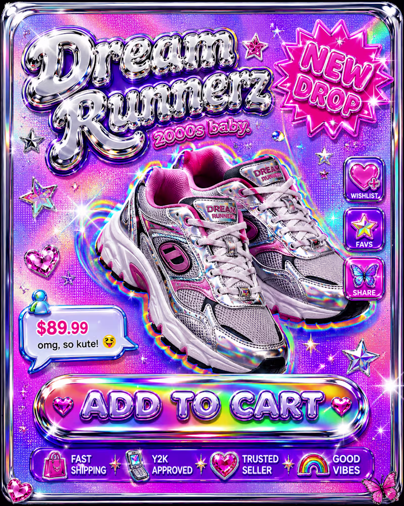
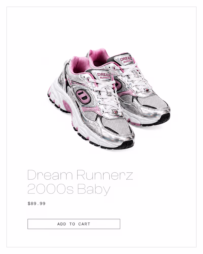
Taste Test
Same sneaker. Same price point. Two product cards built to trigger completely different parts of your brain.
Card 1: Holographic chrome, glitter, sparkle stickers, a button that looks like it's about to play a dial-up sound. Pure Y2K dopamine.
Card 2: White space. One hairline border. A button with no color at all. Looks like it costs $400 more than it does.
Both are "good design." They're just selling to two different nervous systems.
Be honest 👇
Which card makes YOU actually click "Add to Cart" faster — chaos or silence?
🌈 Y2K Chrome | ⚪ Clinical White
(Tag someone who'd 100% pick the opposite of you)
0 voted
0%
3 voted
100%
3 votes
Closed
ging for the clinical white
Круто😍
Clinical White, because silence is its own form of confidence. The Y2K card is loud enough to work for a drop culture audience, but the minimal one earns trust at a glance. The post nails it though: neither is wrong, they're just solving for different buyer psychology.
The network for creativity
Join 1.25M professional creatives like you
Connect with clients, get discovered, and run your business 100% commission-free
Creatives on Contra have earned over $150M and we are just getting started
Related posts
Thanks for sharing man
Which design feels more thoughtful to you?
6 voted
67%
3 voted
33%
9 votes
Closed
Going for the ai generated version
Trending
Claude
Claude has entered the design space. How are you using Claude Design?
Contra University
Learn from expert creatives how to earn more using next-gen AI tools.
MagicPath
The canvas is infinite, and exploration is becoming the workflow. How are you using MagicPath?
creativeaiflow
Creative AI workflows are evolving. What tools do you use, and what are their strengths and weaknesses?
freelancerlife
Freelancer life is wins, pivots, and everything in between. What’s yours right now?