The network for creativity
Join 1.25M professional creatives like you
Connect with clients, get discovered, and run your business 100% commission-free
Creatives on Contra have earned over $150M and we are just getting started
Back to feedPost

ZENK — Matcha Brand Identity 🍵
From chaos to calm.
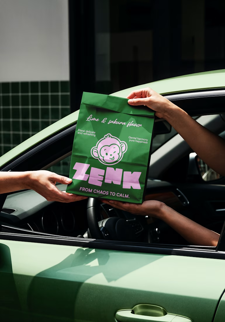
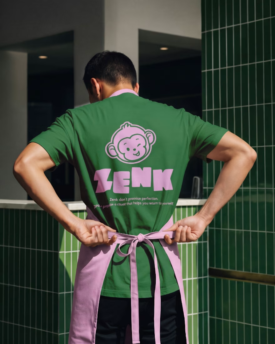
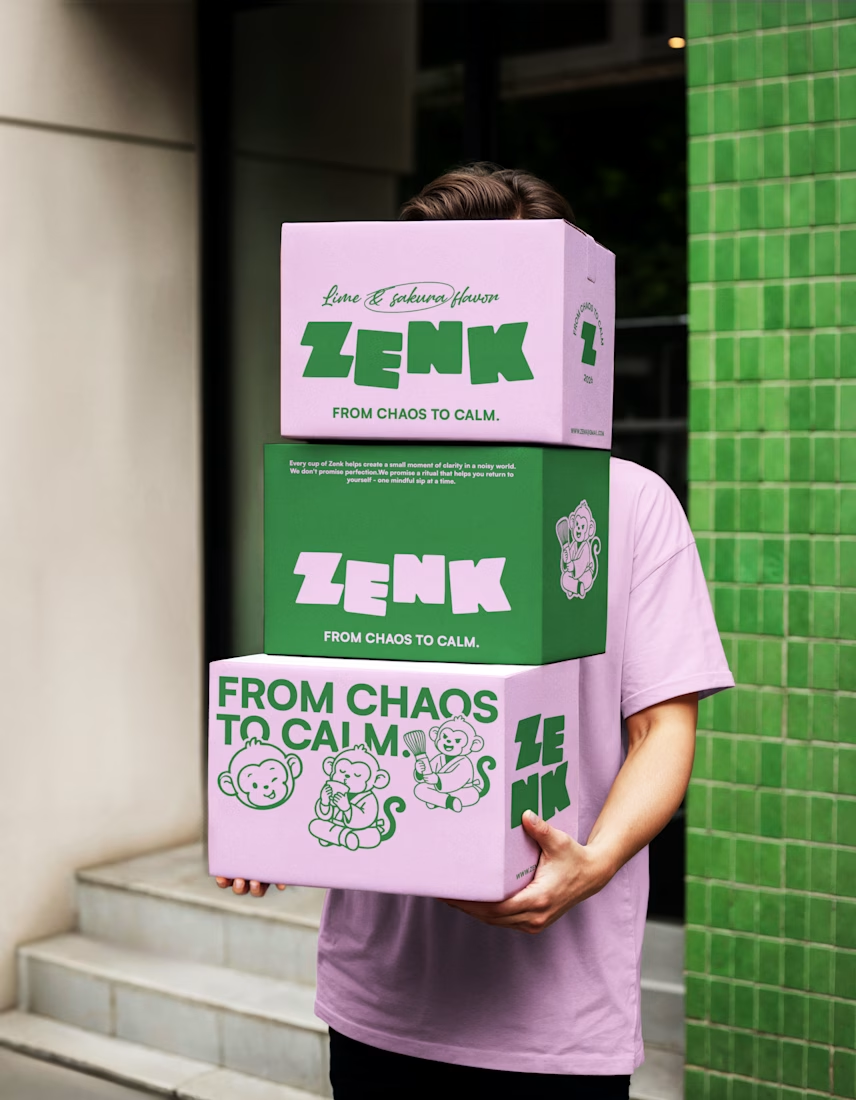
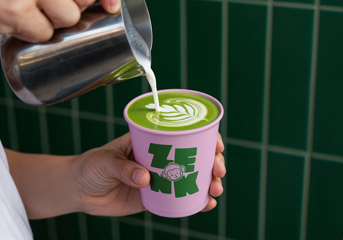
ZENK is a playful matcha brand built around the idea of slowing down, resetting, and finding small moments of calm in everyday life.
The identity combines bold typography, fresh green tones, soft pinks, and expressive monkey illustrations to create a personality that feels energetic yet calming — balancing chaos with calm.
From packaging and apparel to café touchpoints, every element is designed to make the brand feel recognisable, playful, and approachable.
Brand Identity • Packaging • Art Direction
#BrandIdentity #Branding #PackagingDesign #MatchaBrand #MatchaBranding #CafeBranding #VisualIdentity #BrandDesign #PackagingDesign #CreativeBranding


The network for creativity
Join 1.25M professional creatives like you
Connect with clients, get discovered, and run your business 100% commission-free
Creatives on Contra have earned over $150M and we are just getting started

Challenges
View all


Related posts

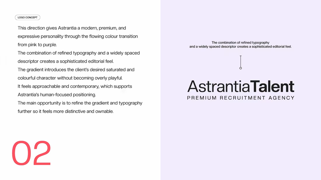
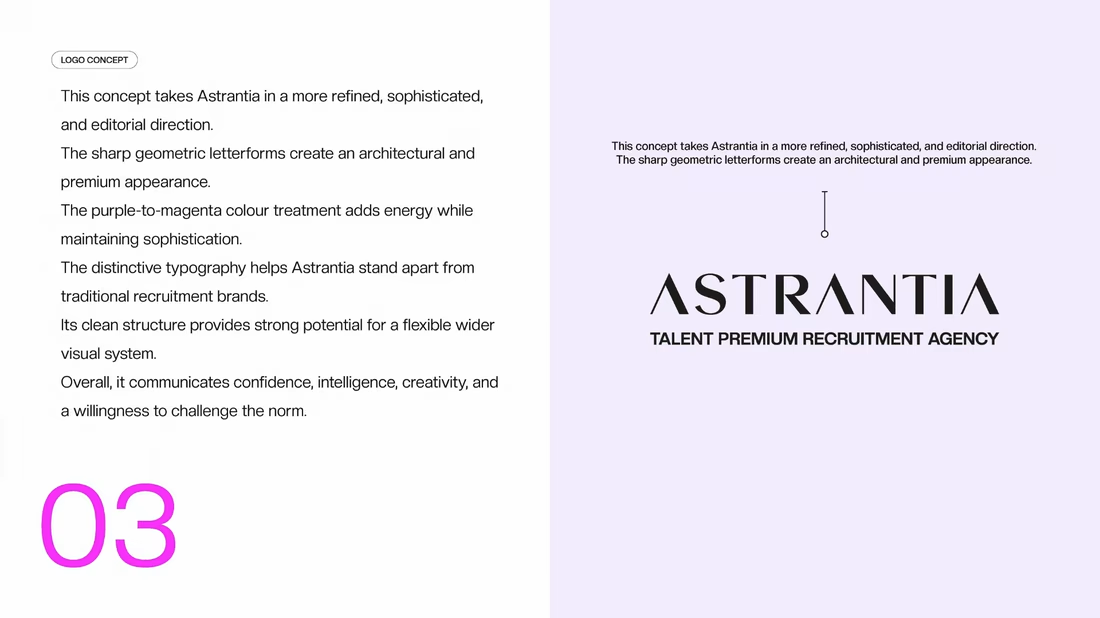
Logo design and brand identity project for Astrantia Talent, a premium recruitment agency. Explored three wordmark concepts bold geometric type, editorial gradient, and architectural serif built around a vibrant purple-to-magenta palette for a modern, memorable recruitment brand identity.



Outstanding 😊

What if a space brand didn’t just look futuristic — but felt like it was already living in the future?
For XPACE, the goal was to build a visual identity that could turn the idea of space exploration into a complete and immersive brand experience.
The identity combines a bold typographic system, a high-contrast visual language, and electric blue accents against deep black to create a futuristic presence that feels precise, technological, and unmistakably XPACE.
But the identity didn’t stop at the logo.
The system was extended across digital interfaces, web design, favicon and UI icons, access cards, board passes, and branded applications — creating a consistent experience across every touchpoint.
Every detail was designed to make XPACE feel less like a brand inspired by the future, and more like a brand built for it.
XPACE — Visual Identity System.
Looking to build a visual identity that goes beyond a logo?
Let’s create something with a world of its own.

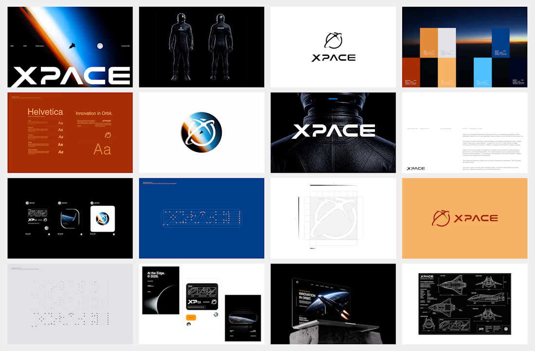

The identity system feels cohesive because the typography, electric blue accents, and image language all push in the same direction. Extending that logic into interfaces and packaging is what makes XPACE feel like a real world, not just a futuristic logo.