Ahlan Siddika Aliza
Form: https://tally.so/r/rjbBkv


Bold packaging that doesn’t just sit on the shelf — it demands attention. ❤️
For The White Rose, I explored a bold red-and-cream visual language with expressive typography, tactile details, and sculptural packaging forms to create a beauty identity that feels confident, playful, and unmistakably its own.
From the embossed soap bars to the statement tube and structured box — every touchpoint was designed to make the brand feel like an experience, not just a product.
0
74
From chaos to calm — meet ZENK. 🍵
A matcha brand made for those little moments when you just need to slow down, reset, and take a sip.
Fresh greens, playful pinks, bold type, and a personality that refuses to feel boring.
2
189
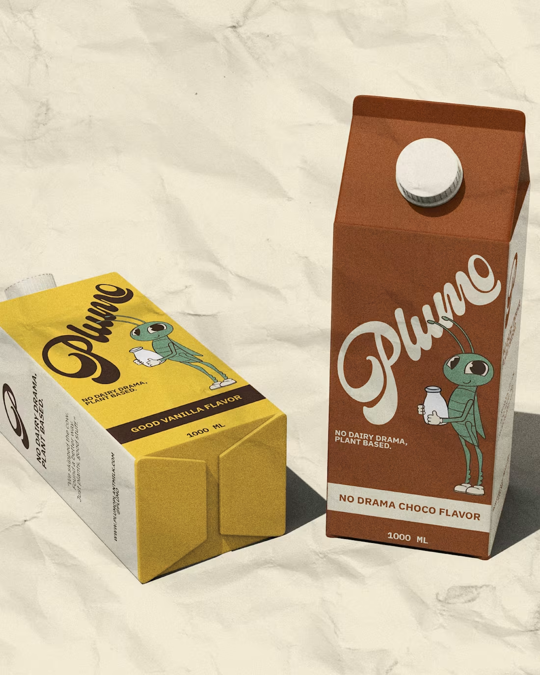
The cow had nothing to do with this. 🌾
Introducing Plumo — plant-based milk that actually tastes like a choice you want to make. No compromise. No dairy. Just good, honest oats.
Retro soul. Built for people who want better.
No dairy, no drama. Plant-based.
No dairy drama, plant-based milk brand, 1970s retro-inspired.🌾
.
.
.
Bold · Playful · Retro · Honest · Plant-Powered
0
124
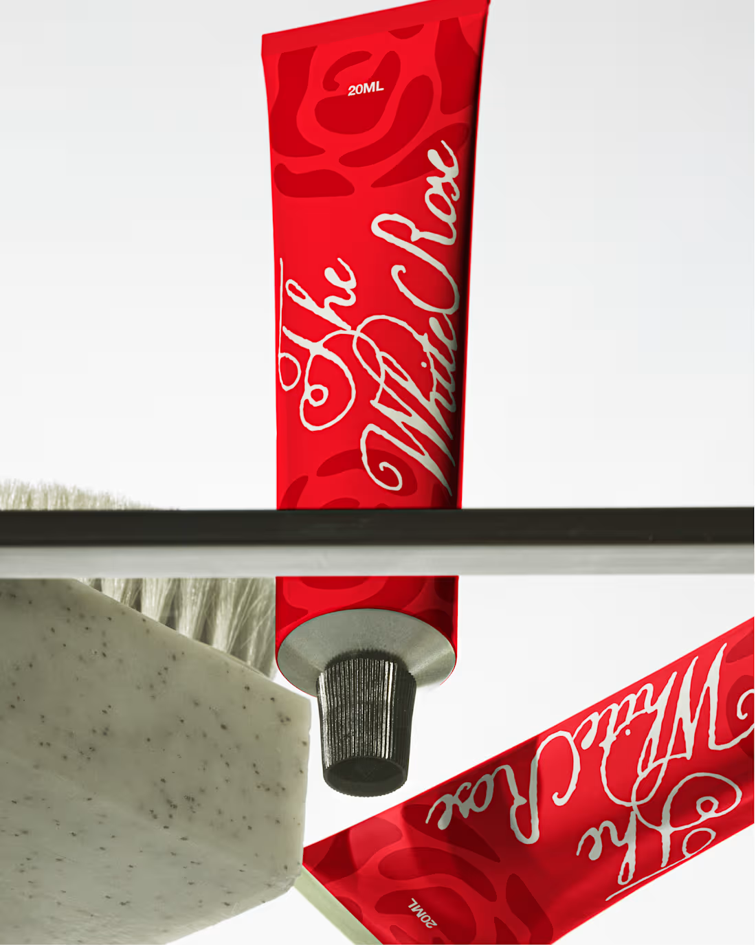
:The White Rose — Beauty Brand Identity & Packaging
A bold, editorial identity created for a modern beauty brand.
The direction combines deep red, warm cream, expressive typography, and tactile packaging details to create a visual system that feels confident, distinctive, and elevated.
From the soap packaging to the tube and box, each touchpoint was designed to make the products feel as considered as the brand itself.
Services: Brand Identity · Packaging Design · Art Direction
1
163