The network for creativity
Join 1.25M professional creatives like you
Connect with clients, get discovered, and run your business 100% commission-free
Creatives on Contra have earned over $150M and we are just getting started
Back to feedPost

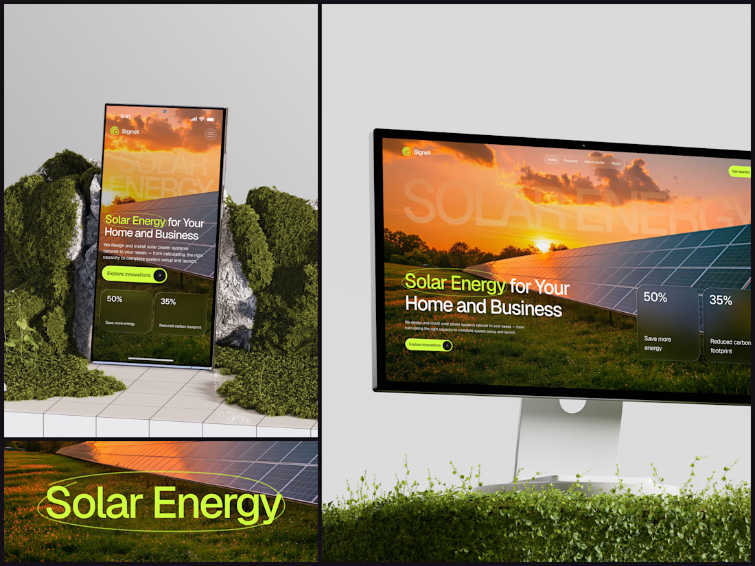
New website + brand project for a French renewable energy company.
Here’s a quick Framer section from it 🫴


The balance between the editorial layout and the warmer imagery feels really considered. That short Framer sequence makes the renewable-energy story feel tangible without overloading the page.


clean section, the french headline sits so well

looks awesome!

The design looks awesome. Great project!

looks amazing

Renewable energy brands usually lean so heavily on green and blue gradients, hope this one breaks from that a bit.
The network for creativity
Join 1.25M professional creatives like you
Connect with clients, get discovered, and run your business 100% commission-free
Creatives on Contra have earned over $150M and we are just getting started



Related posts

Solar Energy Website
A thin lime circle tells you which two words this page is about.
The headline sits over a sunset photo of a panel field. The "Get started" and "Explore innovations" buttons share the circle's lime, so the eye moves from the circled words straight to the next step.
Large faded capitals repeat those two words across the sky, faint enough to stay inside the photo. On mobile they break onto two lines, and the headline and button stack above two frosted cards.
Only two words of "Solar Energy for Your Home and Business" are lime, and the whole page follows them.
Designed by the Hue & Machine team.
#SolarEnergy #RenewableEnergy #CleanTech #WebDesign #LandingPage #HeroSection #UIDesign #ResponsiveDesign #MobileDesign #FigmaDesign



This is really cool, Nice job Dmytro

What if your photo gallery could do more than just display images?
This one brings photos to life with floating images, smooth scroll animations, and customizable decorative frames ✨


Portfolio update: I couldn't decide on a look, so I built both.
A or B? manucabezas.com

11 voted
69%
5 voted
31%
16 votes
Closed

dev mode on dark looks 👌🏻✨