The network for creativity
Join 1.25M professional creatives like you
Connect with clients, get discovered, and run your business 100% commission-free
Creatives on Contra have earned over $150M and we are just getting started
Back to feedPost
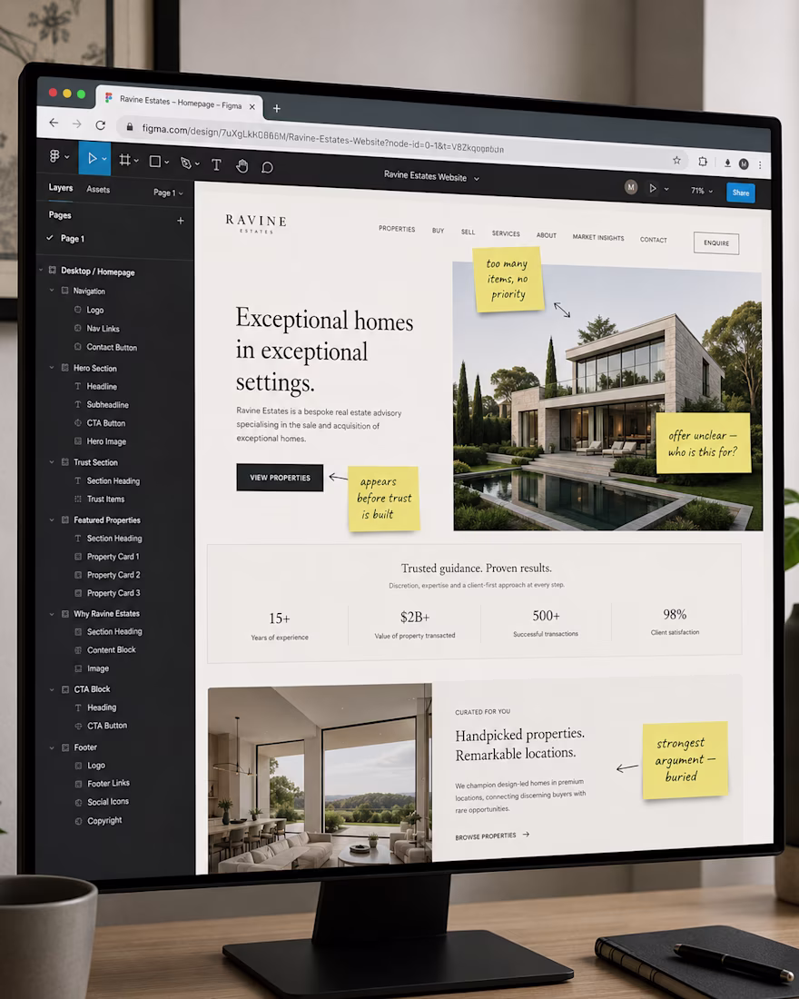
When I open a premium service website for the first time, I don’t scroll immediately.
I give the first screen ten seconds. That’s what a real visitor does.
Here is what I look at:
• Clarity of the offer.
Can I understand what this company does, for whom, and why it matters — without reading past the hero? Most premium sites fail here. Beautiful photography, elegant type, no actual answer.
Emotional tone.
Does the first screen feel consistent with the price point? Luxury real estate and a cluttered navigation don’t belong together. The tone is set before the visitor reads a single word.
• Offer structure.
Is there a logical path from “I’m interested” to “I want to take action”? Or does the page present everything at once and hope the visitor figures it out?
• CTA path.
Where does the page want me to go? Is there one clear next step — or four buttons competing for the same moment of attention?
Most premium service websites have the visual language right.
The experience is where they lose the visitor.
The network for creativity
Join 1.25M professional creatives like you
Connect with clients, get discovered, and run your business 100% commission-free
Creatives on Contra have earned over $150M and we are just getting started
Related posts
Gallery experience explain more about how the project process was being done. Good job
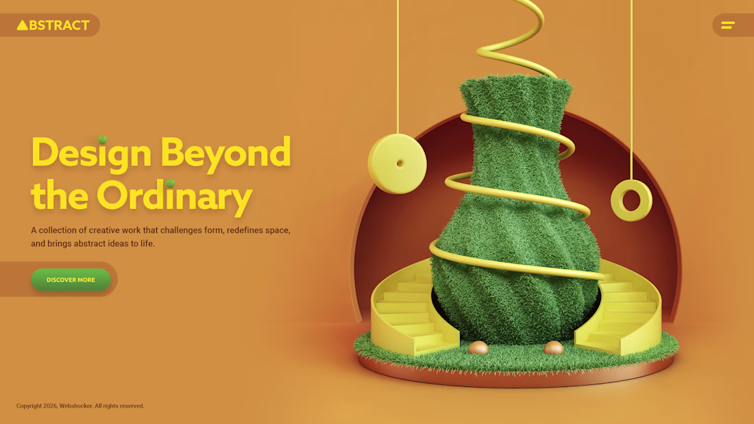
Abstract website visual I created early this year.
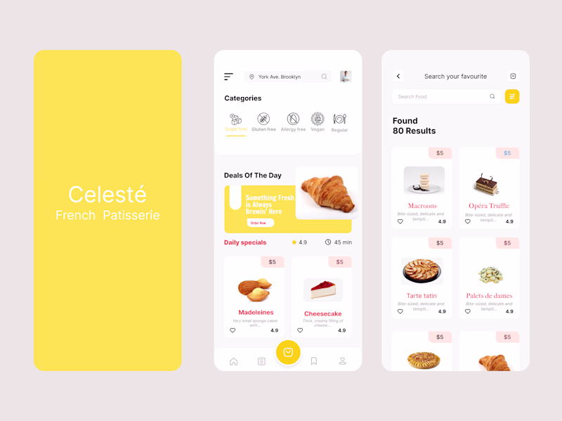
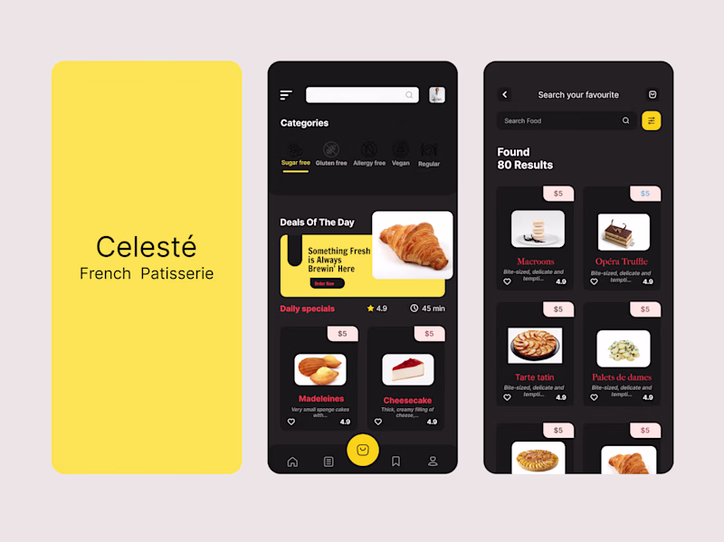
Exploring two visual directions for a French patisserie mobile app concept
Same product, same flow but two completely different moods
11 voted
35%
20 voted
65%
31 votes
Closed
Light mode but to improve accessibility a bit I would tweak the white text to black on the yellow background.
Trending
Claude
Claude has entered the design space. How are you using Claude Design?
Contra University
Learn from expert creatives how to earn more using next-gen AI tools.
creativeaiflow
Creative AI workflows are evolving. What tools do you use, and what are their strengths and weaknesses?
portfolioreview
The best portfolios tell a story, not just show a grid. Share yours for feedback.
freelancerlife
Freelancer life is wins, pivots, and everything in between. What’s yours right now?