The network for creativity
Join 1.25M professional creatives like you
Connect with clients, get discovered, and run your business 100% commission-free
Creatives on Contra have earned over $150M and we are just getting started
Back to feedPost

StockSense — Designing for the Nigerian Shop Owner Who Can't Afford to Run Out
There's a particular kind of stress that every small business owner in Nigeria knows.
You're at your shop. A customer asks for Indomie Belleful. You reach for it and the shelf is empty. You lost the sale. You lost the customer. And somewhere in the back of your mind, you know you saw it getting low three days ago and forgot to reorder.
That moment of loss is what StockSense was designed to prevent.
Why dark mode for a market app?
Most inventory apps built for this market are bright, clinical, spreadsheet-like. They were designed by people who imagined a warehouse manager sitting at a desk. But the real user a shop owner in Lagos, Aba, or Kano on their feet, checking their phone between customers, often in a shop with mixed lighting. A dark navy interface reduces eye strain across long days, makes numbers pop instantly without squinting, and frankly, it signals that this tool was built for you not handed down from a corporate software suite.
The color system does the thinking for you
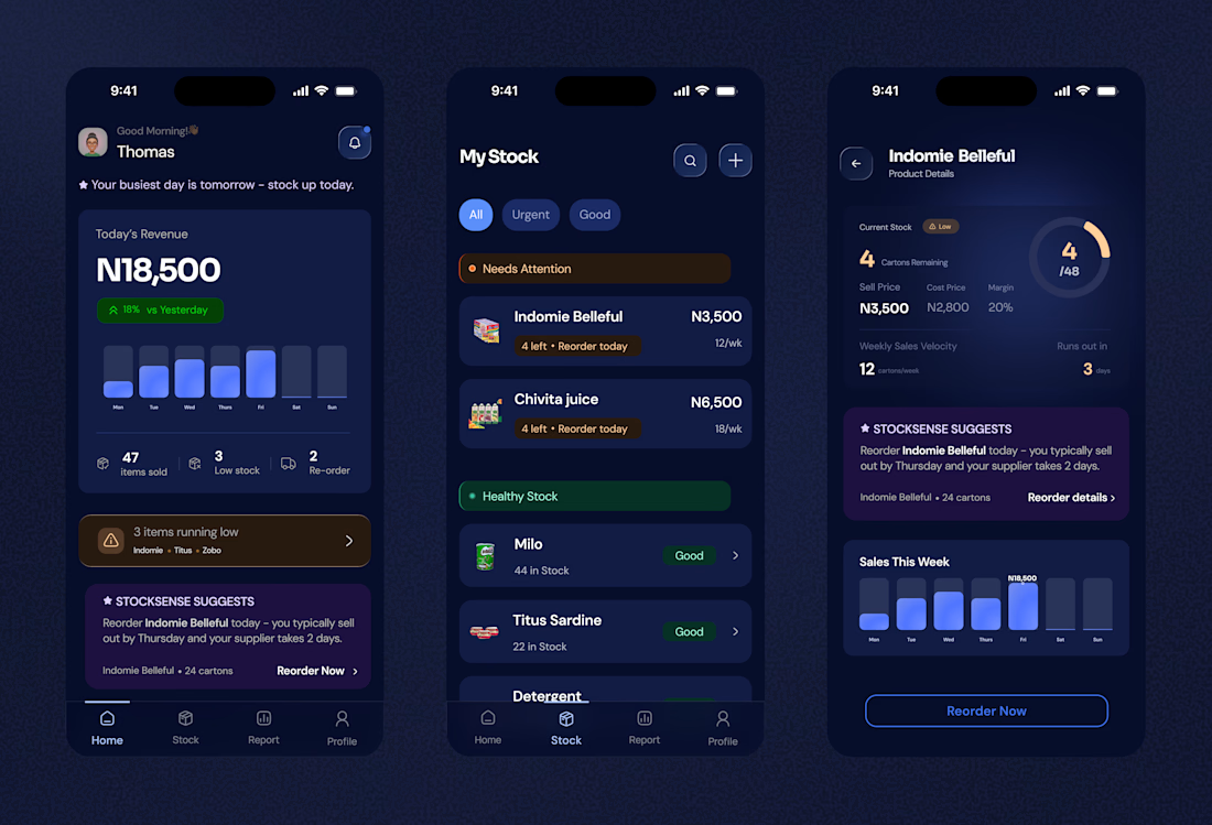
I made a deliberate decision to keep the color language binary and immediate. Amber means act now. Green means you're safe. No gradients of confusion, no five-level priority system nobody remembers. When a shop owner opens the Stock screen, they shouldn't need to read they should feel the urgency before their brain catches up. The "Needs Attention" section sits at the top in warm amber. "Healthy Stock" sits below in calm green. The visual hierarchy mirrors the mental priority.
StockSense Suggests — the feature that makes everything else matter
This was the most intentional design decision in the entire product.
Every other inventory app tells you what has happened. StockSense tells you what's about to happen and what to do about it before it does. The AI suggestion card isn't tucked away in settings or buried in a product page. It lives on the home screen, front and center, because that insight is the most valuable thing the app can offer.
"Reorder Indomie Belleful today you typically sell out by Thursday and your supplier takes 2 days."
That one sentence is worth more than any chart. It connects sales velocity, supplier lead time, and calendar awareness into a single human instruction. The design frames it with a star icon and a purple card intentionally — it needed to feel like a recommendation from someone who knows your business, not a system-generated alert.
The product detail screen every number earns its place
When you tap into a product, you see exactly what a shop owner needs to make a reorder decision: current stock, sell price, cost price, margin, weekly sales velocity, and days until stockout. No bloat. No noise.
The circular gauge showing 4/48 cartons remaining wasn't just aesthetic it gives an immediate spatial sense of how empty things are. A number alone is abstract. A nearly empty ring is visceral.
Revenue insight on the home screen
The home screen opens with today's revenue because that's the first question every shop owner asks every morning. Not "what's my inventory count" "how am I doing today?" Anchoring the home screen to that question makes the app feel alive and personal, not like a database you log into.
The 18% vs Yesterday badge was designed to give context without requiring the user to remember yesterday's number themselves.
This is a product built around one truth:
Small business owners in Nigeria are running sophisticated operations with zero infrastructure support. They track thousands of naira in stock from memory, predict demand from instinct, and manage supplier relationships through WhatsApp. StockSense doesn't replace that intelligence it augments it. Every design decision, from the color of an alert to the placement of a suggestion card, was made to reduce cognitive load and give time back to the people who need it most.
If you're building a product that needs to earn trust fast and deliver clarity under pressure that's exactly the kind of problem I design for.
Let's work together.

The network for creativity
Join 1.25M professional creatives like you
Connect with clients, get discovered, and run your business 100% commission-free
Creatives on Contra have earned over $150M and we are just getting started
Trending

Claude
Claude has entered the design space. How are you using Claude Design?

Contra University
Learn from expert creatives how to earn more using next-gen AI tools.
creativeaiflow
Creative AI workflows are evolving. What tools do you use, and what are their strengths and weaknesses?
freelancerlife
Freelancer life is wins, pivots, and everything in between. What’s yours right now?








Related posts


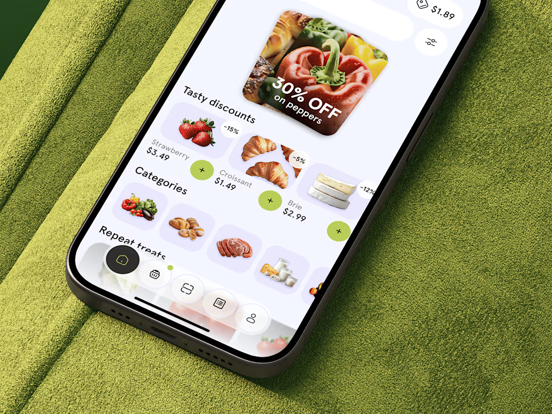
Just shared food delivery app concept 🥐 What do you think?



This looks fantastic. Which stage of the process was the most challenging?

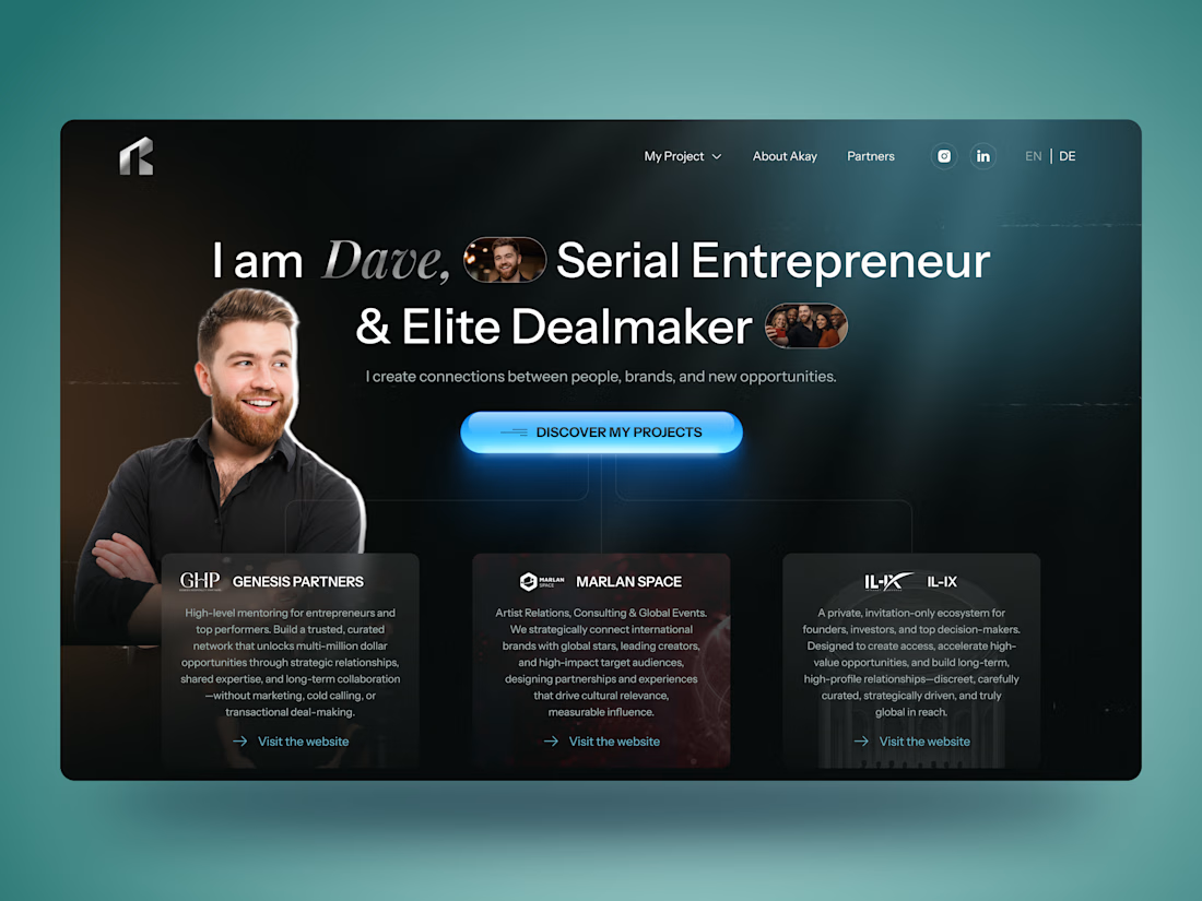
🚀 Personal Brand Website for Entrepreneur | UI/UX Case Study
Building a personal brand online is about more than just having a website — it's about creating trust from the very first interaction.
For this concept, I designed a modern personal brand website for an entrepreneur and dealmaker, combining a bold visual style with a clean user experience. The goal was to showcase credibility, highlight partnerships, and guide visitors naturally toward meaningful connections.
✨ Project highlights:
• Clean and modern UI with a premium aesthetic
• Personal branding focused homepage
• Responsive website design
• Strategic content hierarchy
• Partner & portfolio showcase
• Contact section with clear CTA
• Mobile-first experience
• Dark interface with vibrant accent colors
Always enjoy designing websites where personality and business goals come together in one cohesive experience.
💬 I'd love to hear your thoughts!


Most websites look good.
Few make people stop, trust, and take action.
This landing page was designed with one goal: clarity over complexity.
Every section has a purpose:
- Clear visual hierarchy
- Generous whitespace
- Clean, modern UI
- Scalable components
Good design isn't about adding more,it's about removing what doesn't help users.
I'd love to hear your thoughts:
What part of a landing page has the biggest impact on conversions?
If you'd like, I can also make it more viral, designer-focused, or client-attracting.


Weldone ☀️ 💖