The network for creativity
Join 1.25M professional creatives like you
Connect with clients, get discovered, and run your business 100% commission-free
Creatives on Contra have earned over $150M and we are just getting started
Back to feedPost


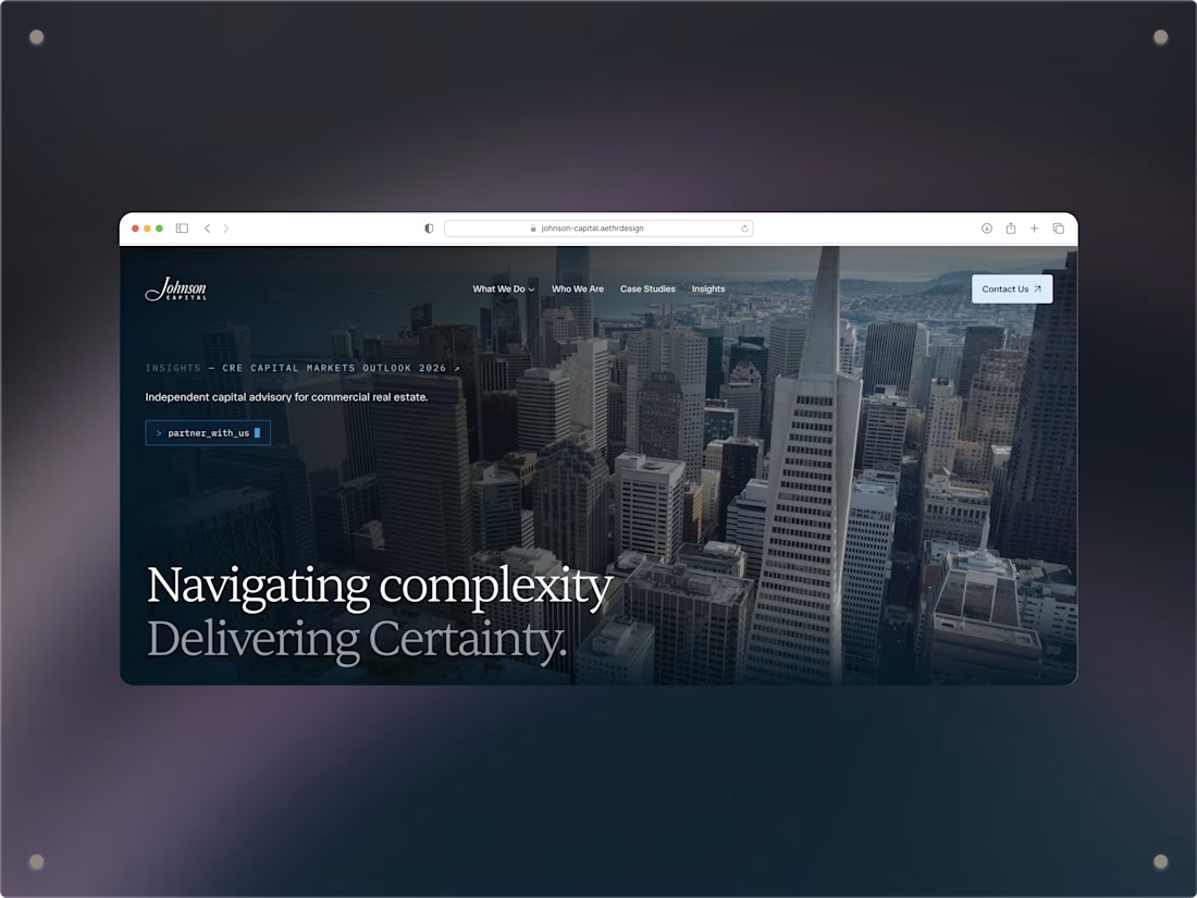
Redesigned and rebuilt Johnson Capital's site in Framer on an accelerated 1-month timeline. The tricky part was threading institutional credibility through a more contemporary, fintech-inspired look instead of just making it "modern for modern's sake."
Stack: Framer for the build, with some Claude-assisted development work along the way.
The network for creativity
Join 1.25M professional creatives like you
Connect with clients, get discovered, and run your business 100% commission-free
Creatives on Contra have earned over $150M and we are just getting started







Related posts


Fresh case study 🚀🚀🚀
Brand identity for Peak, an all-in-one website builder for WordPress that I design and build. A four-letter mark, a warm paper-and-ember palette and one system that runs from the favicon to the packaging.


A four-letter mark that has to hold from favicon to packaging is a tough constraint. Did you draw one letterform first and build the other three from it, or design them together as a set from the start?


🌶️ Spicy take from my latest identity project
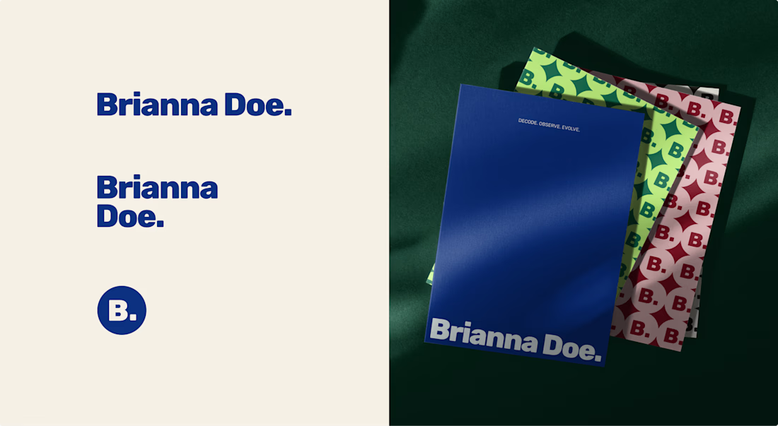
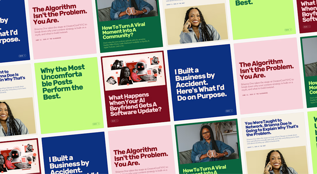
Brianna Doe’s entire logo is her name and a dot. And it does more work than most of the “unique” logos I scroll past on socials.
A logo only has to IDENTIFY a brand. Defining it is the job of everything else: creative direction, color & font systems, imagery.
Complicated logos impress other designers, simple ones work for the client.
Check out the full case study to see how a simple logo carries an entire brand identity

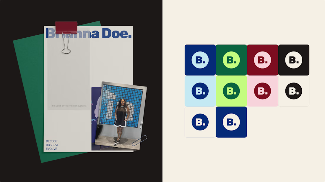

Lovely palette. I'm sure the client is stoked.


Another Kajabi project wrapped up! 🎉
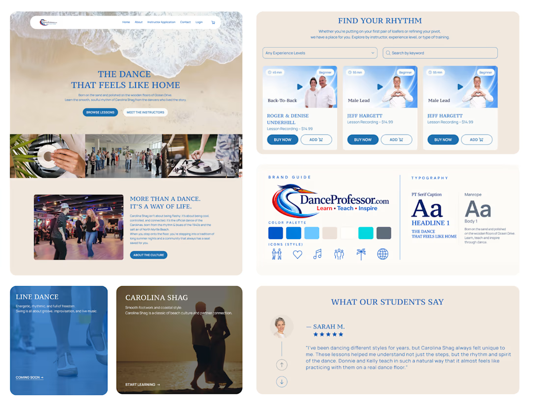
We've noticed a common challenge across many of our recent projects: clients have a growing number of courses, but making them easy to browse isn't always straightforward.
Kajabi doesn't offer advanced course filtering out of the box, so for DanceProfessor, we built a custom solution.
It took quite a bit of time on both the design and development sides, but the result was worth it. The client is happy, and visitors can now easily find exactly what they're looking for.
Sometimes the most challenging features are the ones that make the experience feel the simplest.