The network for creativity
Join 1.25M professional creatives like you
Connect with clients, get discovered, and run your business 100% commission-free
Creatives on Contra have earned over $150M and we are just getting started
Back to feedPost

Which header would you choose?
While working on a new landing page, I wanted to test two different approaches to desktop navigation. Both have their strengths, but they create a very different first impression.
Option 1 - Full Navigation. The logo, navigation links, and the primary CTA are always visible.
Option 2 - Hidden Navigation. Only the logo and a menu icon are visible. The navigation slides in from the side when the burger menu is opened.
Which option would you choose - 1 or 2? And why?

The network for creativity
Join 1.25M professional creatives like you
Connect with clients, get discovered, and run your business 100% commission-free
Creatives on Contra have earned over $150M and we are just getting started











Related posts

Onboarding section for a website i am working on
Six simple steps from first call to home-based sessions, with playful illustrated icons.
Need a sales-focused landing page, site, branding?
Book an intro call 👇🏻
https://calendly.com/book-a-15mins-call/theframerdude


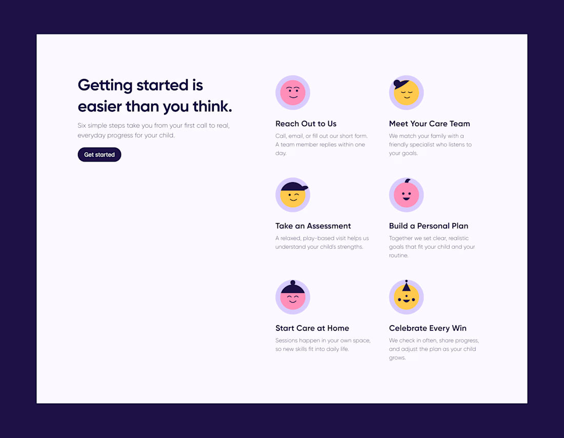

Getting started is easier than you think is such a warm headline for an onboarding section, Olayanju. Six illustrated steps from first call to home-based sessions makes the whole journey feel approachable instead of clinical.

Same content, different experience. A few thoughtful design choices can completely change how a presentation feels, flows, and communicates. Which version would you choose?

11 voted
31%
24 voted
69%
35 votes
Closed

Verde Vista 1 is more modern and futuristic specially with blue colors and robotic hand❤️
Great job Rasid🎉🎉🔥🔥

Accidentally made app navigation look more satisfying than the actual music!😍
16 seconds of spatial audio, smooth transitions, and tactile UI motion. Testing how far you can stretch digital minimalism✨
Feedback and love from the design community are always appreciated🙌
UI DesignmotiongraphicsmobileappdesignuiuxdesignMotion DesignUX DesignAdobe After EffectsCinema 4DFigma


This is so satisfying Raheel! 🔥 You nailed that tactile UI motion - 16 seconds but it feels so premium! The spatial audio card with that depth + smooth transition from Home to Made for Spatial Audio is chef's kiss. Minimalism stretched perfectly without losing the Apple Music...