The network for creativity
Join 1.25M professional creatives like you
Connect with clients, get discovered, and run your business 100% commission-free
Creatives on Contra have earned over $150M and we are just getting started
Back to feedPost

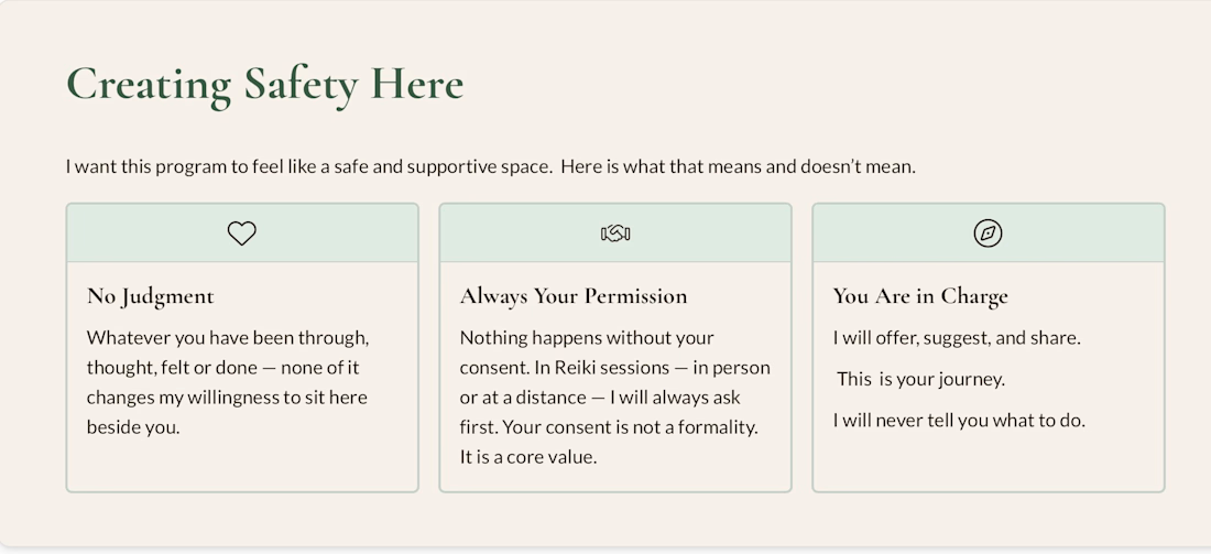
A lesson slide from my Within The Grove program, created in Gamma. I organised three key ideas into a clear layout using consistent colours, simple icons, and readable text. This sample shows how I present course content in an easy-to-follow format.

The network for creativity
Join 1.25M professional creatives like you
Connect with clients, get discovered, and run your business 100% commission-free
Creatives on Contra have earned over $150M and we are just getting started





Related posts

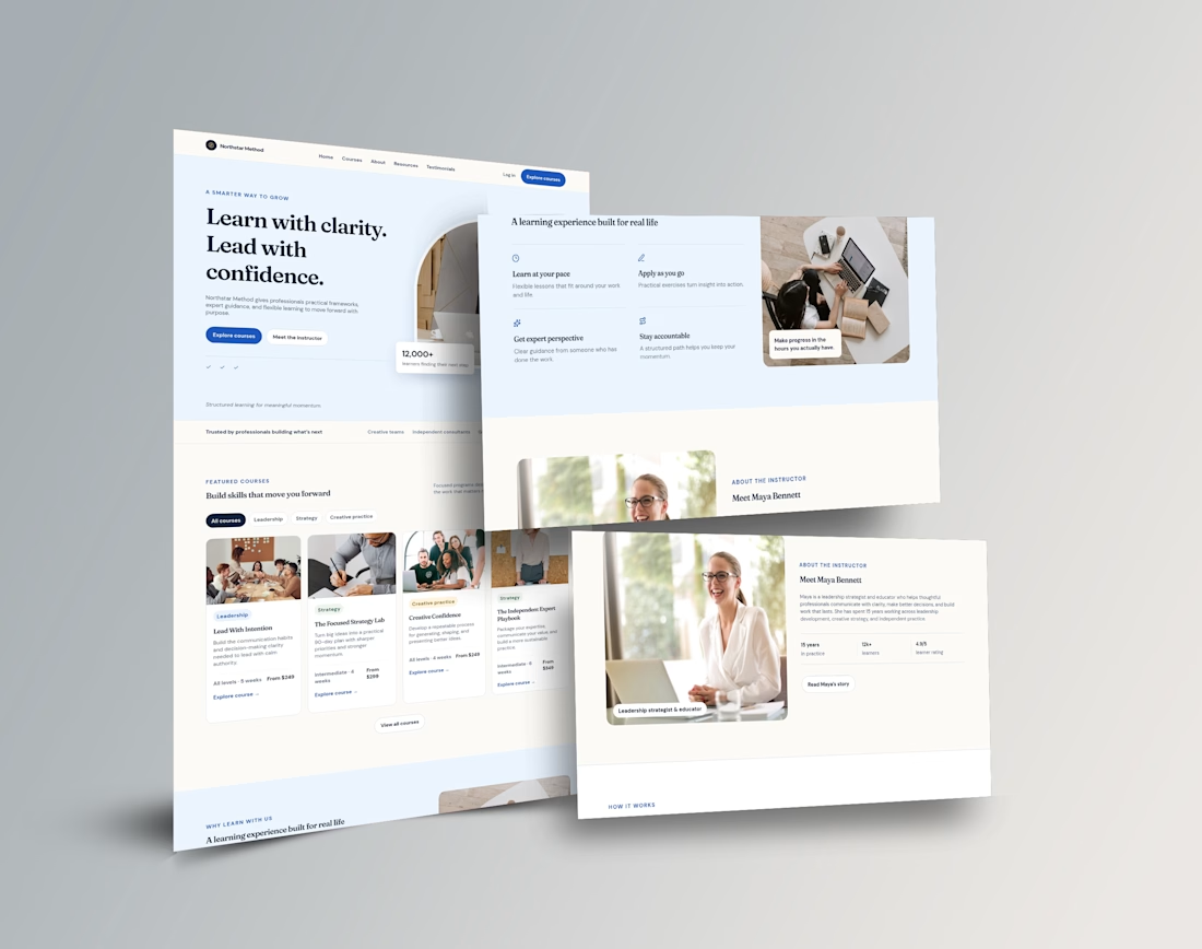
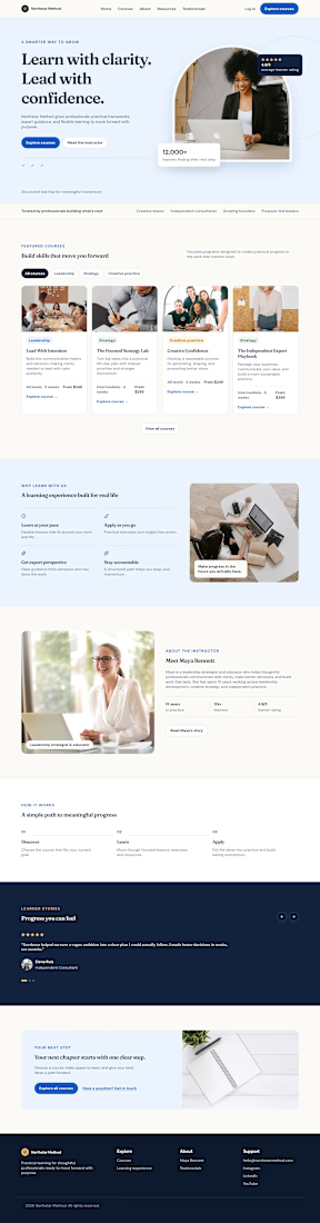
Build and customize professional course websites, course structure, lessons, modules, quizzes, and student experience.

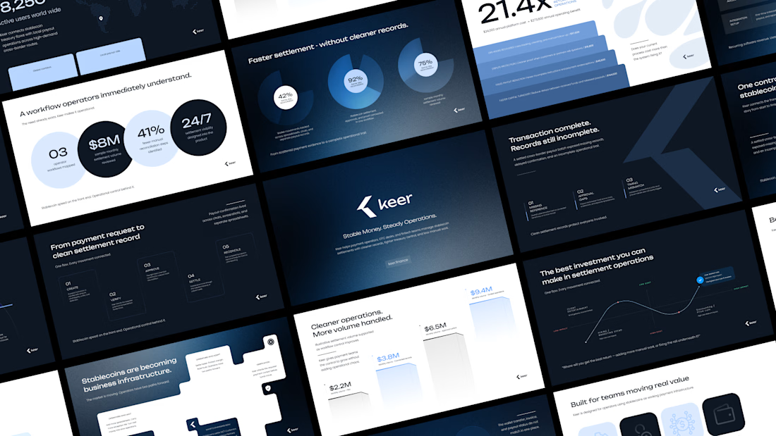
Minimalism isn't a style choice. It's a discipline.
Anyone can strip a slide down to one line and call it clean. The harder part is knowing what to keep, and why every element that stays has a reason to be there.
This deck runs on that principle. Dark base because contrast is the fastest way to direct attention. One accent color because more than one is a decision you haven't made yet. Grid-locked layouts because when the structure holds, the content doesn't have to fight for space.
I design across industries. Tech, finance, healthcare, consumer brands. But there's something about high-stakes products, the ones where a single presentation can move serious money, that pushes the design thinking further.
This is one of those.
I didn't design this to look like a fintech deck. I designed it to look like a decision has already been made, and the slides are just showing you why.
Does the vibe land for you?
Full case study Keer





minimalism is a discipline,, 100% agree

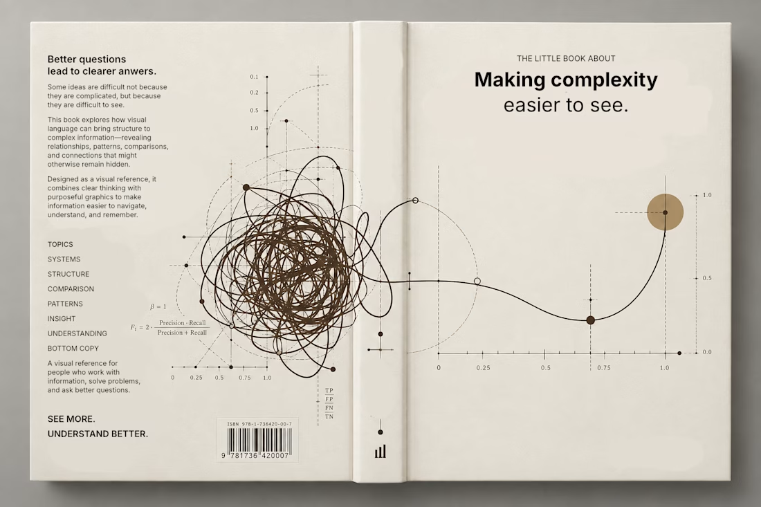
Currently exploring a book design focused on making complex information easier to understand through visual language. Playing with typography, data visualization, and graphic systems to give the subject a more editorial feel.

This is a trully elegant and impressive design concept.
I love it.