The network for creativity
Join 1.25M professional creatives like you
Connect with clients, get discovered, and run your business 100% commission-free
Creatives on Contra have earned over $150M and we are just getting started
Back to feedPost

What Makes a Great Product Engineer?
Beyond technical skill — what the ceiling of product engineering actually looks like.
I. They see a person, not a user
II. They close the gap between the designed interface and the mental model
III. Their language matches the user's language at every layer
IV. They translate between human experience and systems without flattening either
V. They navigate ambiguity without grasping for false certainty
VII. They're attached to the problem, not the solution
VIII. They know when not to build
IX. Their code reads like intent, not implementation
X. They build for the person who inherits it

The network for creativity
Join 1.25M professional creatives like you
Connect with clients, get discovered, and run your business 100% commission-free
Creatives on Contra have earned over $150M and we are just getting started
Related posts

Your SaaS product might be solving the wrong problem. And most designers don't realize it.
Before jumping into Figma, designing dashboards, or creating beautiful interfaces, there's something much more important to understand.
The difference between a Business Problem and a User Problem.
In Part 01 of my SaaS Product Design Masterclass, I'm breaking down:
🔹 1.1 — Start with the Business Problem
🔹 1.2 — Understand the Business Impact
🔹 1.3 — Identify the User Problem
🔹 1.4 — How Business Problems and User Problems are connected, but different.
Here's an important thought:
A business wants to achieve a goal.
A user wants to solve a problem.
Great digital products understand both.
This is where meaningful product differentiation begins — not with UI, but with problem understanding.
🎯 This is Part 01 of my 10-hour practical SaaS Product Design series, where I'll walk through the complete process of understanding and designing a SaaS product.
If you're a UX/UI Designer, Product Designer, aspiring designer, or SaaS founder, this series is for you.
One question: Do you start your design process with business problems or user problems?
Share your thoughts below!
#SaaSProductDesign #UXDesign #ProductDesign #UXResearch #DigitalProduct


Business problem first, but I don't design until I can name the user problem underneath it. Example from Usetally, an invoicing SaaS I built: the business problem was small businesses getting paid late. The user problem was that owners hate chasing customers. So the fix wasn't a...

Business banking is already complex. The product shouldn’t make it feel even harder.
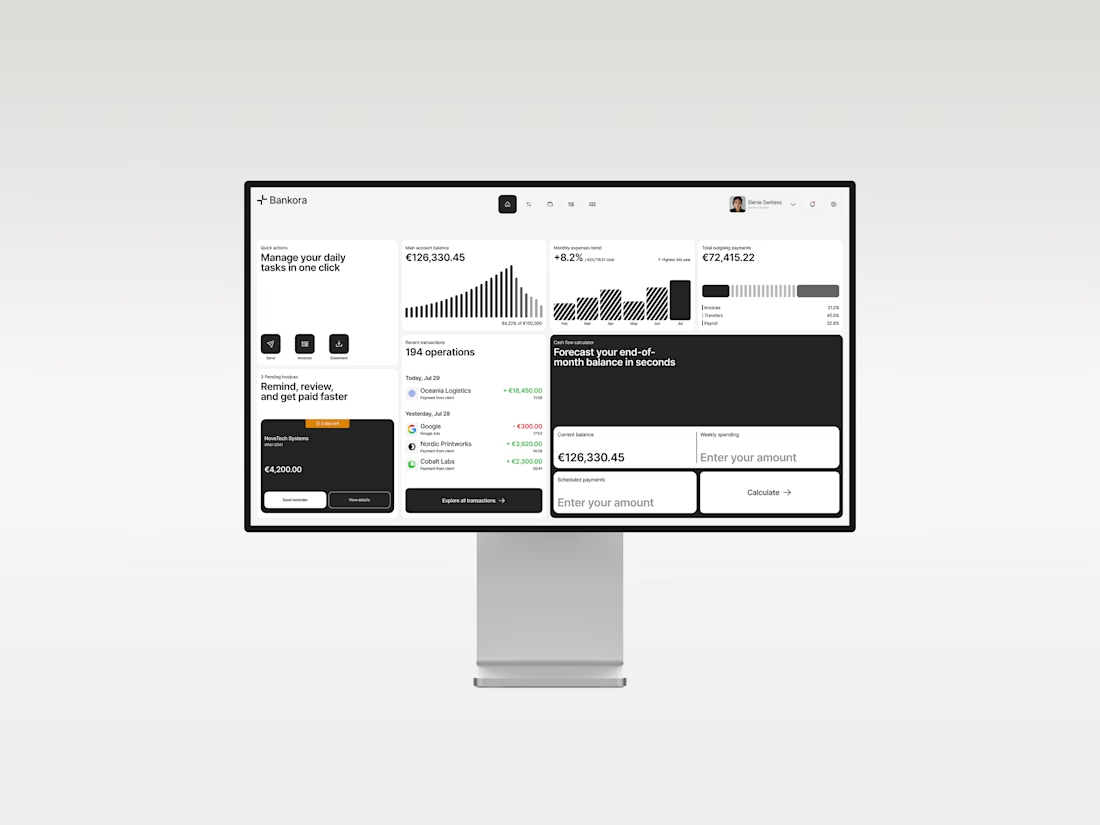
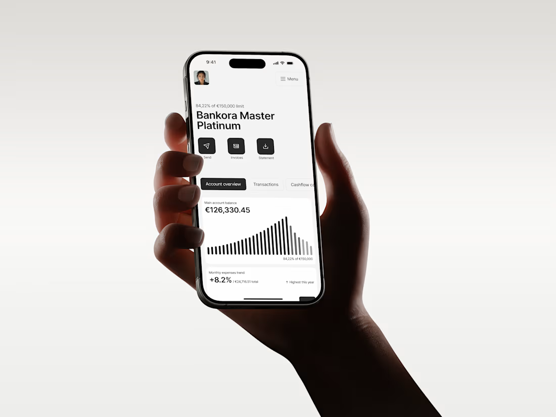
That was the thinking behind Bankora.
Payments, invoices, cash flow, financial overview. These are things business teams deal with constantly, yet many banking products still bury simple actions under dense data, long paths, and complicated navigation.
So I started with the workflows, not the screens.
I looked at the tasks people need to complete most often, where unnecessary steps appear, and what information actually needs attention first.
From there, I built the experience around clearer priorities: key actions available quickly, predictable navigation, structured financial data, and modular UI that makes things like pending and overdue invoices easier to understand at a glance.
I also designed an interactive cash flow calculator to help users see where the business may be heading, not just what has already happened.
The goal wasn’t to make financial operations simpler than they really are.
It was to make interacting with them feel simpler.
Less searching. Less cognitive load. More confidence in what to do next.
And it was especially nice to see Bankora later featured by Contra.
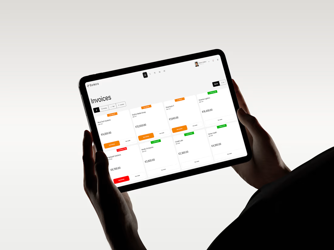
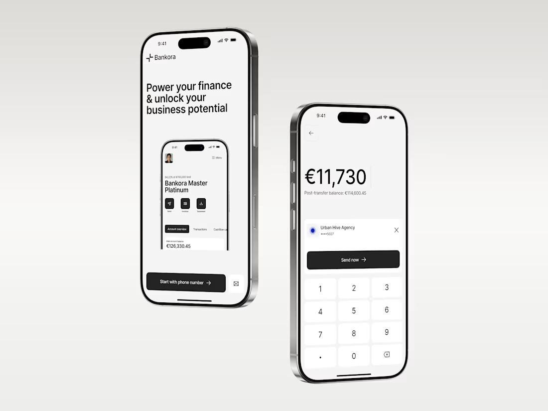

clean!

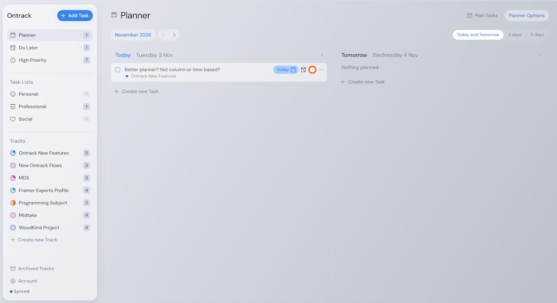
My thought process for Ontrack was to build a task app that made sense for how people keep track of the work they do.
Unfortunately, too many times most task apps forced you into a pattern of spending time micromanaging them over a seamless experience of keeping track of your goals and the work that needed to be done in a fashion that felt fluid and intuitive.
I designed Ontrack around that hypothesis yet I still ran into bottlenecks that blocked the aimed fluidity of a productivity app that felt truly useful.
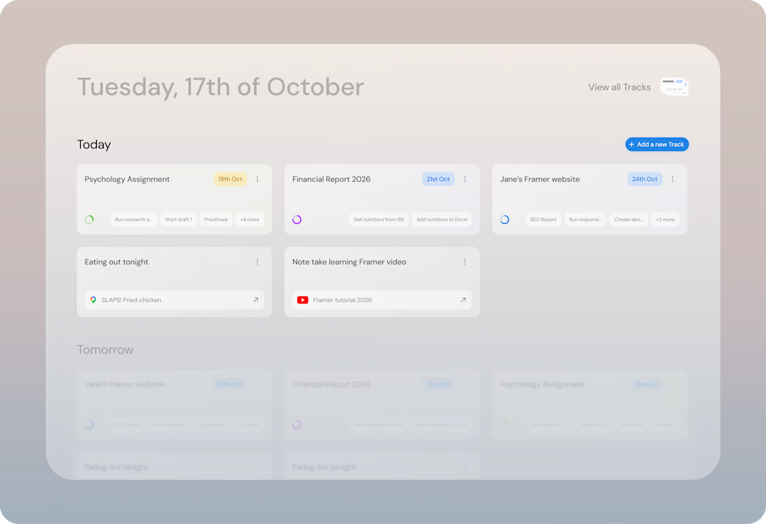
To address the issues, I've been experimenting new approaches that push the limits of creating a frictionless experience, and a productivity app that actually helps you be productive without the overhead.
You can read about some of my research around Ontrack here: https://dilanomer.com/projects/ontrack-treating-task-paralysis
Below, Ontrack as it currently stands, and a proposed version of addressing the current bottlenecks