The network for creativity
Join 1.25M professional creatives like you
Connect with clients, get discovered, and run your business 100% commission-free
Creatives on Contra have earned over $150M and we are just getting started
Back to feedPost
Taste Test

Working on a new lettermark for a brand called "Ridgeline"
I’m torn between the more compact version (left) and the taller, more legible version (right).
Which one reads better as an "R" to you?
Drop a vote :)
0 voted
1%

0 voted
1%

0 votes
Closed
The network for creativity
Join 1.25M professional creatives like you
Connect with clients, get discovered, and run your business 100% commission-free
Creatives on Contra have earned over $150M and we are just getting started
Trending

Claude
Claude has entered the design space. How are you using it?

Contra University
Learn from expert creatives how to earn more using next-gen AI tools.
Brand Design
The best brand designers are on Contra. Scroll to see what's trending in brand design. What are you building?
creativeaiflow
Creative AI workflows are evolving. What tools do you use, and what are their strengths and weaknesses?
freelancerlife
Freelancer life is wins, pivots, and everything in between. What’s yours right now?






Related posts

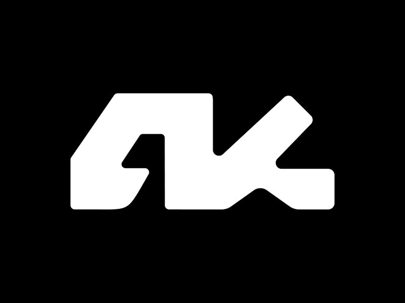
Which do you prefer: Sharp edges or rounded?
50 voted
38%
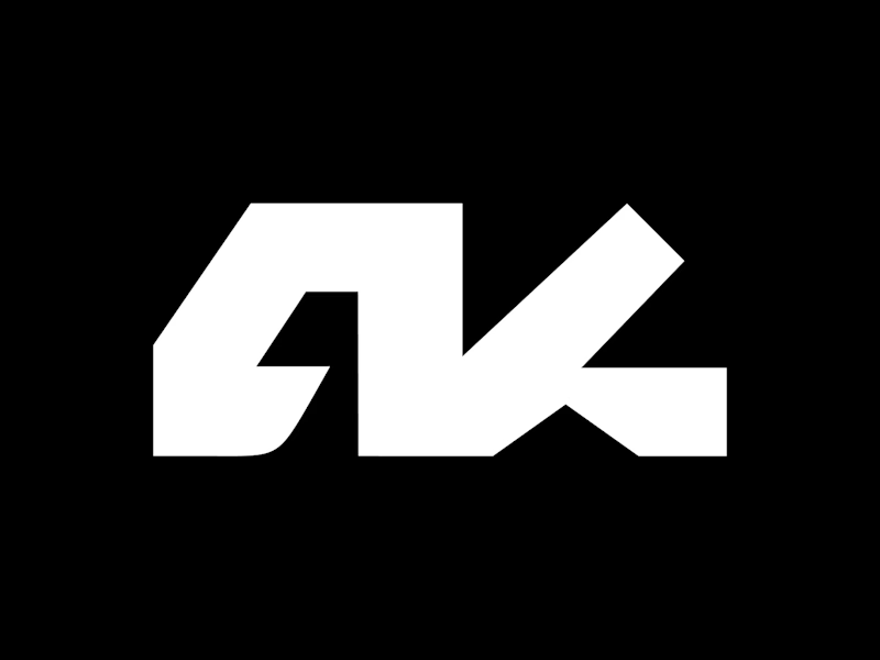
82 voted
62%
132 votes
Closed

Depends on what type of brand you are working on

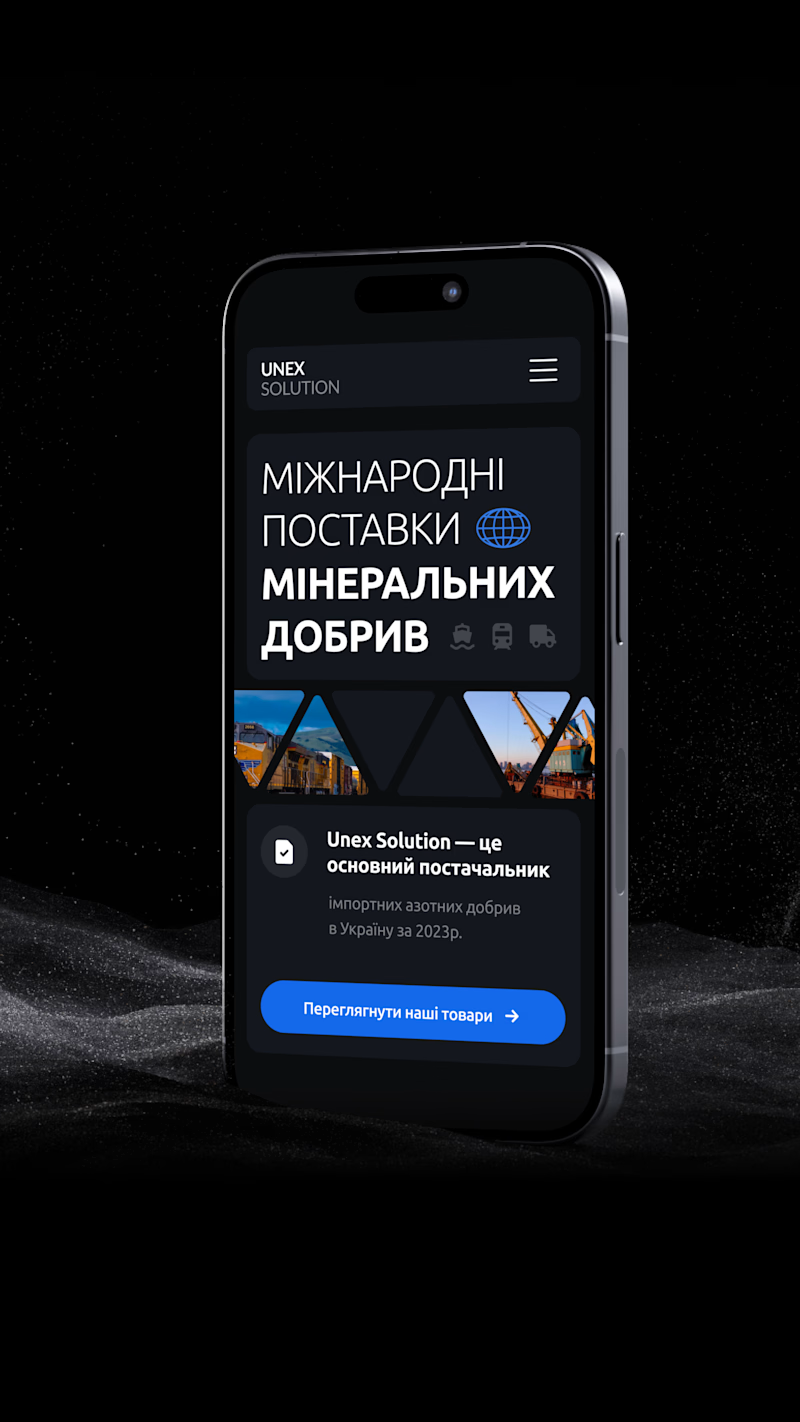
Which of the mockup options do you prefer?
10 voted
50%
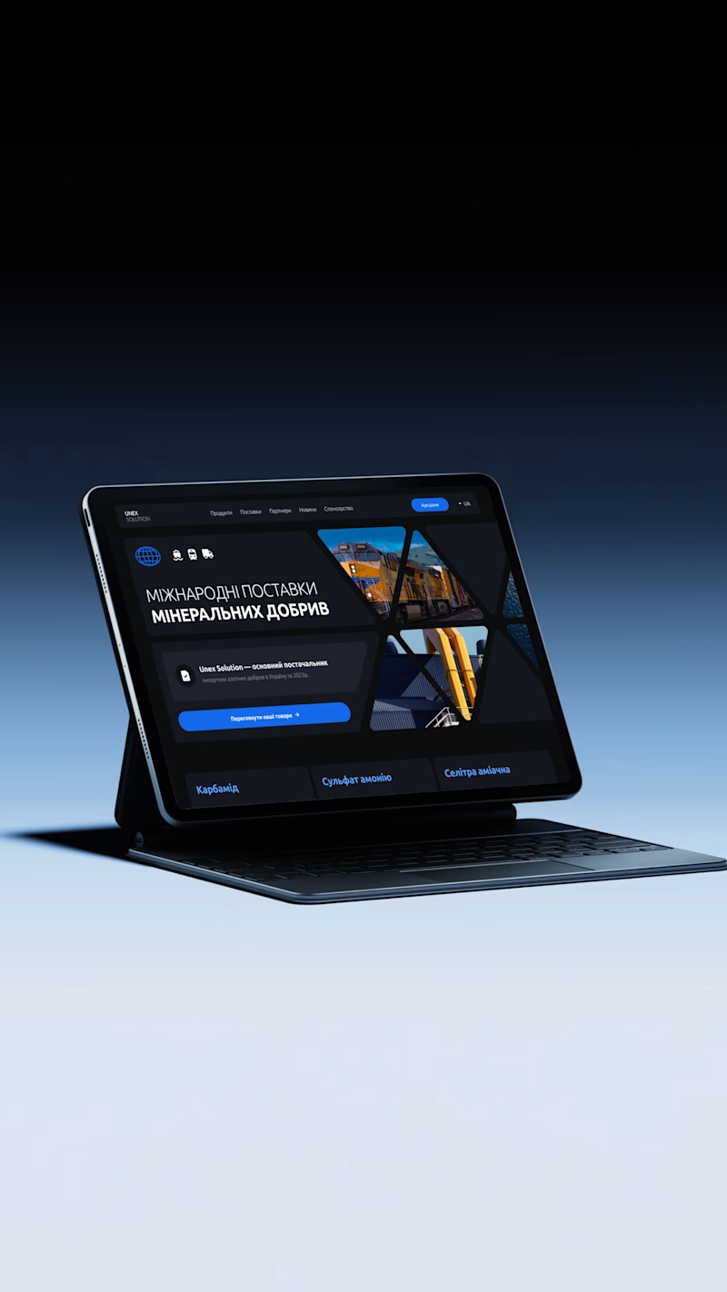
10 voted
50%
20 votes
Closed

V 1 looks more detail-oriented



Version 2 got my vote