The network for creativity
Join 1.25M professional creatives like you
Connect with clients, get discovered, and run your business 100% commission-free
Creatives on Contra have earned over $150M and we are just getting started
Back to feedPost
A website redesign is about more than making a site look better.
Recently redesigned a website for a UK-based coach that was struggling with clarity, user experience, and overall presentation.
Key challenges:
• Cluttered layout
• Unclear messaging
• Poor mobile experience
• Limited trust signals
The redesign focused on:
✔ Simplifying the user journey
✔ Strengthening brand positioning
✔ Improving mobile usability
✔ Creating clearer calls-to-action
The result was a cleaner, more professional online presence designed to support credibility, engagement, and conversions.
Good web design isn't decoration.
It's about helping visitors quickly understand who you are, what you offer, and why they should trust you.
That's where design starts creating business impact.

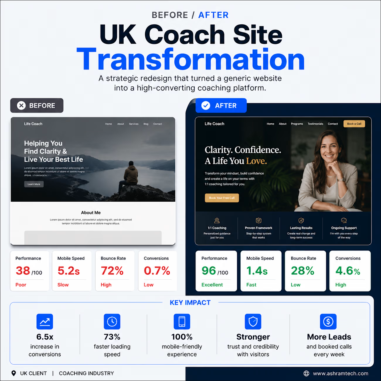


Thanks, Nagaraj! I appreciate it. For this one, focusing on those performance metrics and clear user journeys really made all the difference.
The network for creativity
Join 1.25M professional creatives like you
Connect with clients, get discovered, and run your business 100% commission-free
Creatives on Contra have earned over $150M and we are just getting started





Related posts

Just wrapped up a new redesign, and I’m really happy with how it turned out. 💻
Can’t wait to share more details and the live site soon...


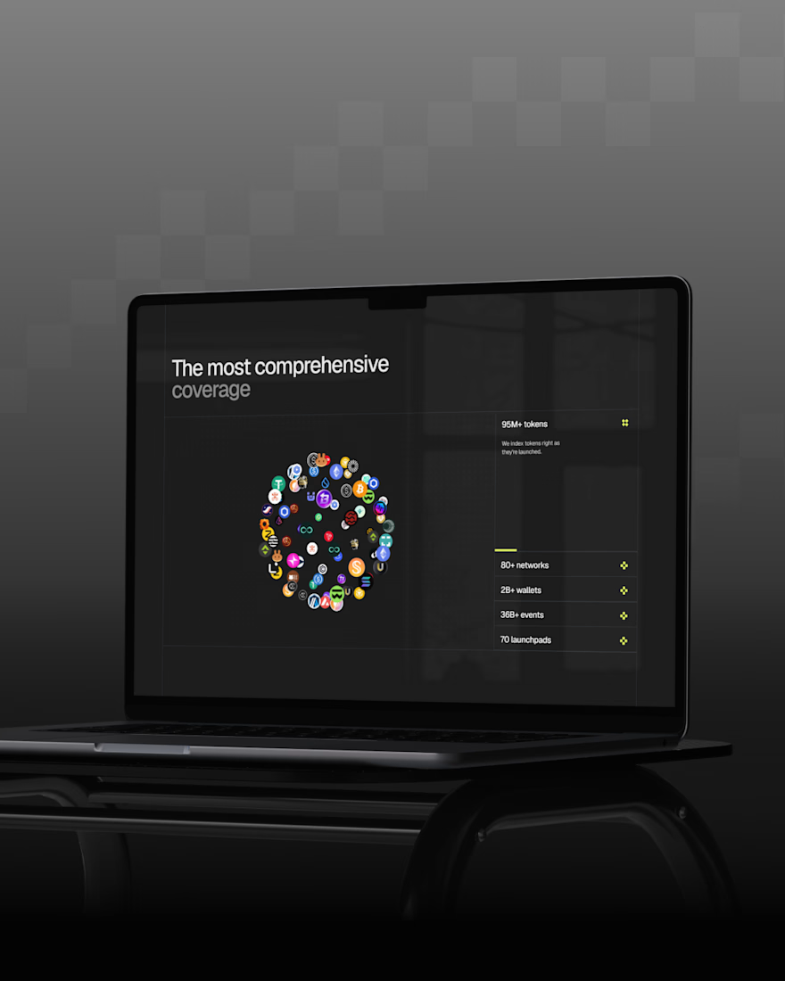

Sitting on this before the reveal instead of rushing to post it says you're already happy with how it landed, so now I'm curious what part of the redesign you're most excited for people to see once the site goes live.


Have you ever gone this bold on a 404? ⚡
Back to our latest poll: y'all voted Black (60%). We shipped Pink anyway.
Our client's call, not ours - and once you see her brand, you'll get why. Feminine-led, bold, unapologetic - Pink was never really up for debate on her end. 💗👠
See it live: https://productionportugal.com/404
404pagecreativewebsitewebdesignCreative Design Motion DesignWeb DesignAdobe After EffectsFigmaWebflow


You nailed the overall mood here. The details just reinforce it nicely.


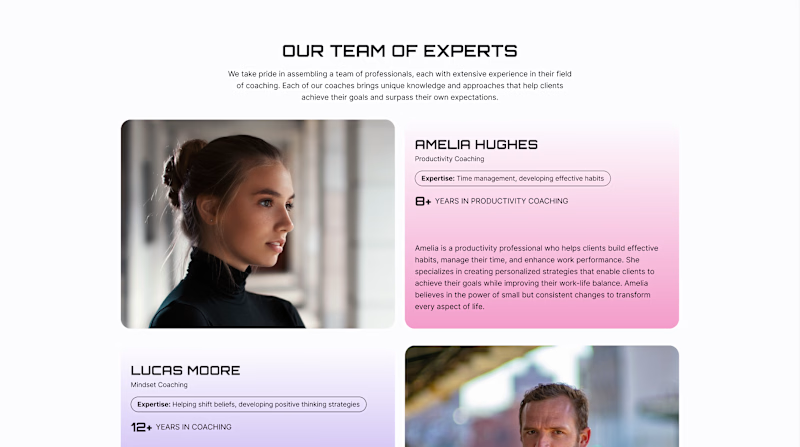
Team Sections: Professional Only or Professional + Personal?
A team section can build trust in different ways.
Version A - Professional. Focuses on the coaches’ professional experience - their expertise, years of practice, and approach to working with clients.
Version B - Professional + Personal. Keeps this information but adds a Weekend Mode with personal photos, interests, and small stories about life outside work.
For a coaching website, both sides matter: expertise shows competence, while personality helps visitors feel a human connection.
Which version would make you more likely to choose a coach?
22 voted
61%
14 voted
39%
36 votes
Closed
Upgoating version B