The network for creativity
Join 1.25M professional creatives like you
Connect with clients, get discovered, and run your business 100% commission-free
Creatives on Contra have earned over $150M and we are just getting started
Back to feedPost

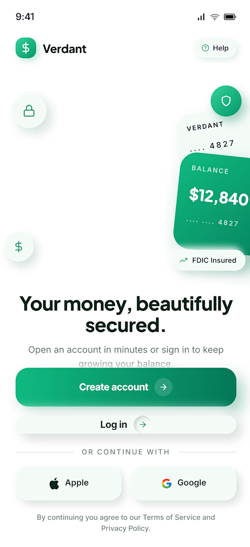
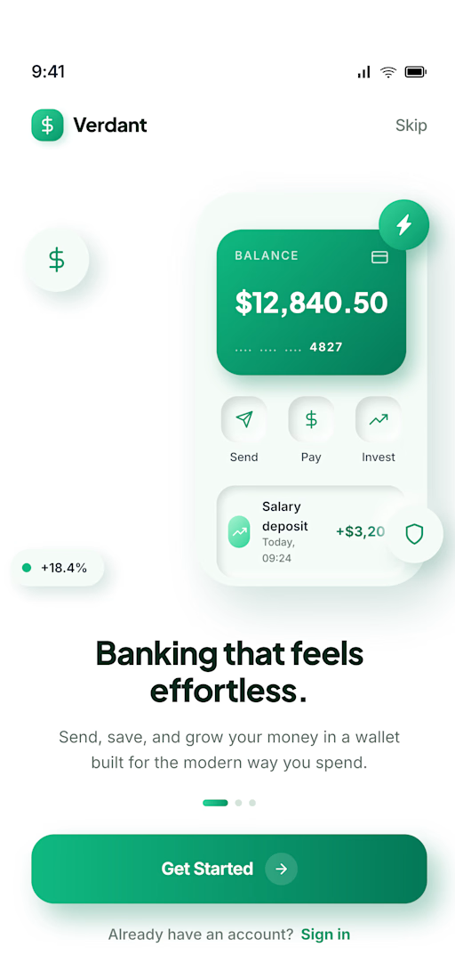
onboarding signup screen
will be sharing more of this fintech design update
stay tuned

Love this
The network for creativity
Join 1.25M professional creatives like you
Connect with clients, get discovered, and run your business 100% commission-free
Creatives on Contra have earned over $150M and we are just getting started











Related posts

recent website revamp for Founderled.
Founderled is the the trusted GTM partner behind 25+ founders who've raised over $750M from Tier-1 VCs like YC, Sequoia, a16z.
cooking as usual @ clarity design studio
https://cal.com/clarity-design-studio/discovery-call


Great work!
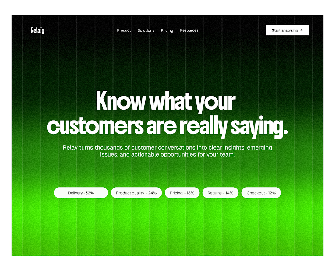
Another SaaS landing page.
This time, Relaiy.

Ohh i loved the heading!! knowing customer is the biggest win!


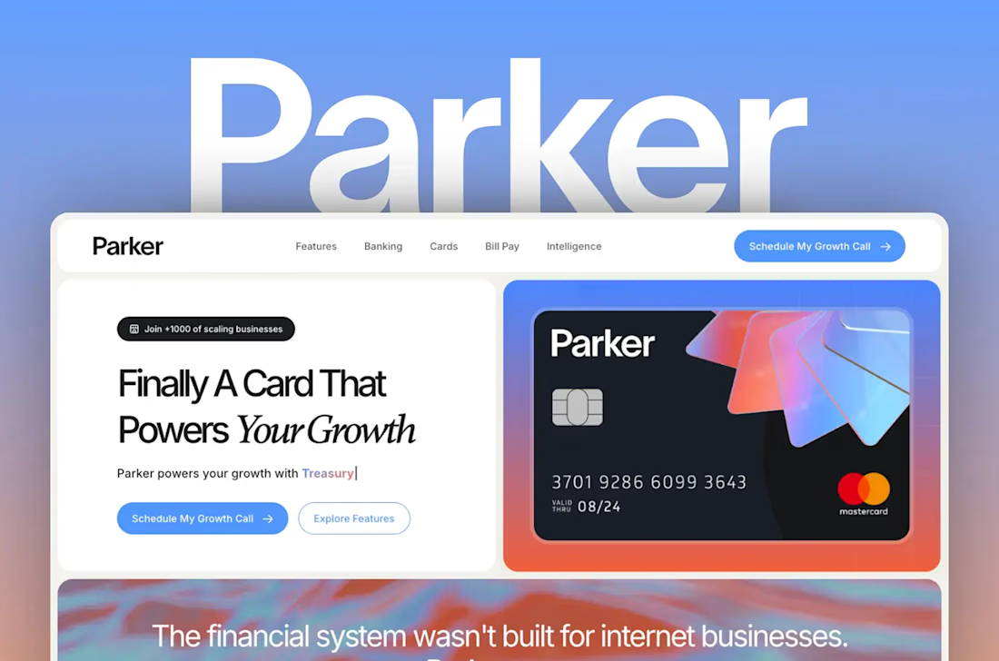
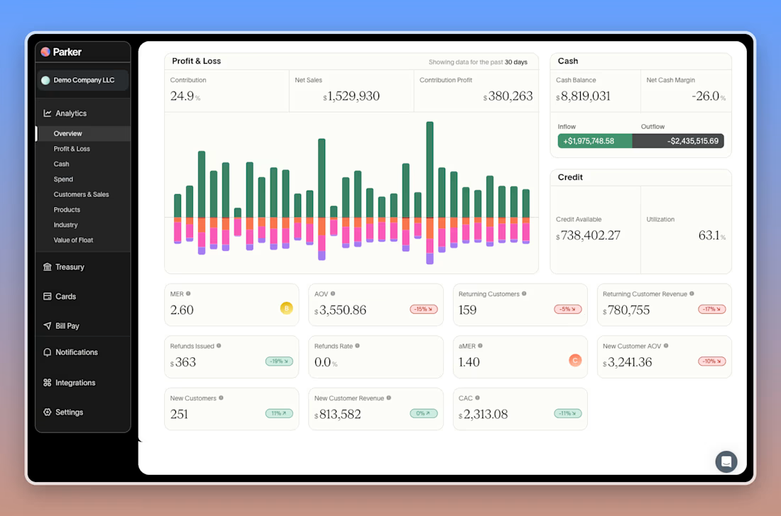
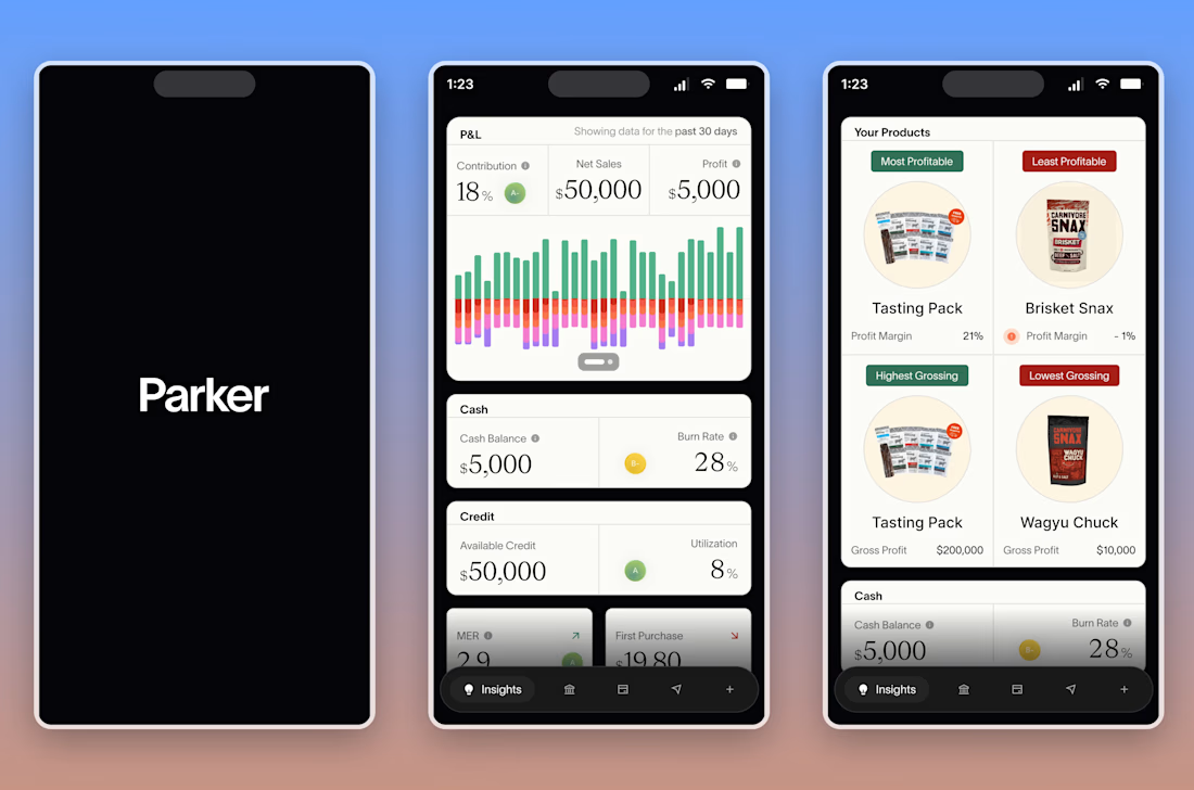
Parker: brand, web and mobile app design for a B2B fintech startup in the credit space (New York). I led the full visual identity and product design, from brand strategy to the website and the mobile app experience, working directly with the founder and leadership team. Used Figma alongside AI tools like Lovable, Claude and GPT to move faster without cutting corners, redefining Parker's brand identity and design language to match the ambition of the product.