The network for creativity
Join 1.25M professional creatives like you
Connect with clients, get discovered, and run your business 100% commission-free
Creatives on Contra have earned over $150M and we are just getting started
Back to feedPost

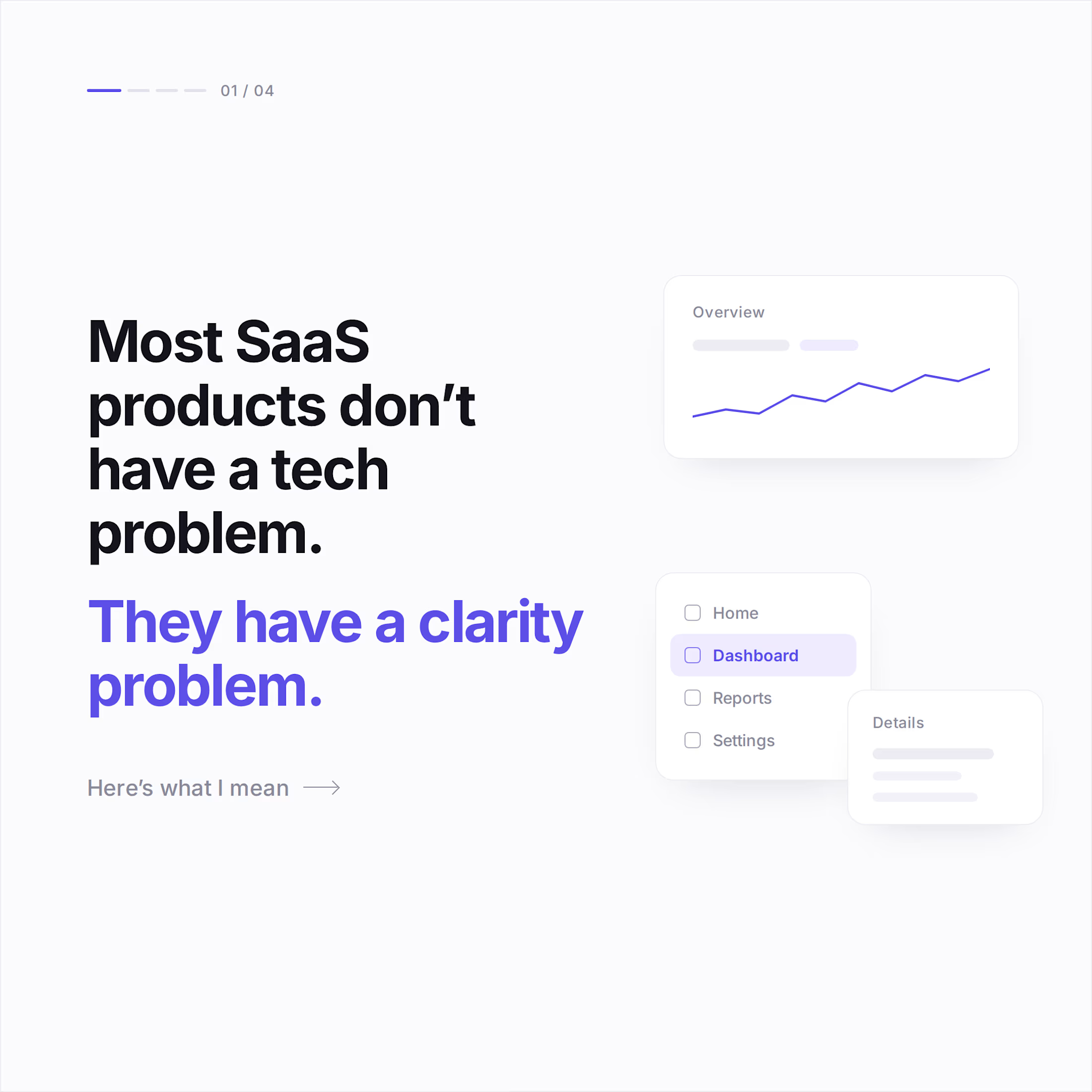
Most SaaS products don’t need more features.
They need more focus.
Most SaaS ideas start with a long list:
→ AI recommendations
→ Advanced analytics
→ Team managemen
→ Integrations
→ Real-time notifications
→ Custom roles
→ And 20 more…
Everything sounds important.
But if everything is important, nothing is.
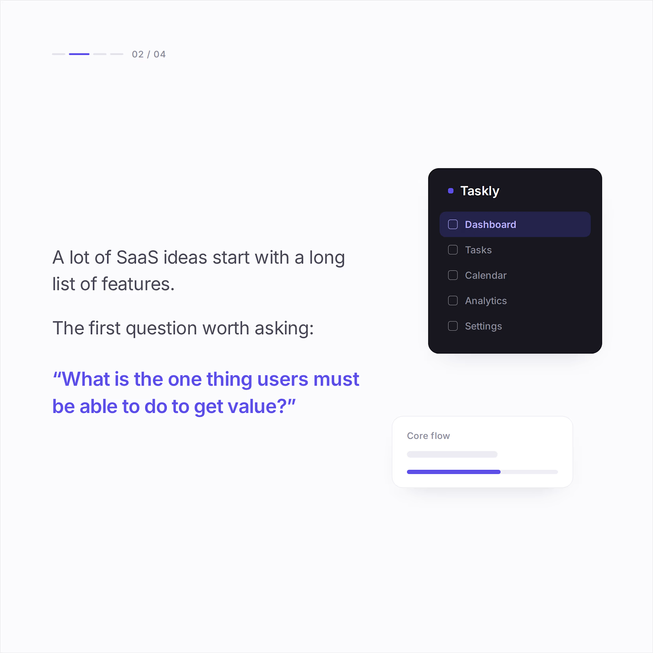
Before building anything, I like to ask:
What is the one thing the user needs to do to get value?
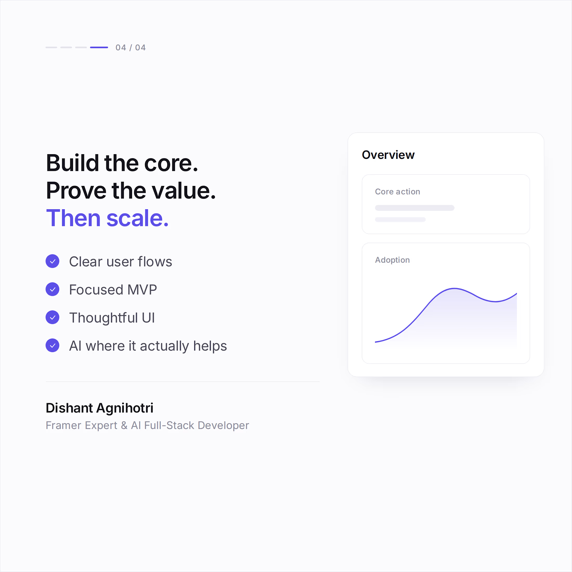
Find that.
Build it really well.
Then expand.
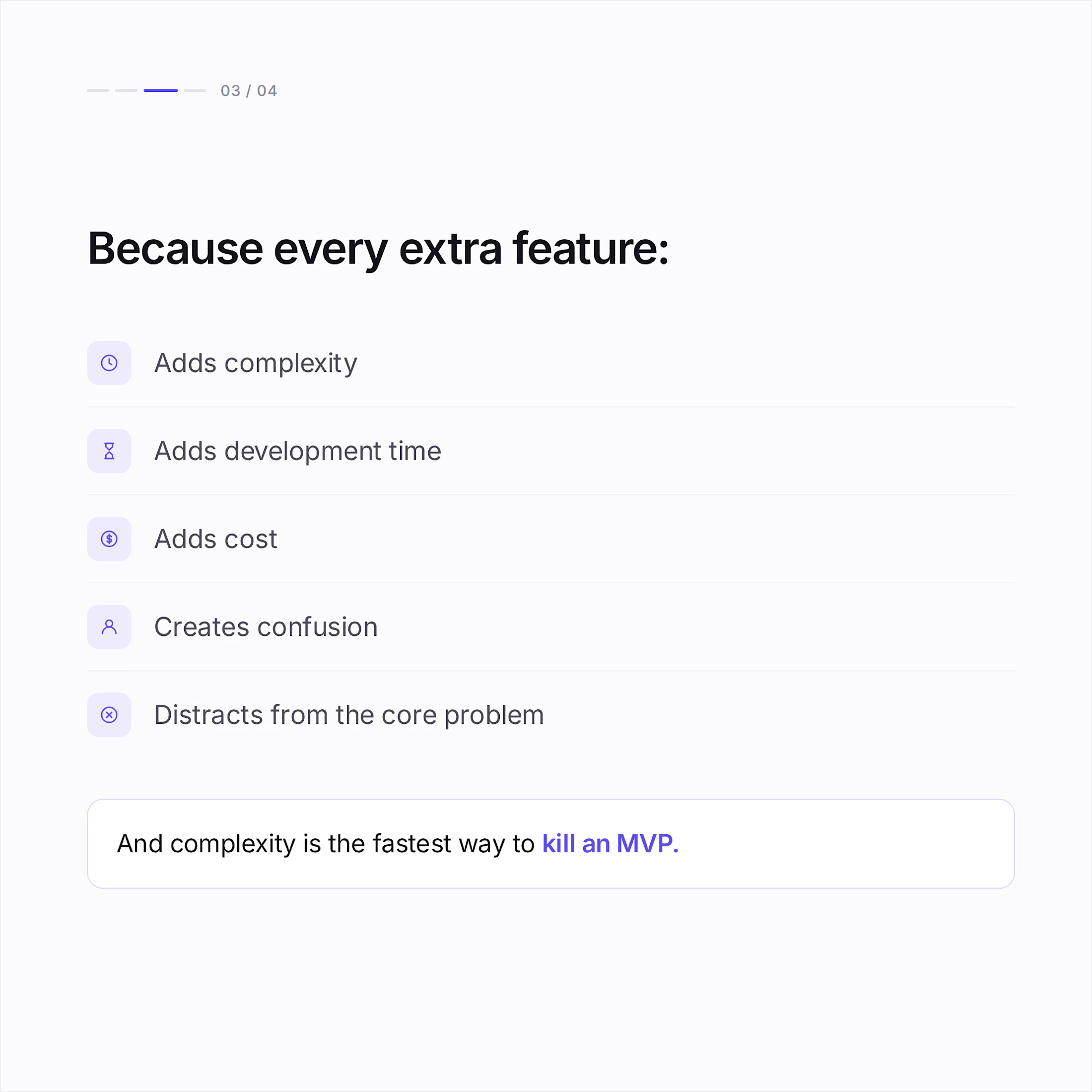
The best MVP isn't the one with the most features.
It's the one that proves the core idea.
What would you keep if you had to cut your MVP down to one feature?
#SaaS #MVP #ProductDevelopment #AI #Framer #Startup
The network for creativity
Join 1.25M professional creatives like you
Connect with clients, get discovered, and run your business 100% commission-free
Creatives on Contra have earned over $150M and we are just getting started











Related posts

Working on a SaaS dashboard concept in Figma. 🚀
The goal is to make complex business data easier to scan and understand through clear visual hierarchy, structured analytics cards, and organized navigation.
Still refining the details and exploring ways to make the experience more intuitive.
What matters more to you in a dashboard: clean visuals or faster access to insightful?
#Ui designs #Ux design #Saas design #Figma
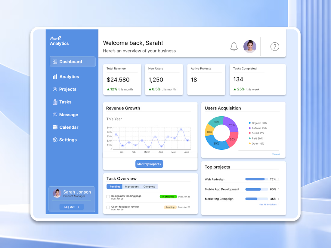

For a dashboard like this, I’d test whether the key action stays visible when the cards are filled with real, uneven data—not just placeholder numbers. What kind of business data are you designing the first view around?

Most SaaS and agency websites share the exact same issue: they look great in Figma, but feel sluggish, bloated, and fail to convert once built.
A pretty site doesn't mean much if it takes 4 seconds to load or fails to guide a visitor straight to a booked demo or call.
Recently, I’ve been helping high-growth SaaS teams and digital marketing agencies move away from slow legacy setups and onto clean, high-performance Framer builds.
Here’s what we focus on:
• Sub-second load times and clean SEO structure
• Custom interactions & micro-animations that enhance UX without dropping frames
• Conversion-focused layouts designed to turn cold visitors into booked pipeline
If your current site feels sluggish or doesn't reflect the true quality of your product, feel free to reach out or drop a message!

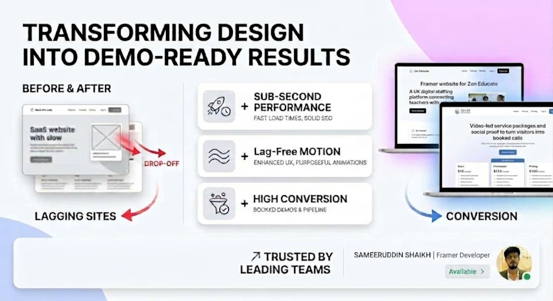

Look great in Figma but feel sluggish is painfully accurate. The before and after graphic showing the drop-off from lagging sites to conversion-focused builds tells the whole story in one glance.

⚖️ A single view of how work is spread across the whole team, so balancing coverage and spotting gaps is simple.


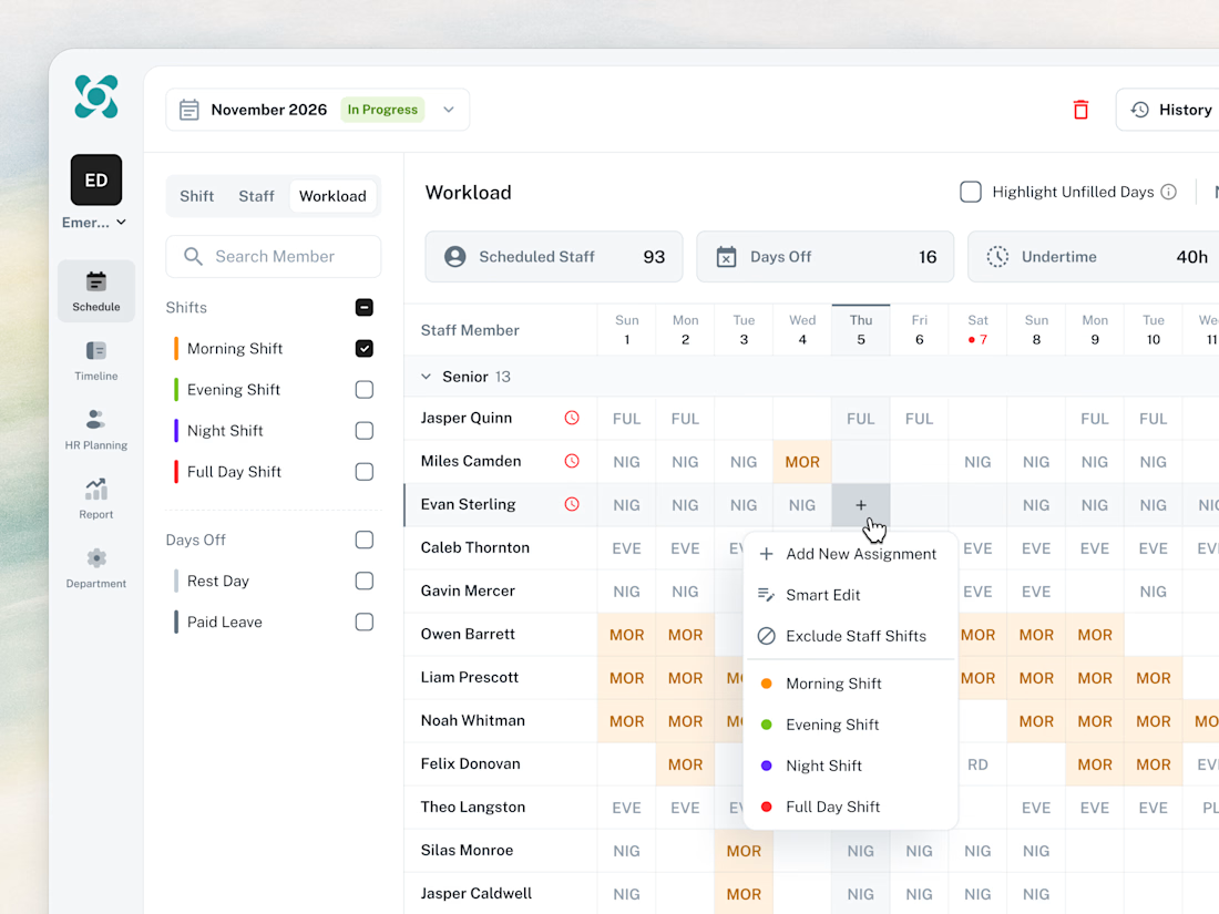

Love this! Personally, I find it tricky to design actions for a specific date on a calendar, so it requires a lot of thought, but you’ve done an awesome job.
I’m curious, does this design also have a mobile version? I’d love to see how you approach displaying notes for a specific...