The network for creativity
Join 1.25M professional creatives like you
Connect with clients, get discovered, and run your business 100% commission-free
Creatives on Contra have earned over $150M and we are just getting started
Back to feedPost

Modern and minimal Luxury Logo for Fashion & Clothing brand
The network for creativity
Join 1.25M professional creatives like you
Connect with clients, get discovered, and run your business 100% commission-free
Creatives on Contra have earned over $150M and we are just getting started






Related posts

Which one would you rather see on a muddy Sunday morning?
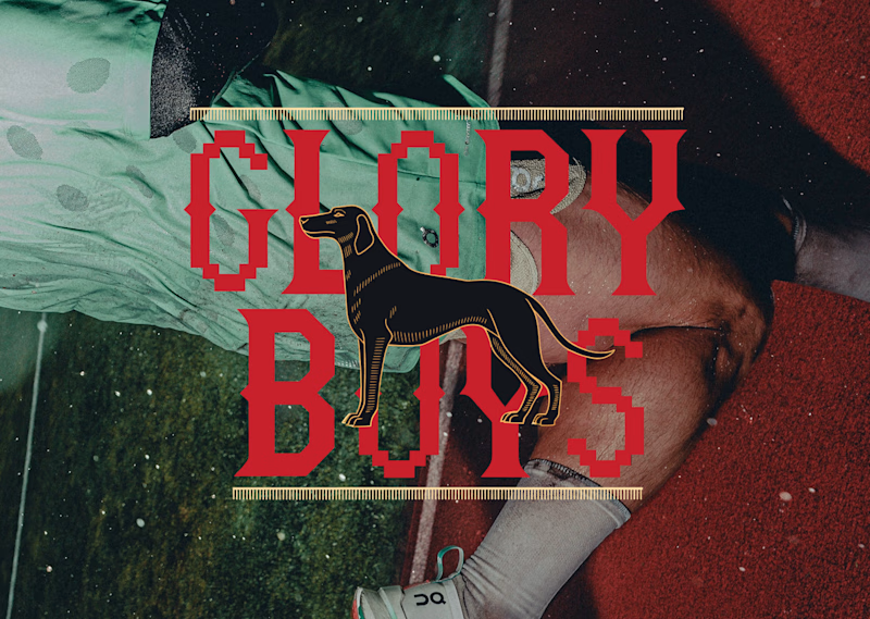
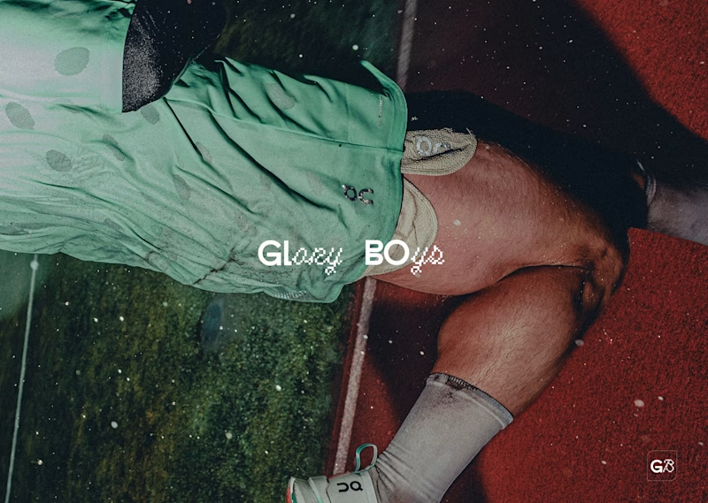
Two logos for the same five-a-side team. Same photo, same sweaty energy, very different personalities.
Option A: red slab serif with pixel notches, a black hound in the middle, gold ticker rules top and bottom. It looks like a pub sign that got into a video game. Loud, heritage, a bit smug.
Option B: tiny white wordmark, half clean sans, half pixel script, with a little G8 stamp in the corner. It looks like it already has a sponsor and a good agent. Quiet, modern, a bit cool.
One screams “we have a trophy cabinet.” The other whispers “we are not telling you about the trophy cabinet.”
Reply A or B. Be honest, nobody’s feelings are on the line except mine.
17 voted
57%
13 voted
43%
30 votes
Closed



The sharp V pops against that vivid gradient.

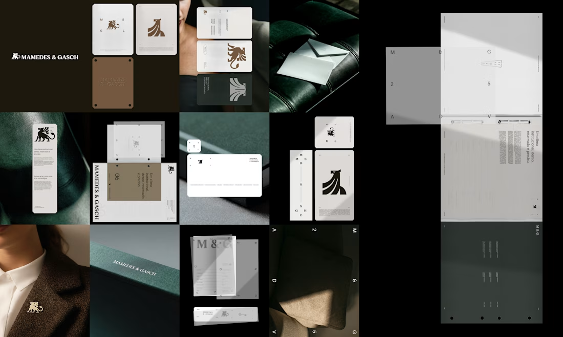
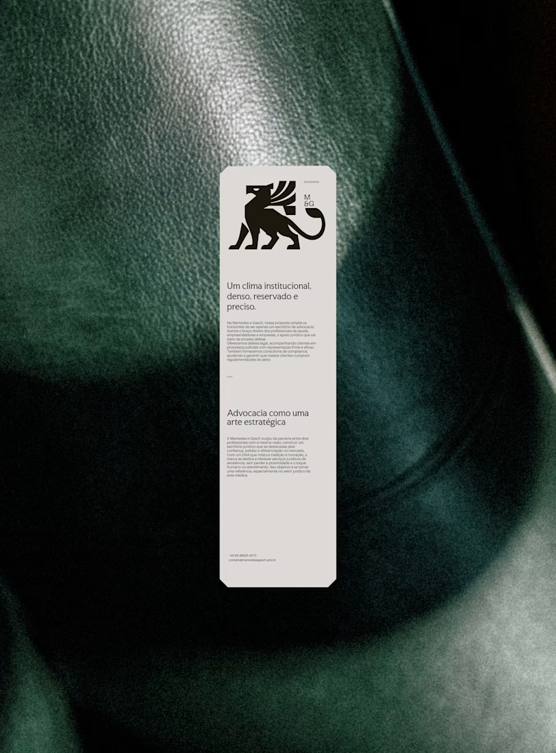
A griffin, not a gavel.
For Mamedes & Gasch, a law firm focused on litigation and legal consulting, the mark is a solid griffin with sharp cuts, set with high-contrast serif type and a deep green-black and bronze palette.
Which legal cliché would you retire first?

The gavel — the griffin already says strength better.