The network for creativity
Join 1.25M professional creatives like you
Connect with clients, get discovered, and run your business 100% commission-free
Creatives on Contra have earned over $150M and we are just getting started
Back to feedPost
A web3 security platform asked us to refresh their identity ahead of a Series B raise. The first asset they wanted us to look at was the logo.
We looked at the typography first.
Here is the actual decision tree we used. Three options on the table.
Option 1: the safe stack. A modern neo-grotesk for headlines, the same neo-grotesk for body, set at the rhythm every B2B landing page uses. Inter, Söhne, GT America, pick your flavor. Defensible, professional, invisible. Every infrastructure company in their category was already on this stack.
Option 2: the editorial pairing. A display serif for headlines, a humanist sans for body. Read like a publication, not a tool. Strong personality. Risk: too soft for a security category that buyers are reading as "trust under attack." A serif on a security homepage signals "essay" when the buyer needs "shield."
Option 3: the unmistakable pairing. A less common technical sans, slightly mechanical, with a monospace for code, captions, and proof points. Read like a security operations console, not a marketing site. Specific to the category, hard to mistake for a competitor's homepage.
We picked option 3.
The logic was not aesthetic. It was positional.
In a category where every direct competitor uses option 1, option 3 is the cheapest move that makes the homepage stop looking like a category and start looking like a company. The buyer who lands on the page stops scanning and starts reading. That is one second of attention you cannot buy back later with a paid ad or a louder logo.
Typography is one decision that pays out on every surface a buyer will ever touch. The pitch deck, the documentation, the investor email, the conference booth, the leave-behind, the announcement post.
If your shortlist of typefaces is the same shortlist your three closest competitors are using, you are not making a typography decision. You are inheriting one.
The logo can wait. The typeface cannot.
This is a masterclass in using Structure as a competitive advantage!
As a Social Media Manager, I’ve seen how choosing an "unmistakable pairing" over a "safe stack" is the fastest way to establish Visual Authority in a crowded market.
The logic behind Option 3 is brilliant...
The network for creativity
Join 1.25M professional creatives like you
Connect with clients, get discovered, and run your business 100% commission-free
Creatives on Contra have earned over $150M and we are just getting started
Related posts
Built a financial SaaS brand that looks like it was designed by a meteorologist who never lost a board meeting.
No dashboards. No icon libraries. No "clean and modern."
Just pressure.
Incredible
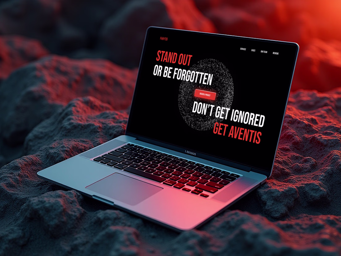
I created a landing page for Aventis marketing agency with modern typography and subtle animations. The goal was to highlight the brand’s dynamic character and help it stand out from the competition. What do you think of this style?
Well done. Thanks for sharing your process and results
Vote below and tell us what influenced your decision trust, emotion, prestige, or approachability. 👇
I've been exploring two logo reveal directions for Maque & Associates, both built around the same identity and tagline:
🌑 Concept 01 (Dark Mode)
A cinematic, premium reveal on a dark backdrop with chrome-like 3D reflections on the mark. Feels high-end, authoritative, and emotionally grounded, like a firm that carries weight.
☀️ Concept 02 (Light Mode)
A clean, airy reveal on a light background with flat, modern form. Feels approachable, fresh, and professional, like a firm that opens doors.
7 voted
32%
15 voted
68%
22 votes
Closed
SUrely going for the darker version, it came out really well 🔥 Great balance of creativity and execution. I’m usually into projects like this, so I had to take a closer look at what you’re building.
Trending
Claude
Claude has entered the design space. How are you using Claude Design?
Contra University
Learn from expert creatives how to earn more using next-gen AI tools.
MagicPath
The canvas is infinite, and exploration is becoming the workflow. How are you using MagicPath?
creativeaiflow
Creative AI workflows are evolving. What tools do you use, and what are their strengths and weaknesses?
freelancerlife
Freelancer life is wins, pivots, and everything in between. What’s yours right now?