The network for creativity
Join 1.25M professional creatives like you
Connect with clients, get discovered, and run your business 100% commission-free
Creatives on Contra have earned over $150M and we are just getting started
Back to feedPost


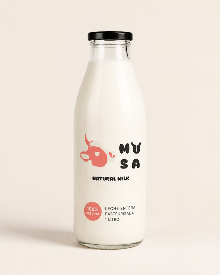
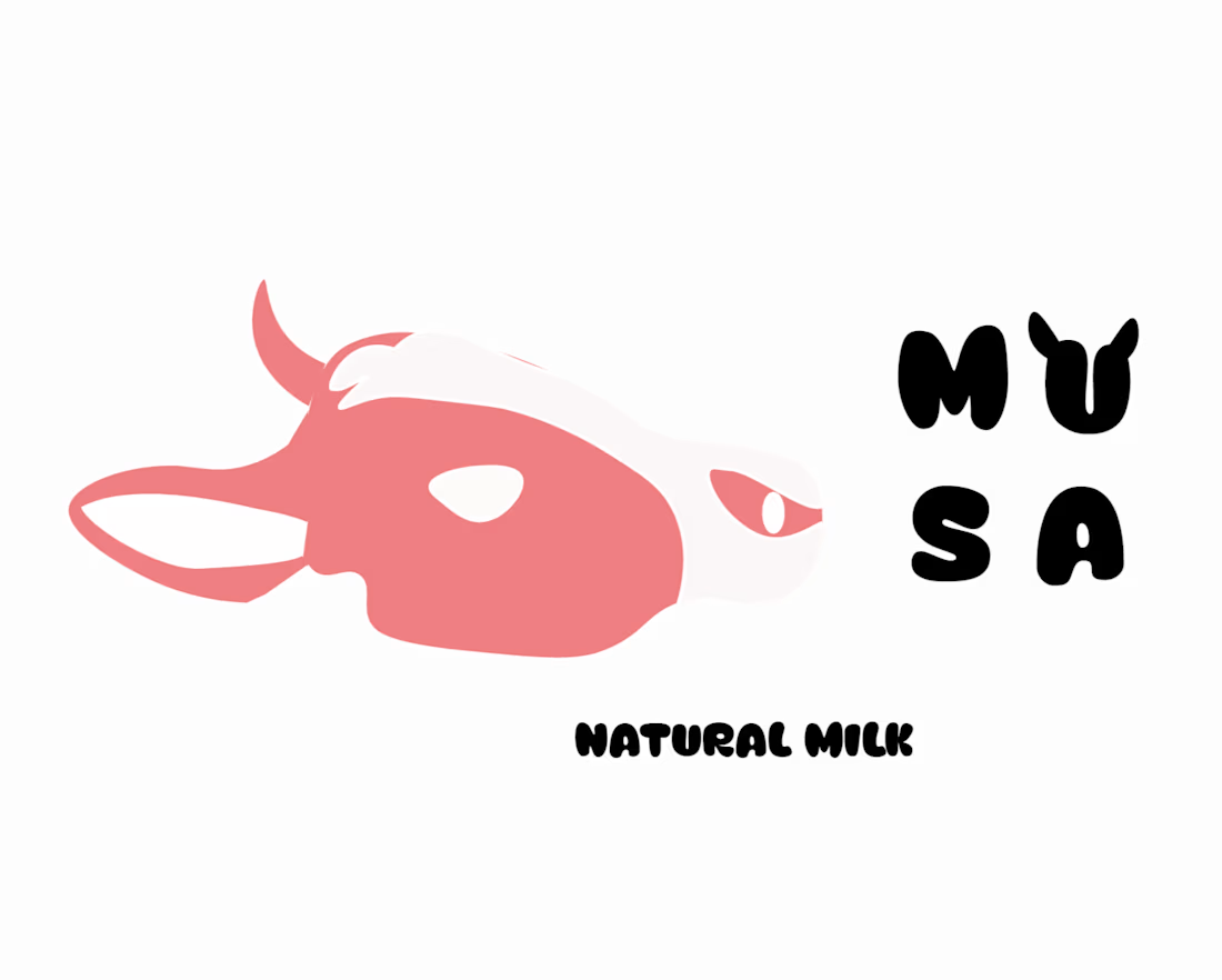
Designing the complete visual identity for MUSA, a natural milk brand—this was the project where I really experimented with reducing a complex figure to its simplest form.
Starting with a black-and-white sketch of a cow, I simplified it until it was instantly recognizable as a “cow” even at sticker size—no outline, no detail, just a coral-colored spot and a white eye.
The typography went through more rejections than the icon. I tried three rounded typefaces that technically “worked” but felt too corporate or too childish—the brand needed warmth without losing its presence on the shelf.
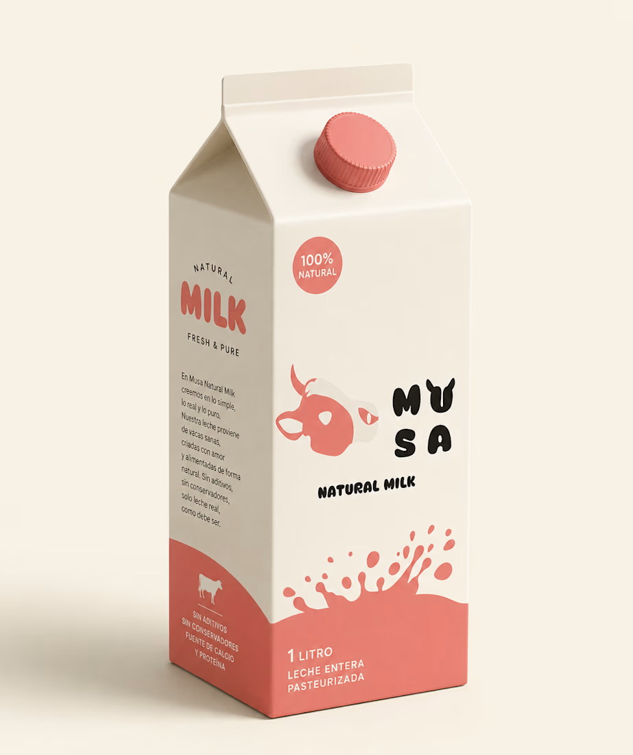
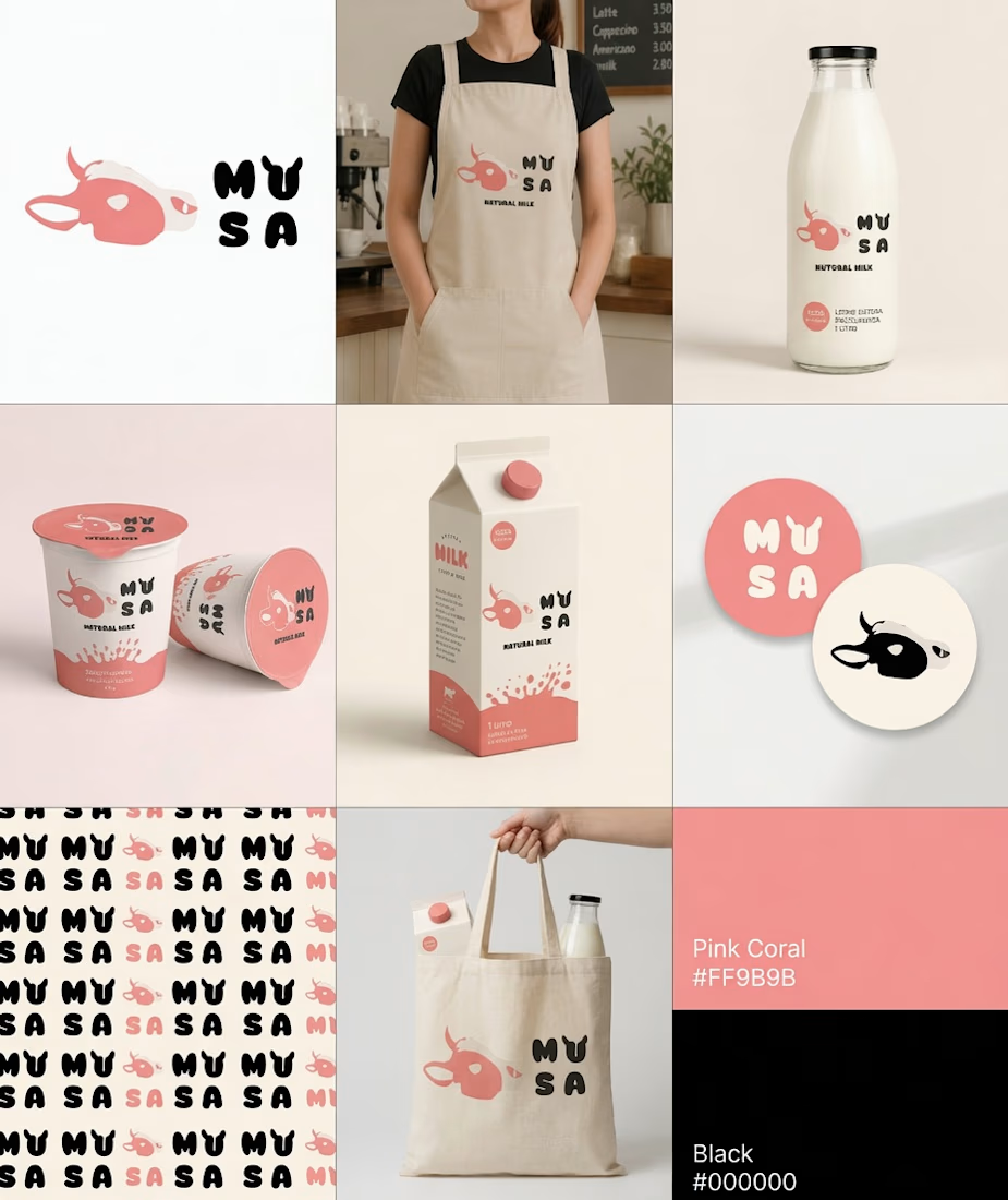
The most important decision wasn’t the shape or the typography: it was choosing Pink Coral instead of the green/brown that every dairy brand defaults to. That’s not an aesthetic preference; it’s a positioning strategy—MUSA needed to look nothing like a “farm” to stand out on a shelf full of farms.
Check out the complete system—bottle, packaging, uniform, sticker pack, and pattern—in the case study below. 👇
#branddesign #packaging #contra



CLean work🤍

Really impressive work. Keep creating amazing designs!🔥
The network for creativity
Join 1.25M professional creatives like you
Connect with clients, get discovered, and run your business 100% commission-free
Creatives on Contra have earned over $150M and we are just getting started












Trending

Claude
Claude has entered the design space. How are you using it?

Contra University
Learn from expert creatives how to earn more using next-gen AI tools.
Brand Design
The best brand designers are on Contra. Scroll to see what's trending in brand design. What are you building?
creativeaiflow
Creative AI workflows are evolving. What tools do you use, and what are their strengths and weaknesses?
freelancerlife
Freelancer life is wins, pivots, and everything in between. What’s yours right now?
Related posts



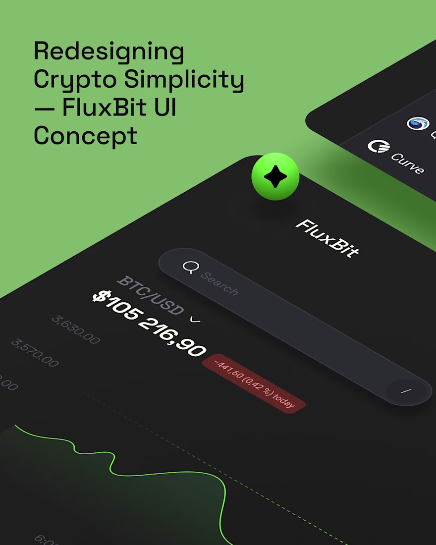
Revisiting one of our earlier UI concepts.
FluxBit was our take on how a crypto trading platform could feel if simplicity came before complexity.
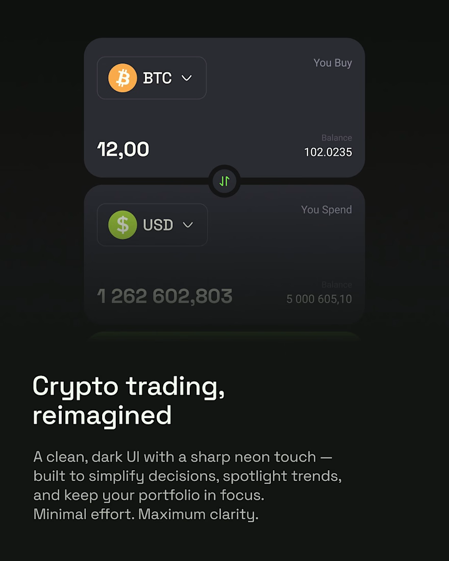
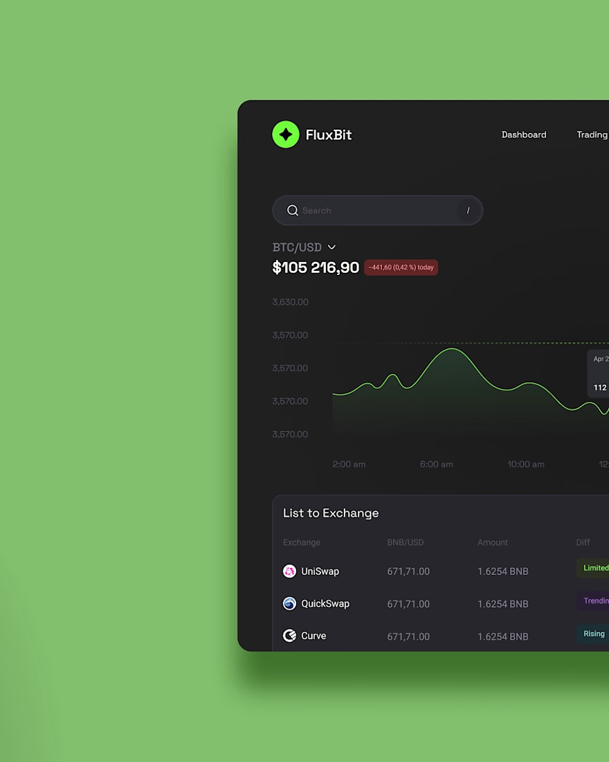
Instead of overwhelming users with endless charts and distractions, we explored a cleaner experience with a focused dark interface, subtle neon accents, and layouts that make market data easier to understand at a glance.
Every screen was designed to reduce visual noise while keeping the tools traders actually need within easy reach, creating an experience that feels modern, confident, and intuitive.
It's always fun looking back at concepts like this and seeing how timeless a clarity-first approach to product design can be.


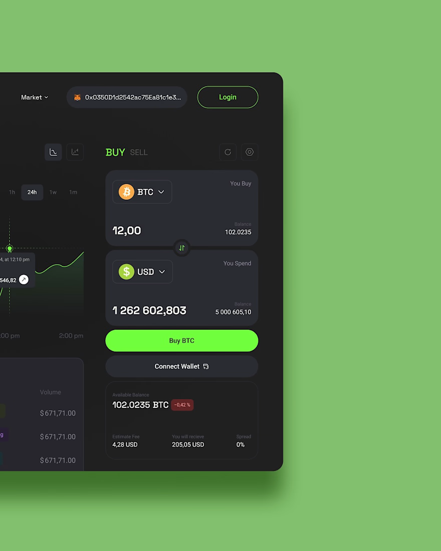

love the UI

Project,
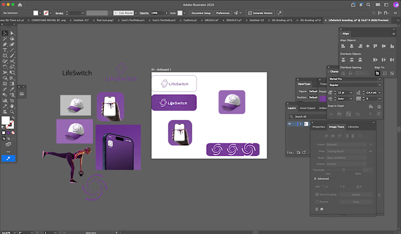
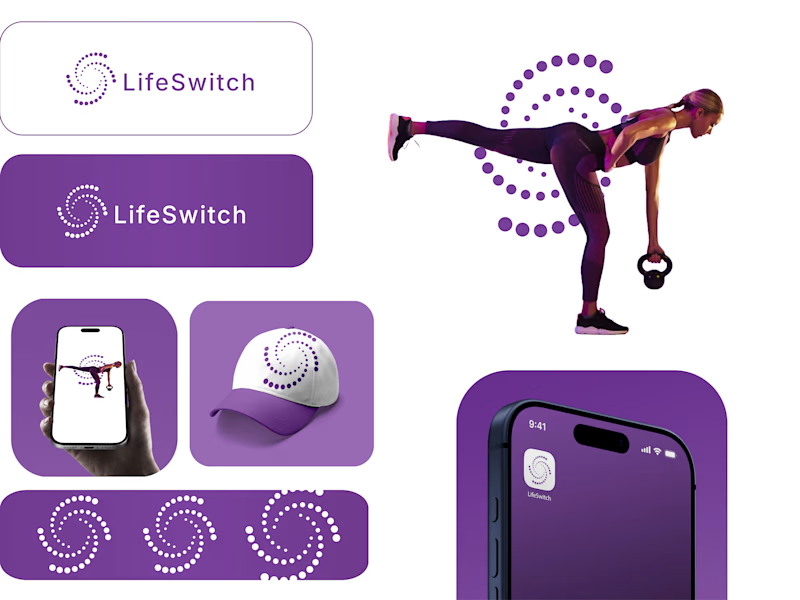
Target audience is people interested in losing weight, lifting weights, tracking data and seeing real results.
0 voted
1%
0 voted
1%
0 votes
Closed

This looks clean and well thought out. How long did it take you to bring everything together?