The network for creativity
Join 1.25M professional creatives like you
Connect with clients, get discovered, and run your business 100% commission-free
Creatives on Contra have earned over $150M and we are just getting started
Back to feedPost

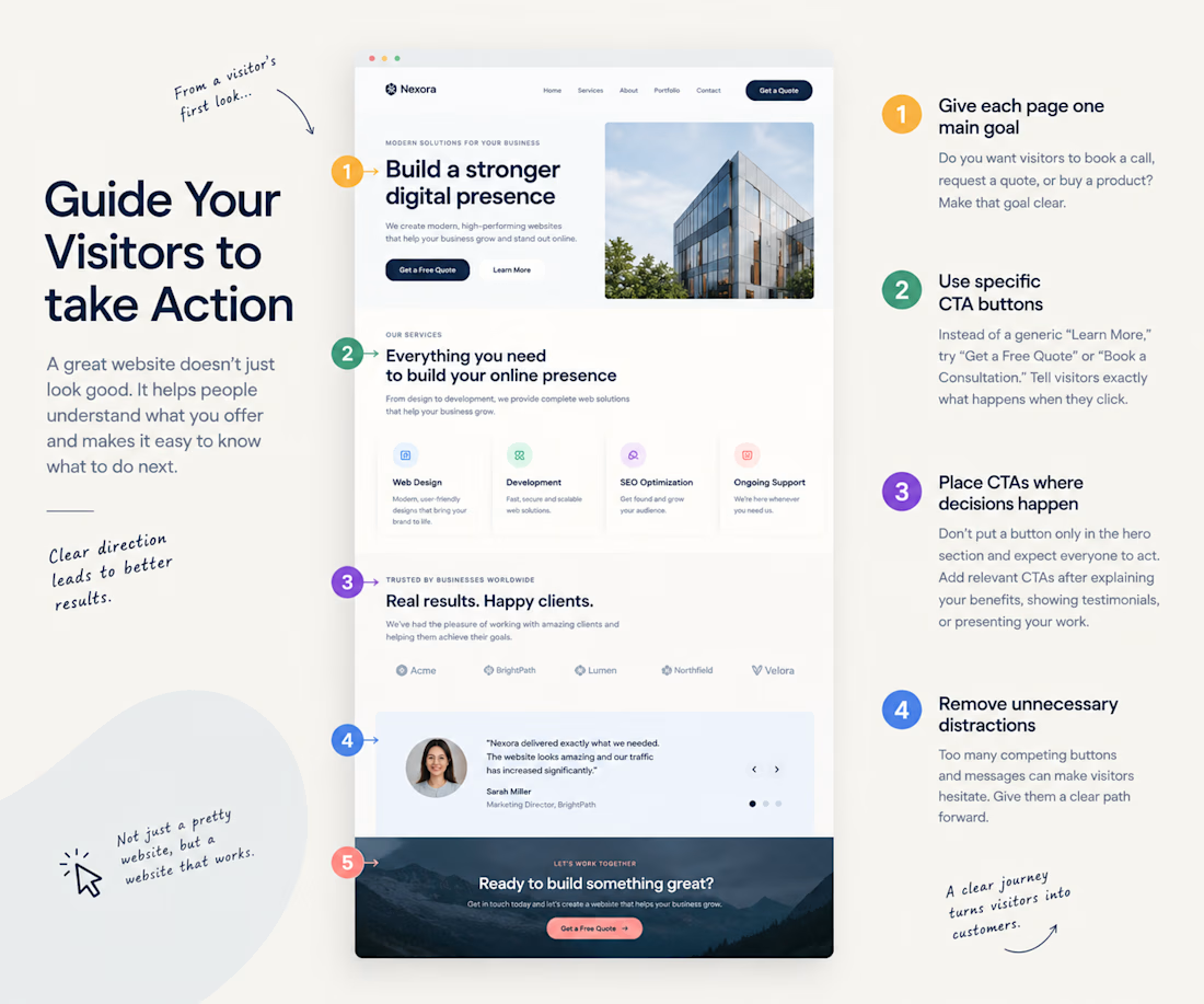
Your website looks great. But do visitors know what to do next?
Imagine someone lands on your homepage.
They like the design, scroll through a few sections, and then leave.
Not because your website looks bad, but because they aren't sure what to do next.
Here are 4 simple ways to fix that:
1. Give each page one main goal
Do you want visitors to book a call, request a quote, or buy a product? Make that goal clear.
2. Use specific CTA buttons
Instead of a generic “Learn More,” try “Get a Free Quote” or “Book a Consultation.”
Tell visitors exactly what happens when they click.
3. Place CTAs where decisions happen
Don't put a button only in the hero section and expect everyone to act. Add relevant CTAs after explaining your benefits, showing testimonials, or presenting your work.
4. Remove unnecessary distractions
Too many competing buttons and messages can make visitors hesitate. Give them a clear path forward.
A good website doesn't force people to guess their next step. It guides them naturally from understanding your offer to taking action.
A question for designers and developers: When reviewing a homepage, do you check the visual design first or the user journey?


The network for creativity
Join 1.25M professional creatives like you
Connect with clients, get discovered, and run your business 100% commission-free
Creatives on Contra have earned over $150M and we are just getting started



Related posts

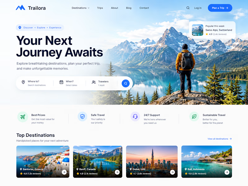
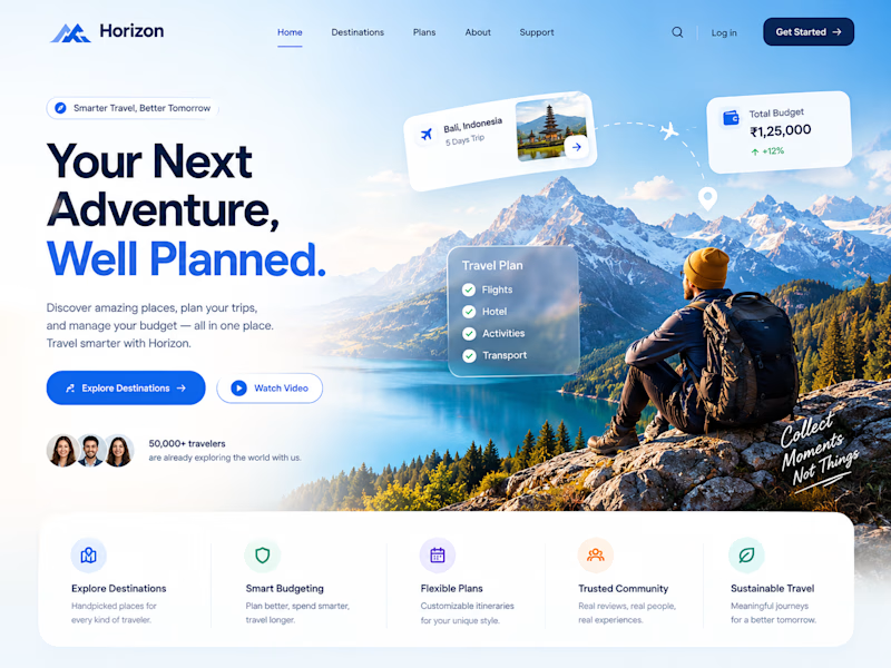
Two designs. One idea. Two different ways to experience travel. ✈️
What if planning your next trip felt less like managing a checklist and more like discovering a story waiting to unfold?
Trailora makes discovery feel effortless, while Horizon turns travel planning into a smarter, more structured experience.
Same industry. Different design directions.
Which direction would you choose: the freedom to explore or the confidence of a well-planned journey?
25 voted
71%
10 voted
29%
35 votes
Closed

Both are lovely! The second one feels more like an adventure, which fits travel well.


Spline 3D plus GSAP inside Webflow without the site feeling heavy is no small thing. The product interactions in this reel are really clean, Toqir.


These stickers are clickable on kaisle13.framer.website they link to each individual artists profile page and each sticker custom designed for that artist.



So cool!!