The network for creativity
Join 1.25M professional creatives like you
Connect with clients, get discovered, and run your business 100% commission-free
Creatives on Contra have earned over $150M and we are just getting started
Back to feedPost
(Studio Flat-Lay Concept) Web Design
Visual Direction: Bridging Direct-to-Consumer Reality and Digital Agency
Concept Overview:
This concept is built on a direct, high-contrast flat-lay studio aesthetic. The design philosophy was to instantly merge the result (physical products) with the catalyst (the digital agentic engine). By displaying iconic e-commerce goods—like a vibrant orange puffer jacket and a bold pink sneaker—side-by-side with minimal UI, the composition tells a story: your words create physical reality.
Key Design Elements:
High-Tactility Flat-Lay: Curated photography of physical retail goods (luxury fragrance, high-fashion apparel, modern sneakers) positioned on a crisp white textured canvas.
Minimalist UI: The prompt bar is stripped down to its essential form with a clean black control button, highlighting the ease of "one click" approval.
Augmented Widgets: Floating frosted panels displaying performance graphs and a natural user story/social post concept are placed around the products, reinforcing the "engine" that handles your ads and growth, grounding the platform's power in tangible outputs.
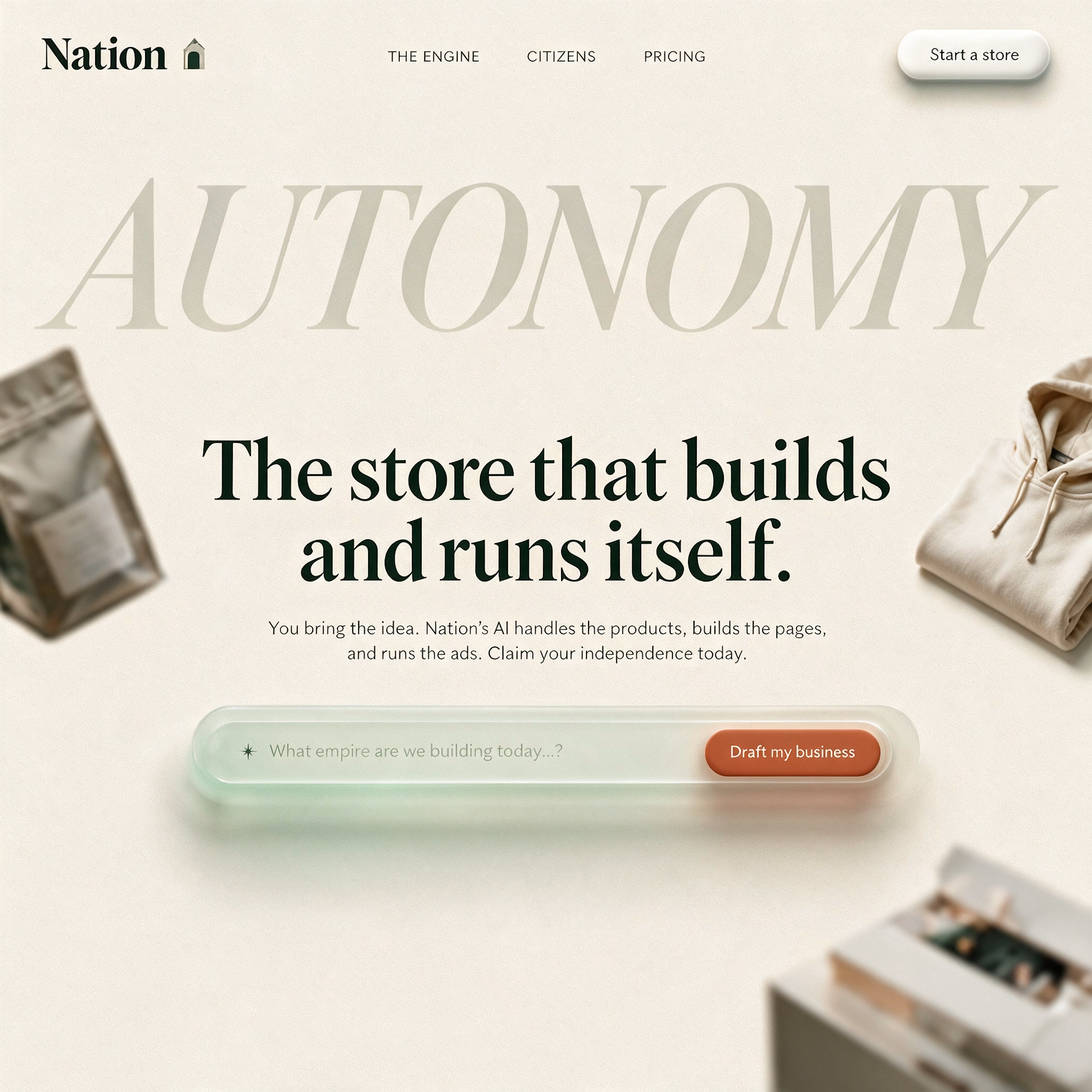
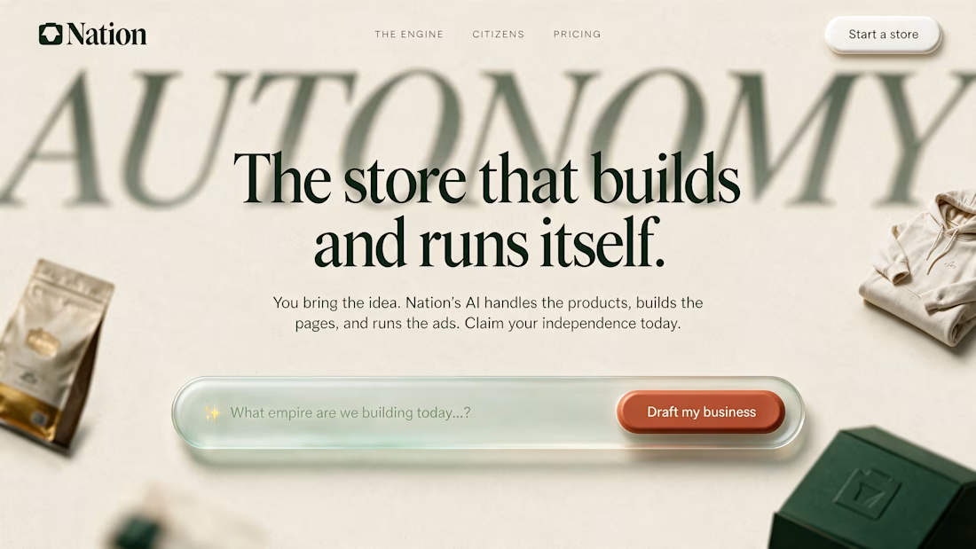
Description for Image 3 (Soft Ivory Editorial Concept)
Visual Direction: Editorial Autonomy & Strategic Sophistication
Concept Overview:
This description addresses the mature, refined core of the Nation brand identity. Designed with a warm, textured ivory canvas and subtle, organic shadows, this layout functions like a prestigious editorial cover for a modern creative engine. It rejects typical cold, technical UI patterns in favor of luxury brand sophisticated typography (a dominant serif title) and extensive whitespace to convey trust and quality. It positions Nation not just as a tool, but as a strategic partner.
Key Design Elements:
Editorial Serif Typography: I used a large, elegant serif font to headline "AUTONOMY," making the concept feel mature and premium.
Organic Shadow-Work: The design relies on soft, floating product samples (like a premium bag and a folded hoodie) cast in subtle shadows, creating deep layers without clutter.
Themed CTAs: Features a custom, soft-green-tinted prompt bar and a warm terracotta primary CTA ("Draft my business"), using natural earth tones instead of generic digital blue to emphasize the organic, human aspect of business creation.



The high-contrast flat-lay direction is such a tactile way to sell an agentic engine, Ibtisam. Pairing physical products like the orange puffer jacket and pink sneaker with minimal UI tells the story beautifully: your words create physical reality. Love the soft ivory editorial variant too.

Thanks
The network for creativity
Join 1.25M professional creatives like you
Connect with clients, get discovered, and run your business 100% commission-free
Creatives on Contra have earned over $150M and we are just getting started











Related posts


Brilliant work

looking for a great designer

Behind the scenes of the Treal Studio brand film.
Built in one week, from creative direction to sound design.


Love the overall feel, looks amazing 👌🏼

