The network for creativity
Join 1.25M professional creatives like you
Connect with clients, get discovered, and run your business 100% commission-free
Creatives on Contra have earned over $150M and we are just getting started
Back to feedPost
Designed a set of social media posts for Sage Capita, a real estate investment brand, covering seasonal greetings, monthly welcome posts and educational content like property inspection red flags. A consistent green palette and 3D property visuals keep the feed recognizable and professional while building trust with prospective investors.


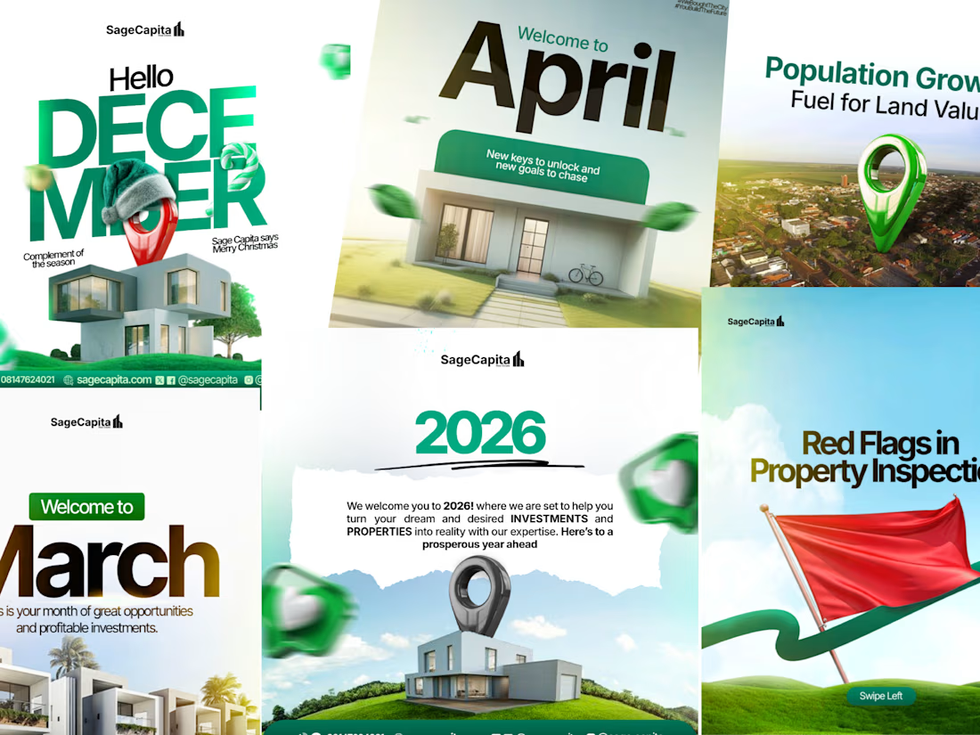

The 3D location pin keeps showing up across the set, so the whole feed reads as one brand. The red flag for the inspection post is a smart visual too. Which did better, the educational posts or the monthly greetings?

Hi Ivan, thank you for the feedback, as for the post that did better, it was the educational posts, because I worked more on them, providing up to 3 carousels every week.
The network for creativity
Join 1.25M professional creatives like you
Connect with clients, get discovered, and run your business 100% commission-free
Creatives on Contra have earned over $150M and we are just getting started



Related posts

We're currently working on this animation for a mobile app. We're debating whether to use fall colors, like seasonal ones or stick with the app's current color scheme.
Community, which color scheme would you vote for?
8 voted
38%
13 voted
62%
21 votes
Closed

Option 2 was stunning🔥🔥🔥🔥

Inside a purple world. 💜
Created with Seedance 2.5

Designed this weekend promo ads for a brand, bold, loud & built to convert!
THIS OR THAT | Pick your vibe!
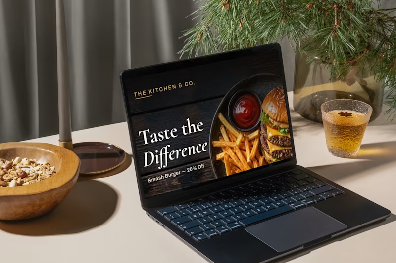
Which style do you prefer for food ads?
Drop your pick in the comments!
2 voted
50%

2 voted
50%
4 votes
Closed

Love the bold and eye-catching style! Food ads should make you stop scrolling and crave a bite. Both styles sound fun to explore! 😍