The network for creativity
Join 1.25M professional creatives like you
Connect with clients, get discovered, and run your business 100% commission-free
Creatives on Contra have earned over $150M and we are just getting started
Back to feedPost

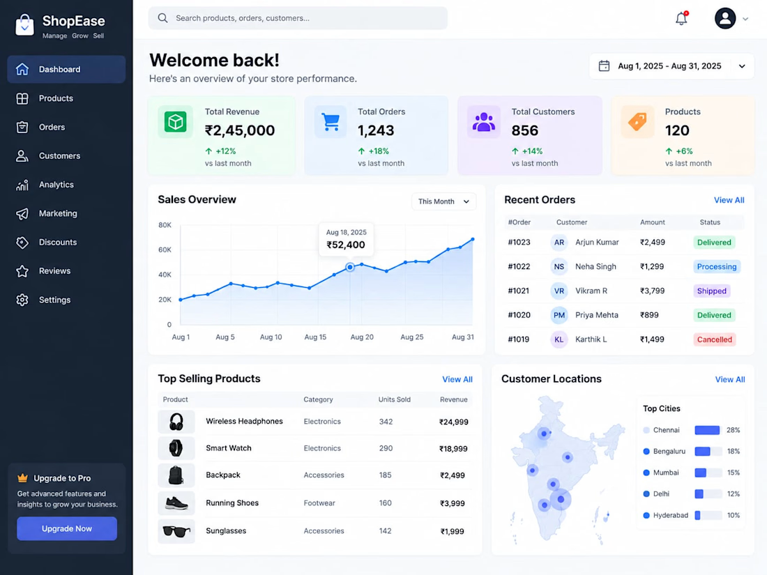
A modern e-commerce admin dashboard concept designed to manage products, orders, customers, sales analytics, and business performance through a clean, responsive interface


The network for creativity
Join 1.25M professional creatives like you
Connect with clients, get discovered, and run your business 100% commission-free
Creatives on Contra have earned over $150M and we are just getting started





Related posts

Credit card landing page design for a fintech startup — an interactive 3D claw machine that turns the offer into the hero instead of another floating card at 15 degrees.
Every card brand ships the same hero: a card hovering over a gradient. Clawd sells one card, not a marketplace, and the entire pitch is "stop comparing — we already did the comparing". So the landing page had to make a single-product offer read as a win rather than a shortage of options, and pull early-access sign-ups from people who are deliberate about money: the ones who actually track spending and read the APR line.
The metaphor does the positioning work. A claw machine that never misses, plus "we already picked the best one", means the visual is the argument and the headline doesn't have to explain itself.
I built the scene in Blender as an interactive element rather than a still render — the claw follows the cursor, the card tilts in the grip, and the pile underneath reacts, so a visitor plays with the product's core idea for a few seconds instead of scrolling past it.
Hero plus full page structure, desktop and mobile designed separately, the Blender scene with web-ready exports, interaction notes, and a developer-ready Figma file.


nice work

You leaned toward Atmospheric in my last taste test, so I took it beyond the hero.
Here’s the full homepage for the same fictional lighting studio, with two different scroll experiences: Fluid and Cinematic.
Which one makes you want to keep exploring?
Continuing from this post: https://contra.com/community/KacW2yxF-homepage-design-comparison-product-photography-vs
22 voted
46%
26 voted
54%
48 votes
Closed

I can't recognizable the difference but both of them are great 🎉🎉

CINÉRA is a great example of cinematic storytelling for a brand. The 3D gallery and booking flow is so smooth!
Building similar experience-driven ads for DTC brands with AI. Love this direction.

I wanted to make a photography website that felt more like an experience than a portfolio.
So I built CINÉRA — a cinematic photography studio website with a 3D gallery, interactive archive, real availability, and a complete booking flow.
You can explore the work, pick a date and...

Appreciate it! That’s actually a big part of what I was going for — making the experience itself part of the brand. Your DTC work sounds interesting too, would love to see what you’re building.