The network for creativity
Join 1.25M professional creatives like you
Connect with clients, get discovered, and run your business 100% commission-free
Creatives on Contra have earned over $150M and we are just getting started
Back to feedPost

If you deliver audio to clients, the work is not finished when the files leave your drive.
We keep seeing good sonic branding undone at implementation. The mark fires late on mid-range phones, sits at the wrong level against the showreel, replays on every page until the visitor mutes the tab. The client reads that as cheap work, not as a handoff gap.
Two things that changed how we scope:
→ Treat web implementation as a named deliverable in the proposal, not a favour after delivery. Either you do it, or you write the spec whoever builds the site has to follow.
→ Ship a short implementation note with the files. Where the sound belongs in the visit, target level relative to other site audio, frequency cap, mute behaviour.
It takes an hour, it protects six weeks of work, and it is billable.
Full version here: https://supadark.com/notes/sound-logo-web-implementation

supadark.com
How to Ship a Sound Logo on the Web Without Breaking It
Autoplay policy, decode latency, level, and repetition. The six constraints that decide whether a sound logo survives contact with a real browser.
The network for creativity
Join 1.25M professional creatives like you
Connect with clients, get discovered, and run your business 100% commission-free
Creatives on Contra have earned over $150M and we are just getting started

Challenges
View all


Related posts


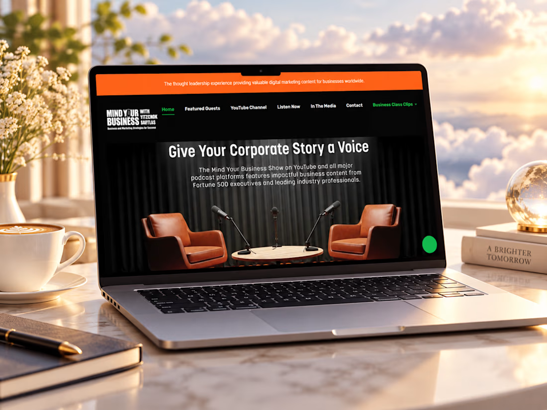
Just completed this Webflow website project for Mind Your Business Radio
The goal was to turn a growing library of business interviews, guest stories, and media content into a clean, easy-to-explore experience.
I focused on strong episode discovery, clear guest presentation, responsive layouts, podcast and video integration, and a structure that makes it easy for listeners to find valuable conversations while giving potential guests and partners a clear way to connect.
I’d love to hear your thoughts, does the website feel like a platform you’d actually enjoy browsing and listening through?
#Webflow #WebDesign #PodcastWebsite #UIDesign #UXDesign #WebDevelopment #MediaWebsite #ResponsiveDesign #WebsiteDesigner #PortfolioProject #Contra


Lovely 😍

Project Title: Nexora — SaaS Product Explainer
Overview
How can a productivity platform communicate its value in seconds?
Nexora is a self-initiated SaaS video concept created to demonstrate how motion design can turn a product's features into a clear, engaging story.
The Approach
The video follows a simple narrative: introduce the brand, highlight the challenges of scattered workflows, present Nexora as the solution, and showcase its core features through clean dashboard visuals and UI animation.
The Goal
To demonstrate how a well-crafted SaaS explainer can communicate product value, simplify complex features, and make a digital product more engaging.
Services: Motion Design, SaaS Explainer Video, Product Marketing
Tools: Adobe After Effects and Figma


Every detail of craftsmanship has a #sound.
For Louis Vuitton , we designed a sonic palette that closely follows their creation process: crisp pencil sketches, watercolor brushstrokes, metallic clinks of tools setting diamonds, and tuned crystalline accents that enhance the piece’s weight and texture without detracting from its visuals.
Huge thanks to Louis Vuitton for bringing me and Penrose Audio on board for this project.
#sounddesign #ccgi #louisvuitton #sfx #highjewelry #foley #craftsmanship #audio


That's really great Davies your work is really luxury 👑😎