The network for creativity
Join 1.25M professional creatives like you
Connect with clients, get discovered, and run your business 100% commission-free
Creatives on Contra have earned over $150M and we are just getting started
Back to feedPost

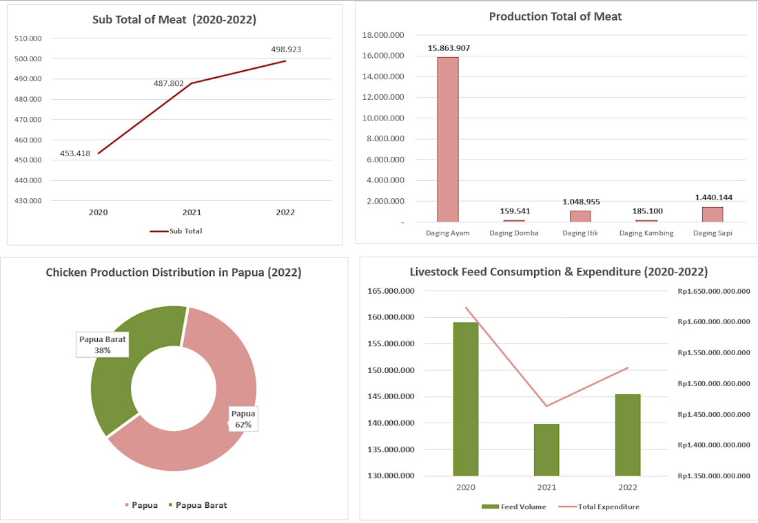
Choosing the right chart in Excel depends entirely on the dataset. This project demonstrates effective data visualization for livestock and meat production insights:
Line Chart: Shows the upward growth trend of total meat production (2020-2022).
Column Chart: Compares the total production volume across different meat categories.
Donut Chart: Illustrates the percentage share and regional distribution of chicken production.
Combo Chart: Displays two metrics at once—feed volume (columns) vs. total expenditure (line).

The network for creativity
Join 1.25M professional creatives like you
Connect with clients, get discovered, and run your business 100% commission-free
Creatives on Contra have earned over $150M and we are just getting started
Related posts


Monthly Insights Dashboard Micro Interaction
A dashboard micro interaction exploring how motion can make analytics feel clearer, more engaging, and easier to understand.
This concept showcases smooth progress animations, animated statistics, and monthly insights to improve data visualization and user experience across analytics, SaaS, CRM, and business dashboard applications.
microinteractionanalyticsinsightsdashboardanalyticsMotion DesignProduct DesignWeb DesignFigJamFigmaJitter



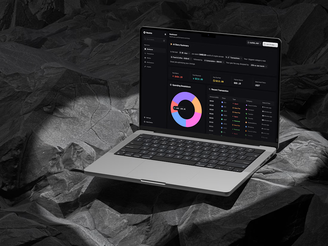
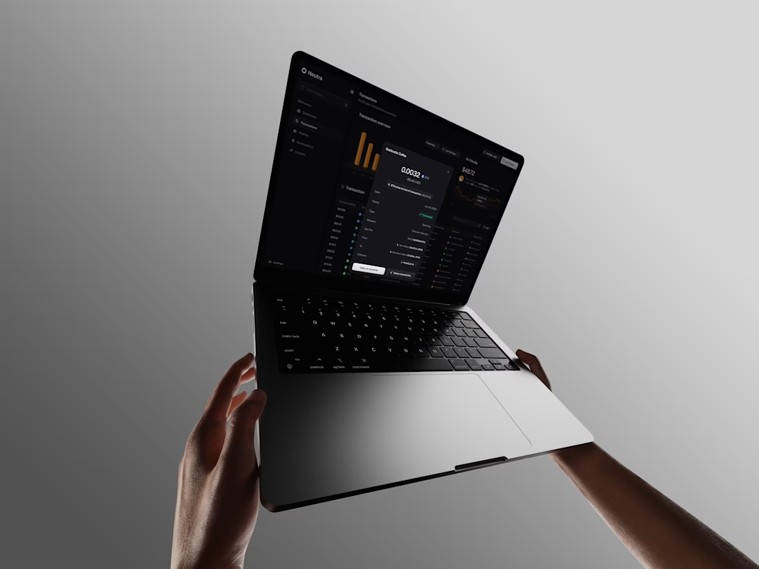
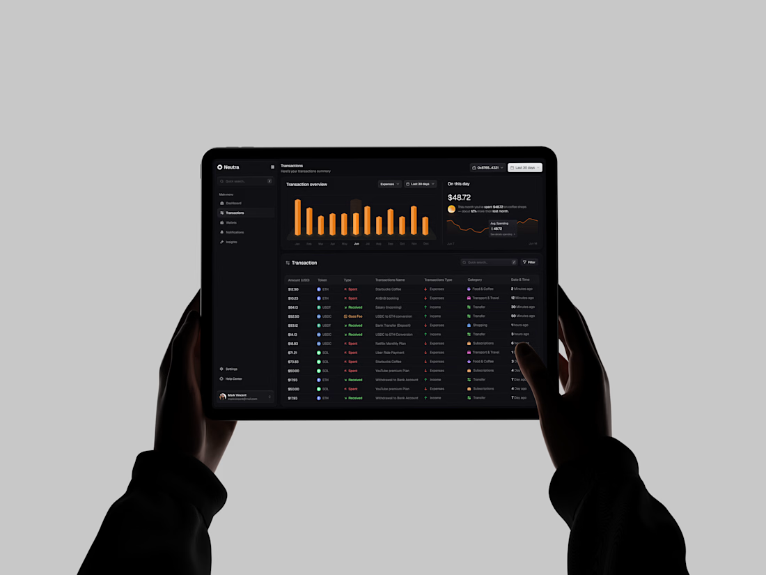
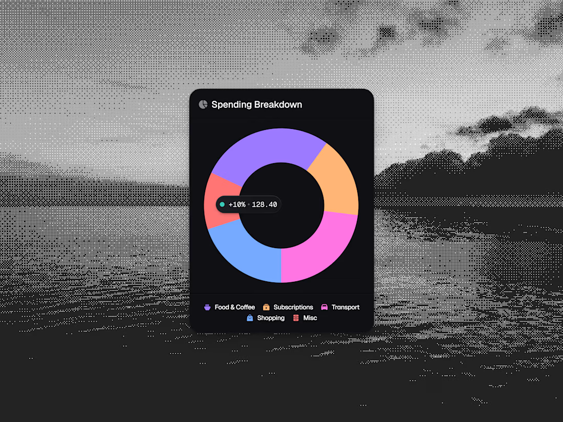
Turning sterile cryptographic data into a human-readable financial story. Neutra is engineered to bring elite financial intuition to the Web3 era. 🛡️✨
We completely bypassed raw developer-centric grids to build an intuitive dashboard tailored for institutional-grade asset tracking. By pairing an editorial layout with clear consumer pillars, we engineered boardroom trust across every interactive surface.
Look closely at the details:
🎯 Data Micro-Moments: A vibrant, color-coded "Spending Breakdown" donut chart designed to eliminate categorization guesswork.
📊 Data Density Without Fatigue: A clean transaction ledger that balances token operations on an ultra-focused tablet layout.
🛡️ Contextual Modals: Streamlined overlays isolating deep network telemetry natively within the viewport.
If this inspires your current product workflow—Like, Save for your moodboard, or hit that Repost! 💎
#ProductDesign #DashboardDesign #CryptoUI



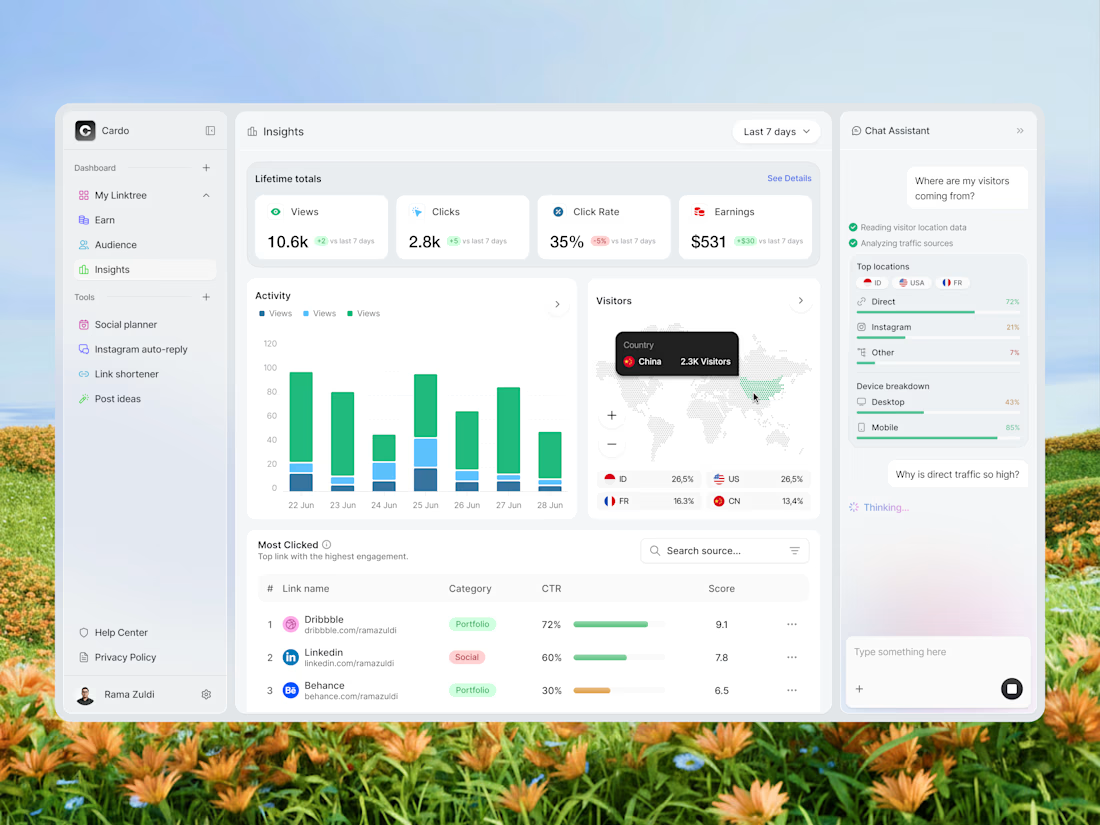
Hi Folks! Today I'm sharing my latest design exploration, an analytics dashboard for a link-in-bio tool called Cardo. The idea was simple: make your link performance data actually readable. So I broke it down into activity charts, a visitor map, and a chat assistant panel that answers your questions about your own data. Would love to hear what you think! 🙌
📩 Collaborate with Us? Contra Cansaas Agency







Trending

Claude
Claude has entered the design space. How are you using Claude Design?

Contra University
Learn from expert creatives how to earn more using next-gen AI tools.
fifaworldcup2026
The World Cup is here and the whole world's watching. How are you designing for the world stage?
creativeaiflow
Creative AI workflows are evolving. What tools do you use, and what are their strengths and weaknesses?
freelancerlife
Freelancer life is wins, pivots, and everything in between. What’s yours right now?