The network for creativity
Join 1.25M professional creatives like you
Connect with clients, get discovered, and run your business 100% commission-free
Creatives on Contra have earned over $150M and we are just getting started
Back to feedPost
The SCISM Visual System
Most streetwear brands fail because they try to be "safe":
They end up as background noise.
SCISM is designed to be the signal.
In a crowded market, "nice design" isn't enough. You need a visual system that forces a choice.
Key features:
★ Distorted Typography: Custom-built letterforms to ensure 100% uniqueness.
★ Signal Palette: Strategic use of Acid Green for maximum "stop-factor" in social feeds.
★ Technical DNA: A secondary graphic system (technical strings & coordinates) to increase perceived value.
It’s not just apparel. It’s a visual manifesto for the 1% who pay attention to the details.
The result? A brand that’s impossible to ignore and 100% ready for production.


I like the color palette and the side green color fitting both to black and white creating a contrast vision so much! Good work!

Thanks a lot! I’m really happy you like it. That high-contrast vision was exactly what I was aiming for with this project. It means a lot to get such positive feedback!
The network for creativity
Join 1.25M professional creatives like you
Connect with clients, get discovered, and run your business 100% commission-free
Creatives on Contra have earned over $150M and we are just getting started





Related posts

A few months ago I got to work with Coderhouse, one of the leading education brands in Argentina, and the place where I took several courses myself.
So this one feels like a full circle. A brand that shaped my career and helped me grow as a designer, and now I got to design for it.
The funny part is Chris had no idea I was a former student when he reached out. I was really happy when that message came in.
I built a visual system for their 60+ course covers, made so their team can keep producing them on their own. Today it lives across their app, website and Meta ads.
Thanks Chris for trusting my work and for the opportunity 🧡 And thanks @Contra HQ for making connections like this one possible.


This looks great

Another very cool brand Identity project I got to work on this year for Elio Mortgage.
Bringing warmth and love to a brand that is usually cold and stressful. Elio are doing things differently to make mortgages easier to deal with. We made a brand that felt more approachable.
Full case study here:
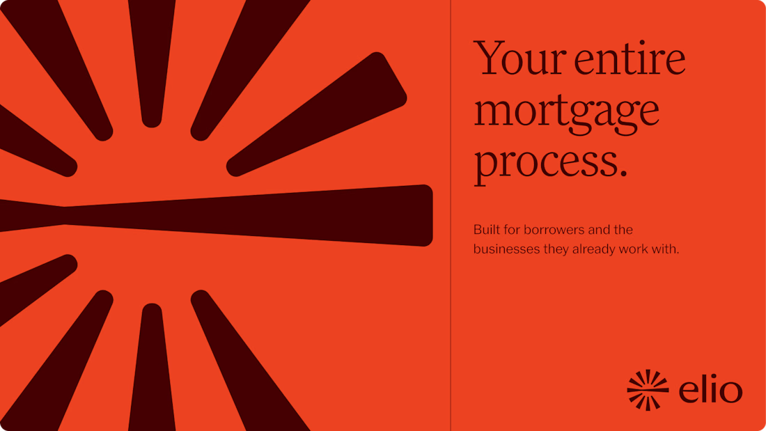
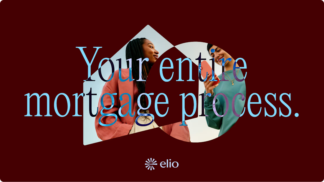
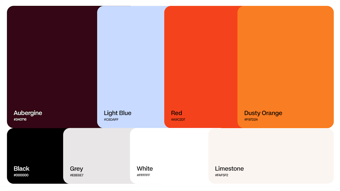
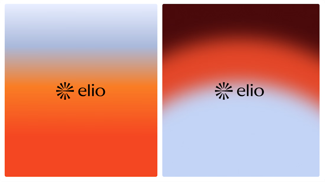

Warm, approachable identity for stressful mortgages.

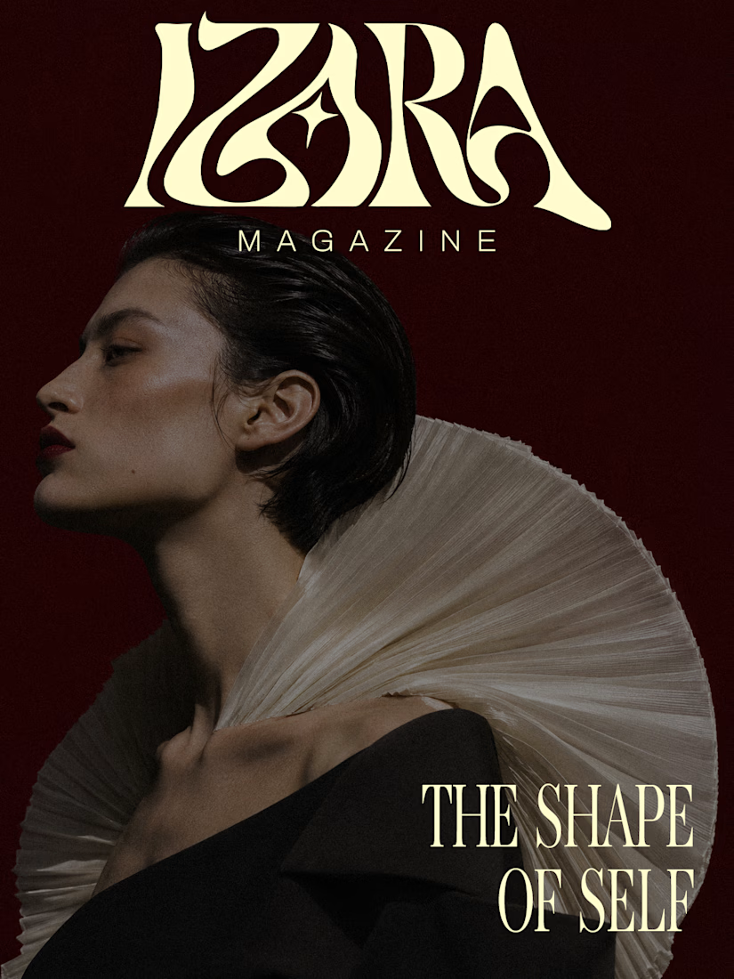
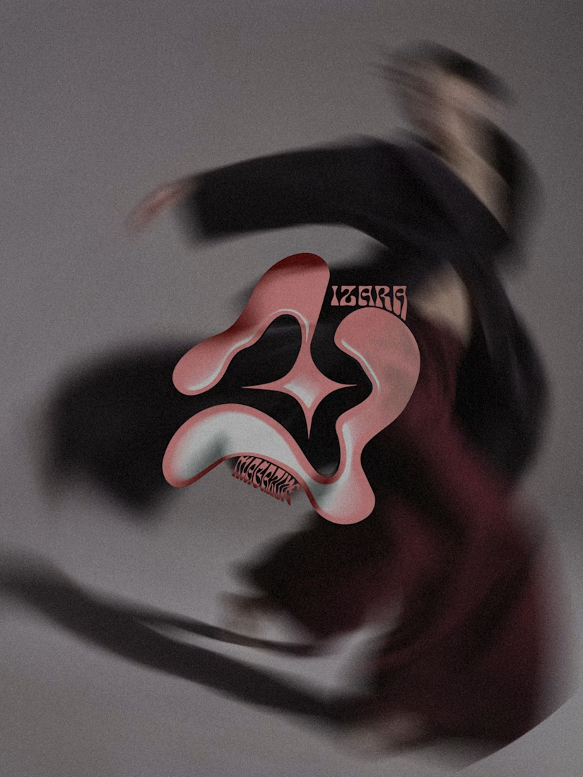
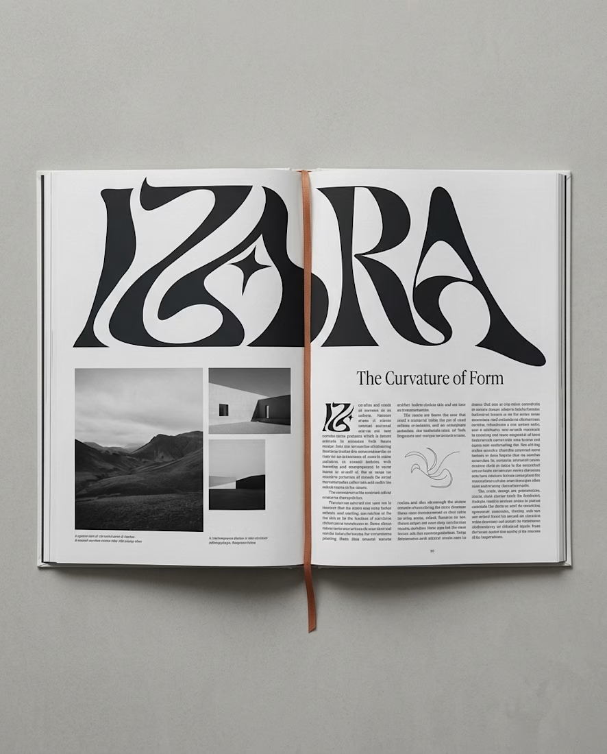
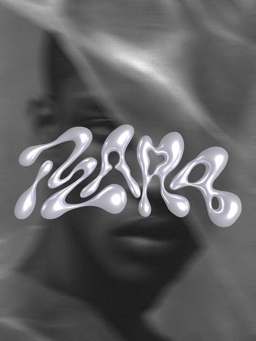
A magazine that refuses to look like every other magazine.
Introducing IZARA MAGAZINE — The Shape of Self.
A self-initiated editorial identity exploring the intersection of fashion, art and contemporary visual culture.
I wanted to create a visual world where bold typography, sculptural forms and experimental art direction could coexist — without losing a sense of identity.
From expressive visuals to editorial applications, every piece becomes part of the same creative universe.
Creative Direction & Visual Identity by Yarzy Studio.
Explore the full interactive case study:
https://izara-magazine-yarzystudio.framer.website
I'd love to hear which visual is your favorite🖤



I melt when I see bold typography 🫠❤️🔥


