The network for creativity
Join 1.25M professional creatives like you
Connect with clients, get discovered, and run your business 100% commission-free
Creatives on Contra have earned over $150M and we are just getting started
Back to feedPost

I'm about to publish the case study for CUT · PRINT · WRAP, a fashion film trilogy I made about one woman, one gown and one day in New York.
At 06:00 she cuts the gown in calico. By 17:00 it's printed with the sunrise she watched that morning. At 23:59 a coat of lost umbrellas makes it hers.
The case study needs a cover, and I've ended up with three that I like for different reasons:
1. Finale. All three looks walk out together, like the end of a show.
2. Pattern. The front of the gown, cut from the printed fabric, still on the cutting mat.
3. Pinked. One woman pieced together from all three looks with pinking shears.
If this were the cover of a fashion project you were working on, which one would you pick? And what would you change?
I'll read every reply before I decide.
The network for creativity
Join 1.25M professional creatives like you
Connect with clients, get discovered, and run your business 100% commission-free
Creatives on Contra have earned over $150M and we are just getting started

Challenges
View all


Related posts


Which one would you build the collection around?
The first is ruby glass with a fluted rim and a single calla lily, sky blue surface, red caustics thrown across the floor.
The second is matte cobalt ceramic with a hole through its body on travertine, one orange anthurium, rust wall carrying the flower’s shadow.
One sells light. The other sells form.
👇 #objectdesign #interiordesign #brandconcept
5 voted
63%
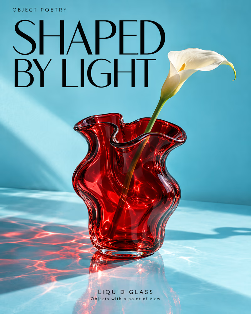
3 voted
37%
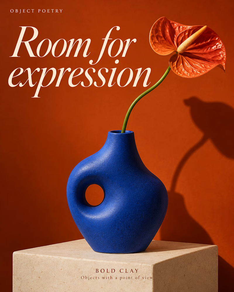
8 votes
Closed

Two book covers, two creative directions. Which captures personal growth better: cinematic and bold, or calm and minimalist? Vote A or B!
4 voted
80%
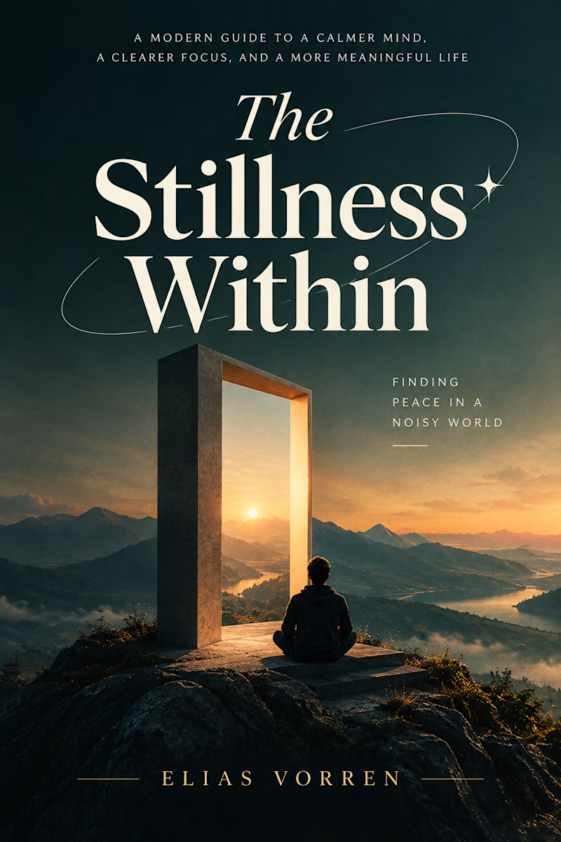
1 voted
20%
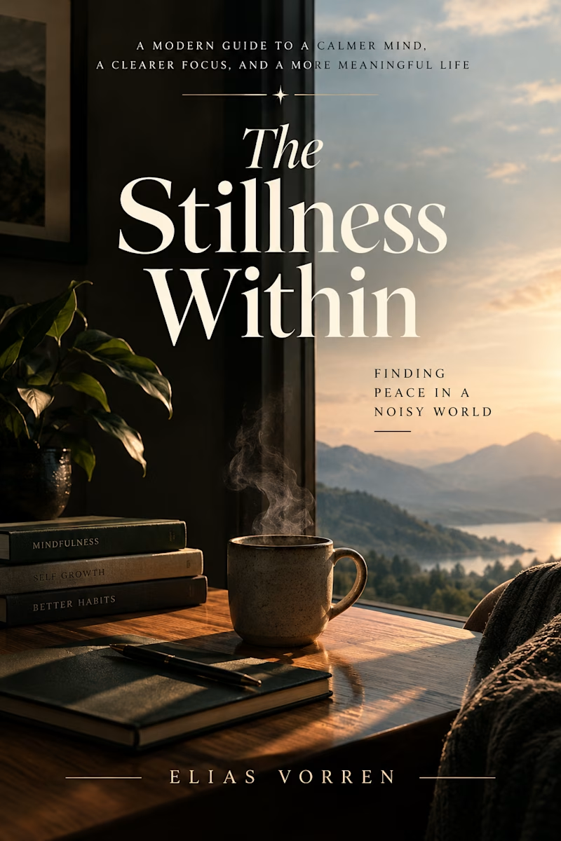
5 votes
Closed


calm one for me. personal growth doesnt need to shout

Not every design needs to sit still.
A little depth. A little movement. A whole new experience.
Exploring 3D motion and interactive UI concepts through Say It in Daylight, a mental wellness concept built around connection, reflection, and self-expression.
Your next idea could look this good in motion.
Available for creative projects and collaborations.
#3DMotion #MotionGraphics #DigitalDesign #Contra


