The network for creativity
Join 1.25M professional creatives like you
Connect with clients, get discovered, and run your business 100% commission-free
Creatives on Contra have earned over $150M and we are just getting started
Back to feedPost

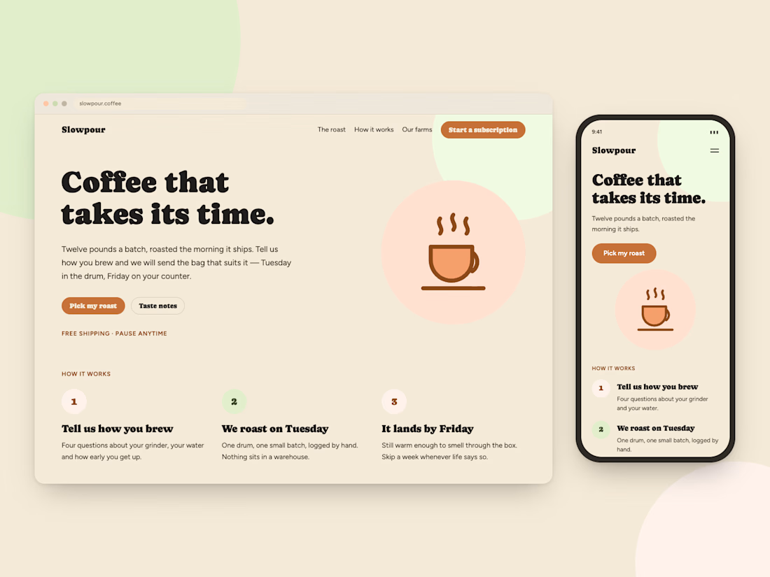
This is slowpour coffee - a fictional coffee company that sends you freshly-made coffee every week.
This project was created to demonstrate creating a landing page for a simple service that users could sign up for. The landing page utilizes Next.js and has several SVGs to walk the user through the process of how they get their coffee each week.


The network for creativity
Join 1.25M professional creatives like you
Connect with clients, get discovered, and run your business 100% commission-free
Creatives on Contra have earned over $150M and we are just getting started
Related posts

🚀 Aurora: a real-time 3D website system, built from scratch with Three.js.
Everything in this 20-second showcase is real. The 3D shape is a live shader, and the site footage is a screen recording of the finished build, not a mockup.
What's inside: 6 finished pages, a mobile-first layout, scroll-reactive motion, and Figma-ready design tokens. Plain HTML, CSS and JS, so it deploys free on Netlify or Cloudflare Pages.
Need a custom 3D site or a rebrand of Aurora for your studio? Message me. I reply within 1 to 2 working days.
The full kit is on my Products tab. Live demo: aurora-3d-kit.netlify.app
#threejs #webgl #webdesign #3dwebsite #frontend


A live shader instead of a rendered video makes a big difference in how the hero feels. Plain HTML, CSS and JS with free deploys on Netlify is a nice choice for a kit like this.

Blog Listening Web Application With Admin Dashboard.
webdesignappdesignadmindesignBackend DevelopmentFrontend DevelopmentFull Stack DevelopmentExpressJSNext.jsTailwind CSS


☕ Moka: A New Era of Coffee — Brand Identity & Editorial Concept
Minimalist luxury meets quiet sophistication. I’ve just published my latest branding project for Moka, a modern coffee concept defined by an off-white monochromatic palette, pristine typography, and high-end editorial lifestyle photography.
From tactile packaging and clean stationery to serene spatial design, every element was crafted to elevate the specialty coffee experience.
✨ Tools used: Gemini, Kittl, Figma, Photoshop, Illustrator
Take a closer look at the full case study and drop your thoughts here: 👇 🔗 Check it out on Contra
💬 I’d love to hear your feedback on the aesthetic! Like, share your thoughts in the comments, and hit that goated repost if this inspires your feed today!



You asked for feedback on the aesthetic, so here it is. The big lowercase moka on a white bag and the black sign on the white storefront are crisp and very Scandinavian, and the nested small caption keeps it premium. Honest critique: this is a very familiar third-wave coffee...