The network for creativity
Join 1.25M professional creatives like you
Connect with clients, get discovered, and run your business 100% commission-free
Creatives on Contra have earned over $150M and we are just getting started
Back to feedPost
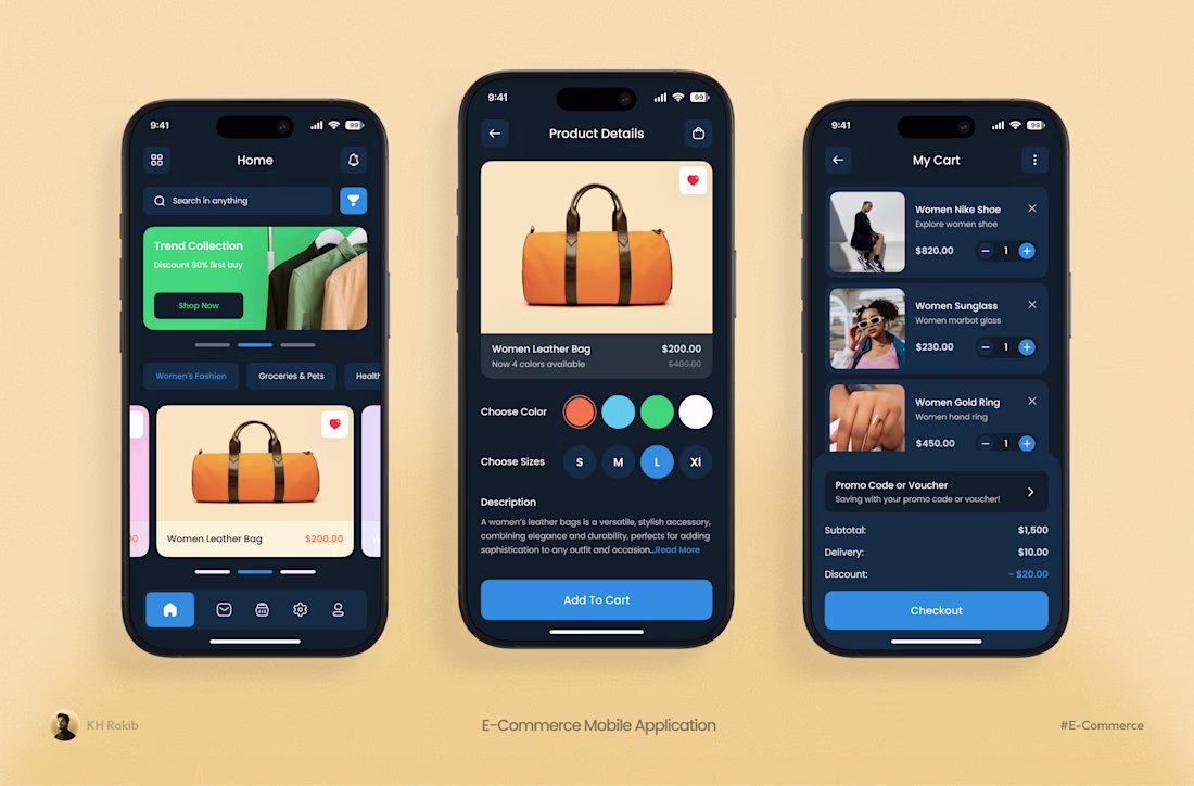
Most e-commerce apps fail at the "Add to Cart" stage because of visual noise.
I streamlined this mobile experience to focus on what matters: the product and the purchase. Lower cognitive load for the shopper and a faster path to checkout.
3 ways I optimized this flow:
High-Contrast CTAs: Using bold primary buttons to guide the user's next move instantly.
Intuitive Hierarchy: Placing essential details—like size and color selectors—within easy thumb reach.
Clutter-Free Cart: A simplified checkout summary that removes distractions right before the final click.
Amazing presentation, the whole project flows nicely.
Thanks 😊
The network for creativity
Join 1.25M professional creatives like you
Connect with clients, get discovered, and run your business 100% commission-free
Creatives on Contra have earned over $150M and we are just getting started
Related posts
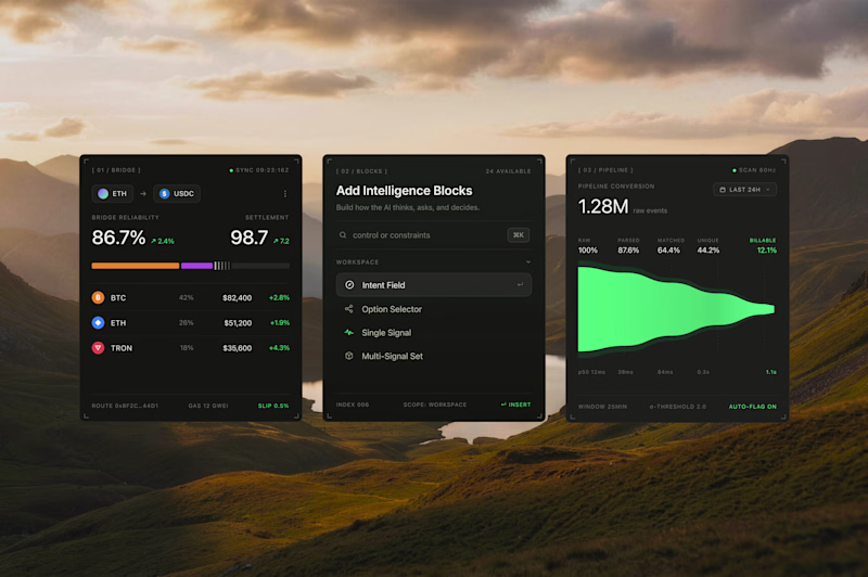
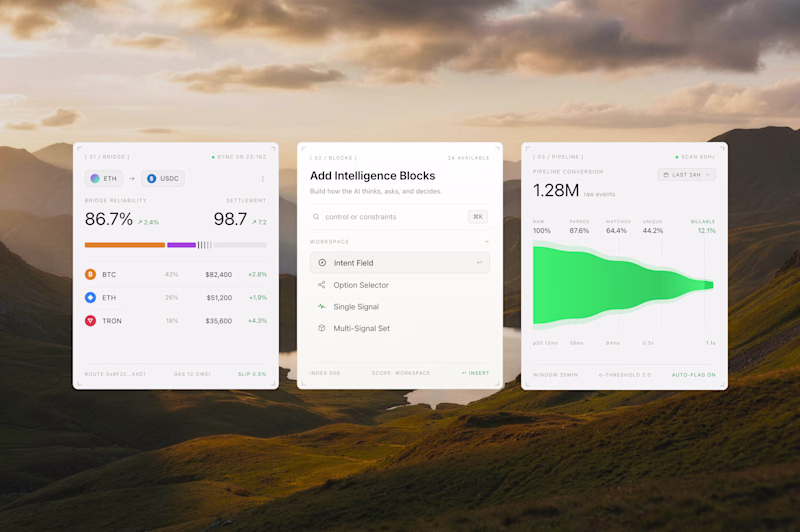
Interface cards for a recent product design project, what would be the best direction? Dark Mode or Light Mode? ⚡️
69 voted
68%
32 voted
32%
101 votes
Closed
Both look great, but i will go for the dark mode
Cool!
The first one gives less cognitive overload 🔥
Trending
Claude
Claude has entered the design space. How are you using Claude Design?
Contra University
Learn from expert creatives how to earn more using next-gen AI tools.
fifaworldcup2026
The World Cup is here and the whole world's watching. How are you designing for the world stage?
creativeaiflow
Creative AI workflows are evolving. What tools do you use, and what are their strengths and weaknesses?
freelancerlife
Freelancer life is wins, pivots, and everything in between. What’s yours right now?