The network for creativity
Join 1.25M professional creatives like you
Connect with clients, get discovered, and run your business 100% commission-free
Creatives on Contra have earned over $150M and we are just getting started
Back to feedPost

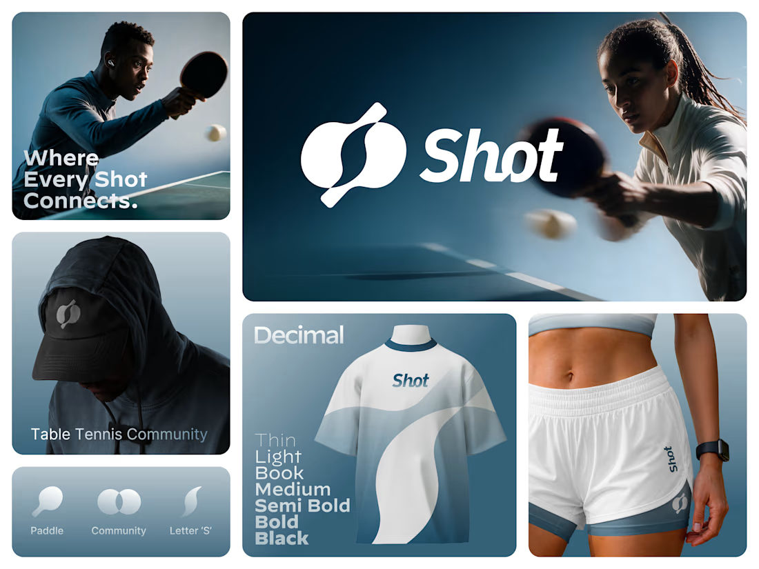
Introducing SHOT — a new identity for the table tennis community. 🏓
The SHOT logo brings together sport, connection, and community in one simple symbol. Two table tennis paddles come together to form the letter “S”, representing two players, every rally, and the shared energy of the game.
From the logo to the visual language, the identity is designed to feel bold, dynamic, modern, and connected.
SHOT — Where Every Shot Connects.


Really Nice Exploration.

The way the two paddles merge into the 'S' is clever. It instantly hints at the back and forth of a rally while keeping the mark tidy.
The network for creativity
Join 1.25M professional creatives like you
Connect with clients, get discovered, and run your business 100% commission-free
Creatives on Contra have earned over $150M and we are just getting started











Related posts


Approved logo for a mental health and daily habit app built for seafarers and offshore workers.
Can't wait to share more.


A little peek at the brand work we did for Elio Mortgage.
A warm, approachable identity full of warm vibrant colors paired with soft sun rising inspired gradients, inner glows and custom illustrations & more. Loved this direction!
Full case study coming soon, from process to final identity.
Plenty of logo explorations to share too!


That color palette takes the whole identity to a different level!! I loove it.

Brand Expressions -- Olivir



Thats so crazy!!!!!! Seeing this I feel we humans are still far better than AI