The network for creativity
Join 1.25M professional creatives like you
Connect with clients, get discovered, and run your business 100% commission-free
Creatives on Contra have earned over $150M and we are just getting started
Back to feedPost

SIONIX | Premium Shopify Swimwear Store Design & CRO
SIONIX wanted a bold, fashion forward online store that reflected the confidence and energy of its swimwear brand.
My role was to design a premium Shopify experience that combined striking visuals with an intuitive user journey to elevate the brand and increase customer engagement.
I created a modern, editorial inspired design with immersive imagery, clean layouts, and premium typography that puts the products at the center of attention.
Every section was carefully structured to tell the brand's story while making it easy for customers to browse collections, explore products, and complete their purchase.
Alongside the visual design, I implemented CRO best practices to improve usability, strengthen trust, and create a seamless shopping experience across all devices.
My Contributions
• Premium Shopify Store Design
• Luxury UI & UX Design
• Homepage & Collection Page Design
• High Converting Product Pages
• Shopify Page Builder Development
• Mobile Responsive Optimization
• Conversion Rate Optimization (CRO)
• Brand Identity & Visual Direction
Outcome
The final result was a sleek, high end Shopify store that captures the essence of the SIONIX brand.
The website delivers a premium shopping experience, reinforces customer confidence, and provides a strong foundation for increasing engagement, conversions, and long term brand growth.


The network for creativity
Join 1.25M professional creatives like you
Connect with clients, get discovered, and run your business 100% commission-free
Creatives on Contra have earned over $150M and we are just getting started
Related posts

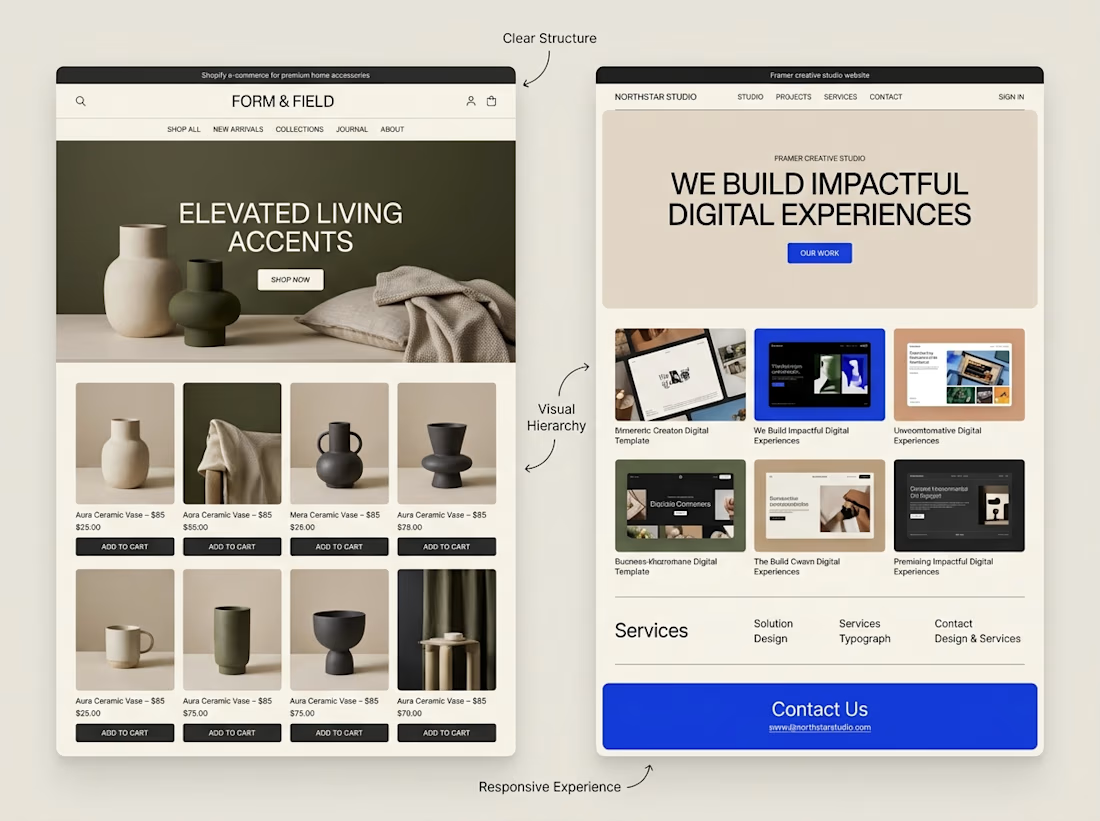
A website can look beautiful and still be difficult to use.
That's something I keep in mind when exploring both Shopify store design and Framer website design.
Although the platforms serve different purposes, some design principles apply to both:
→ Clear navigation helps visitors find their way.
→ Strong visual hierarchy makes important information stand out.
→ Thoughtful page structure creates a natural flow.
→ Responsive layouts help the experience work across screen sizes.
→ Clear calls to action help visitors understand what to do next.
The goal isn't simply to make a website look impressive.
It's to make the experience clear, useful, and easy to navigate.
I'm continuing to explore how these principles can be applied across different types of websites and projects.
What matters most to you when visiting a website, its visual design, its usability, or a combination of both?



Well said. Usability first, then visuals. Clear navigation wins me every time. 🙌

Landing page design for Lumo — banking for freelance life
Banks sell control — dashboards, charts, a card floating at fifteen degrees. Freelancers don't want control over their money. They want to stop thinking about it in the gap between sending an invoice and the money landing.
That gap is what the page is built on. The product sits in a meadow instead of on a dark grid, because the promise isn't "manage your finances better" — it's "we handle the part that keeps you up." And the strongest line on the page isn't a feature: no waiting for Monday. Freelancers don't lose weekends to fees. They lose them to timing.
The proof follows the same rule. One freelancer, one number — 4% lost on every international payment. A percentage someone can check against their own account beats any adjective.


great visuals 🙌

Shopify store for a luxury women's handbag brand: product pages, collections, and a clean storefront built to turn visitors into customers.

Great work 👏🏻