The network for creativity
Join 1.25M professional creatives like you
Connect with clients, get discovered, and run your business 100% commission-free
Creatives on Contra have earned over $150M and we are just getting started
Back to feedPost

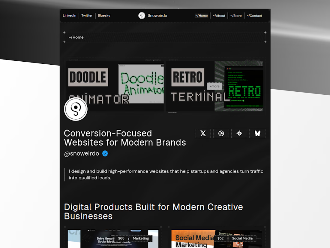
Why I built Pixelus
I’ve been thinking a lot about the friction between "showing" work and "running" a business.
For a long time, my portfolio was just a static gallery. But as I started taking on more client work and selling digital products, I realized I was spending more time managing fragmented tools than actually creating.
I wanted a single ecosystem.
I built Pixelus to bridge that gap. It’s a Framer template, but I approached it as business infrastructure, a way to remove maintenance overhead so your site acts as an engine, not a chore.
How do you handle the balance between maintaining your portfolio and managing your business operations?
X/Twitter Post

The network for creativity
Join 1.25M professional creatives like you
Connect with clients, get discovered, and run your business 100% commission-free
Creatives on Contra have earned over $150M and we are just getting started

Challenges
View all


Related posts

A portfolio doesn't need more space.
It needs to use space differently.
With OVERLAP, projects don't need their own isolated sections. They can share space, create depth and become part of a larger composition.
It's not about fitting more content on screen.
It's about creating relationships between what you show.
Less separation. More composition.

Love this take. Overlapping projects to create depth vs just stacking sections - way more intentional.


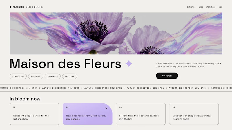
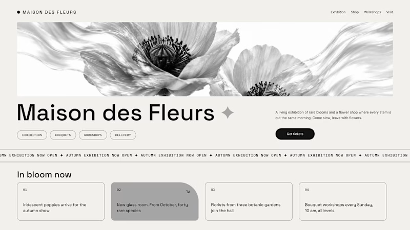
Should a flower shop ever go black and white?
Same flower house, same layout. We only took the color out.
1. Full color. The iridescent petals do the selling: lilac, pink, a little shimmer. The photo is the brand, and every accent on the page borrows from it.
2. Monochrome. No color at all. Shape, texture and typography have to carry everything, and the page suddenly reads like a gallery catalogue.
Color sells the flower. Monochrome sells the exhibition.
Which one would get you through the door?
67 voted
91%
7 voted
9%
74 votes
Closed

The problem with monochrome is that, throughout computer history, it has conditioned users to associate gray and monochrome with being disabled, dysfunctional, or something to ignore and avoid.

Luxury Lighting E-commerce Website Design for Modern Home Decor
A modern luxury lighting e-commerce website concept crafted to showcase premium statement pieces through a refined, immersive, and editorial-inspired digital experience. The design combines warm ambient lighting, bold typography, cinematic imagery, and clean minimalist layouts to create a sophisticated online presence for a high-end home decor brand. Every element is thoughtfully designed to enhance product storytelling, improve user engagement, and deliver a seamless shopping experience across all devices.


really nice design