The network for creativity
Join 1.25M professional creatives like you
Connect with clients, get discovered, and run your business 100% commission-free
Creatives on Contra have earned over $150M and we are just getting started
Back to feedPost

Approaching five years as Editor-in-Chief of U The Caribbean Health Digest, and I’m sitting with a lot of gratitude.
What began as a role has become a responsibility I deeply respect; shaping credible health conversations, guiding thoughtful storytelling, and protecting the integrity of information shared with our readers.
It’s an honor to help steward a publication that continues to inform, challenge, and serve communities globally.

The network for creativity
Join 1.25M professional creatives like you
Connect with clients, get discovered, and run your business 100% commission-free
Creatives on Contra have earned over $150M and we are just getting started



Related posts

Hello Nature | Hand and Leaf Logo Mark
A throwback to one of my favourite logo concepts, created about 7 or 8 years ago, it was featured in LogoLounge 13.
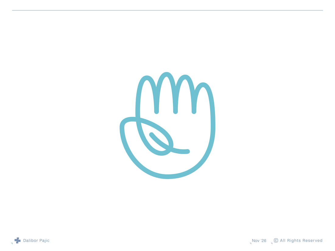

clever and clean concept


This means a lot! Truly grateful for the recognition. Thank you, @Contra HQ

Congratulations Wishva


Which homepage would make you more likely to explore the platform?
HackStack features bold typography, teal gradients, and a centered layout focused on AI tools and automation. DataVistaHQ uses purple accents, a split layout, and a prominent dashboard preview to introduce its business intelligence platform.
I would like your perspective on the visual design, clarity, and first impression. Which approach communicates its value more effectively and makes you want to take the next step?
Vote for your preferred design and share what influenced your choice: the colors, headline, layout, dashboard preview, or overall presentation.
#WebDesign #AIWebsites #UIUXDesign #SaaSDesign #TransformedDesign

2 voted
17%

10 voted
83%

12 votes
Closed

Visually, I lean toward DataVistaHQ, but the cognitive load is really high. The value proposition and the stats feel like they're competing for attention.
On the other hand, HackStack has a much better visual hierarchy. The value proposition and CTA group immediately give me a...