The network for creativity
Join 1.25M professional creatives like you
Connect with clients, get discovered, and run your business 100% commission-free
Creatives on Contra have earned over $150M and we are just getting started
Back to feedPost
Taste Test


From photo composition and color direction to typography and visual hierarchy, every detail was designed to make the message feel personal, polished, and unforgettable.
Need a flyer that looks this intentional for your next event? Let’s create it.


0 voted
0%

7 voted
100%

7 votes
Closed


What a nice outcome 🔥🔥

This highly creative
The network for creativity
Join 1.25M professional creatives like you
Connect with clients, get discovered, and run your business 100% commission-free
Creatives on Contra have earned over $150M and we are just getting started
Related posts

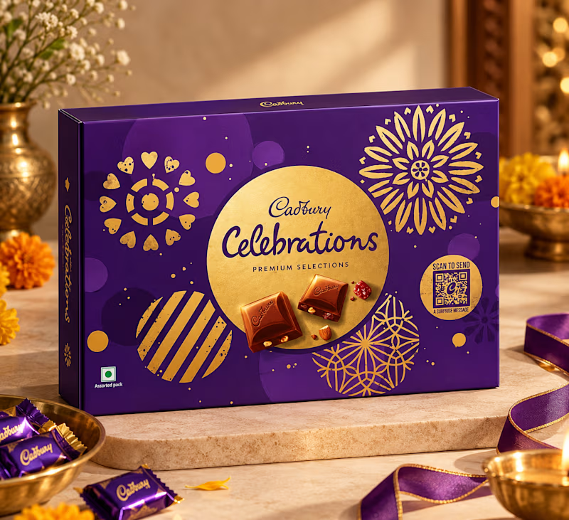
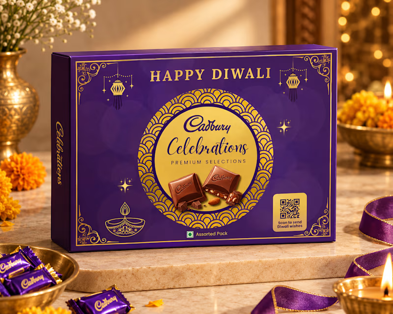
Redesigned the Cadbury Celebrations pack for Diwali 🪔✨
I kept the iconic purple and gold, and added festive details: a gold scallop-pattern ring, hanging lanterns, line-art diya, sparkles, and a "Scan to send Diwali wishes" QR badge.
Which one would you pick for gifting this Diwali?
Vote and tell me why in the comments 👇
#PackagingDesign #Diwali #Cadbury #BrandRedesign #ConceptDesign #PackagingConcept #DiwaliDesign
1 voted
25%
3 voted
75%
4 votes
Closed


What if Altoids dropped a limited Halloween edition?
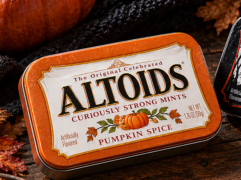
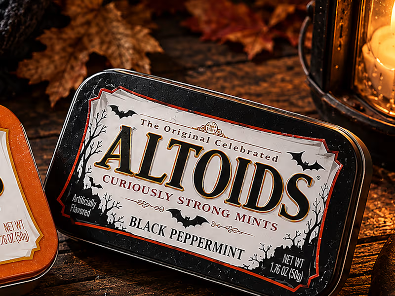
For this week's challenge, I gave one of the most iconic tins on the shelf a fall and spooky makeover with two seasonal flavors: 🎃 Pumpkin Spice and 🦇 Black Peppermint.
👻 What stayed recognizable:
The classic rectangular metal tin, the off-white parchment label, the stepped Victorian frame, and the bold serif wordmark with "The Original Celebrated" and "Curiously Strong Mints" locked in their exact spots.
🪦 What I twisted:
Swapped the classic red and green tins for burnt pumpkin orange and midnight matte black, traded the vintage apothecary crest for autumn foliage on one and gnarled trees with flying bats on the other, and lit the whole shot by lantern light.
Which one would you grab?
#brandincostume
17 voted
47%
19 voted
53%
36 votes
Closed

altoids are SO classic, this is such a clever idea!