The network for creativity
Join 1.25M professional creatives like you
Connect with clients, get discovered, and run your business 100% commission-free
Creatives on Contra have earned over $150M and we are just getting started
Back to feedPost


The network for creativity
Join 1.25M professional creatives like you
Connect with clients, get discovered, and run your business 100% commission-free
Creatives on Contra have earned over $150M and we are just getting started







Related posts

Which Rhino Vector Logo You Guys Like Most?
These 100% Handmade Vector Logos Are Also Available For Purchase With Exclusive Copyrights Transfer Ownership, Feel Free To Contact Us.

4 voted
50%
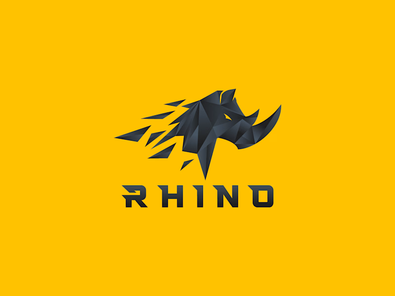
4 voted
50%
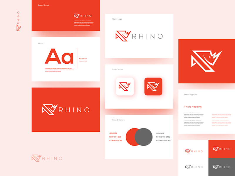
8 votes
Closed

B for me. A is a great mascot, but B actually behaves like a brand, it stretches across a whole system without breaking a sweat. The rhino stays recognisable even when it goes minimal, which is the real test.

I'm a menu designer
Trust me
I'll serve you better


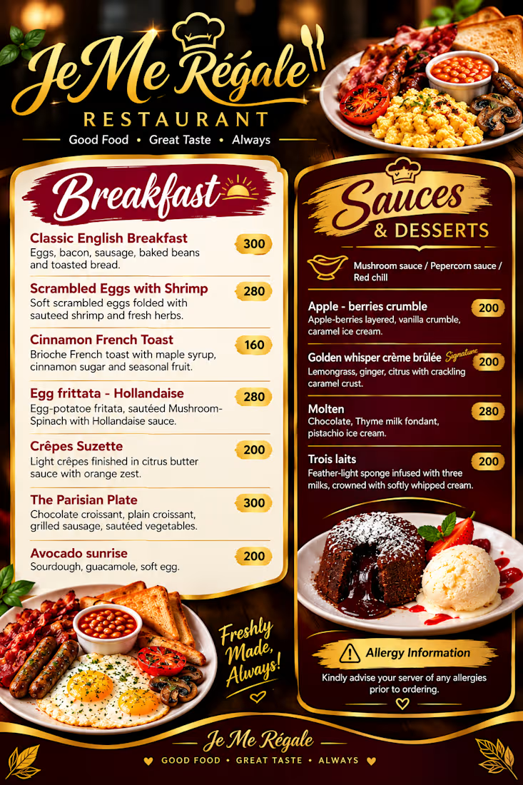

The script Breakfast heading against the gold sauces column makes the two sides easy to scan, and those small price pills keep the numbers from fighting the food photos. Did you build the item rows as a Framer component so the spacing stays locked?

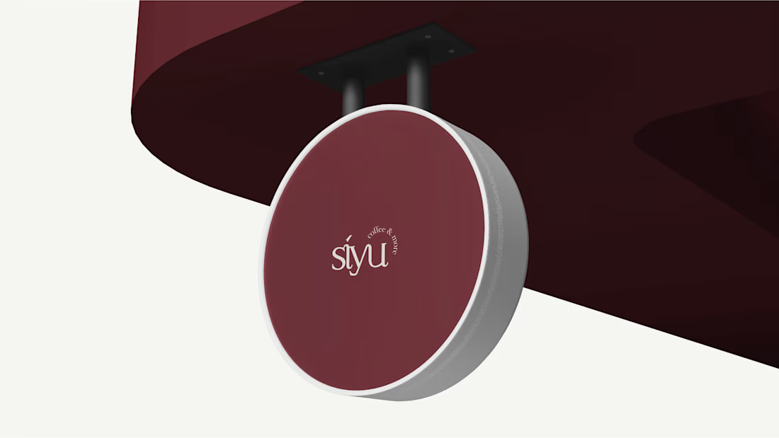
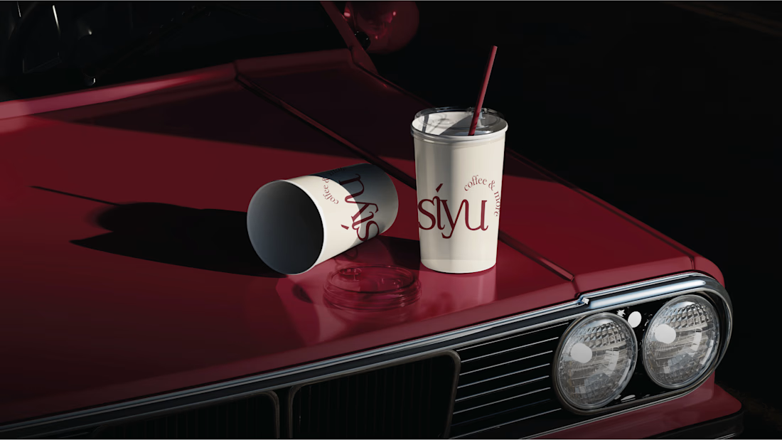
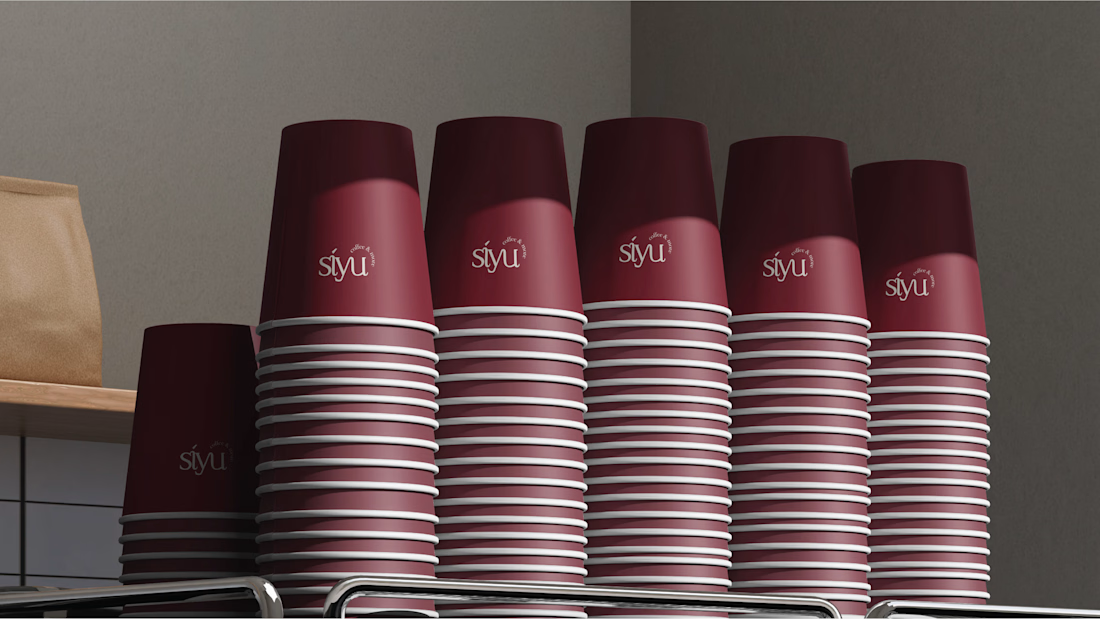
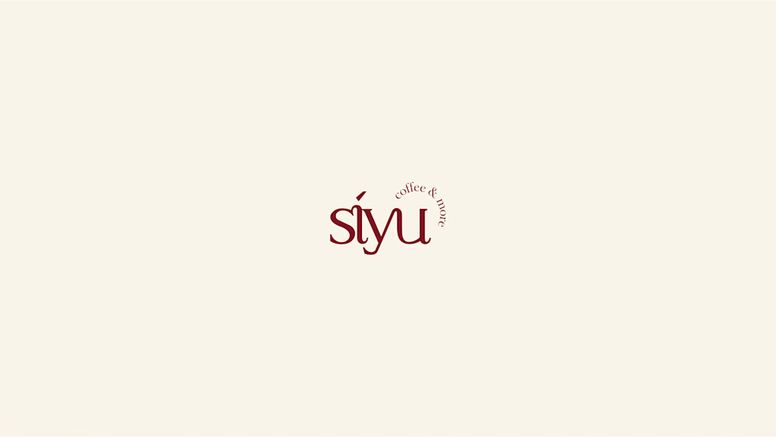
SIYU Coffee & More
A warm, vibrant brand identity created for SIYU Coffee & More, designed to give the brand a consistent, artisanal presence across its customer-facing touchpoints.
The identity
The visual system combines a distinctive logo with a lively color direction and supporting graphic elements. It was developed to feel approachable and memorable while giving the brand a cohesive foundation for everyday coffee-service use.
Brand applications
The identity extends into packaging, custom icons, and brand mockups, showing how the system can carry through physical and digital touchpoints without losing its character.
Deliverables
Brand identity and logo design
Color palette and visual direction
Packaging design
Custom icon set
Brand mockups and applications