The network for creativity
Join 1.25M professional creatives like you
Connect with clients, get discovered, and run your business 100% commission-free
Creatives on Contra have earned over $150M and we are just getting started
Back to feedPost

Figma to Motion UI Transformation
Project Overview
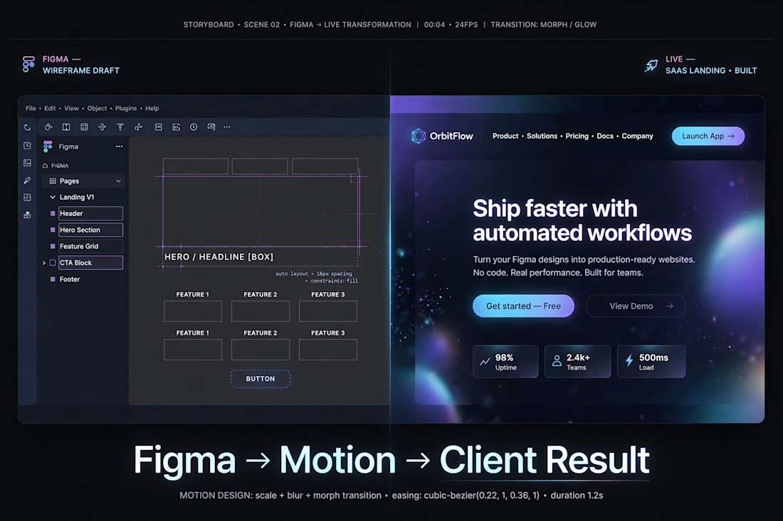
This concept demonstrates my workflow for transforming a simple wireframe into a polished SaaS landing page while keeping the design clean, scalable, and production-ready.
Instead of starting with colors and effects, I focused on structure first, then progressively added typography, spacing, visual hierarchy, branding, and motion-ready components.
The goal was to show how a rough layout can evolve into a premium interface suitable for modern SaaS products.
My Design Process
1. Planning the Structure
I started by creating a low-fidelity wireframe in Figma.
The objective at this stage was to solve layout problems before thinking about visuals.
I defined:
Navigation
Hero section
Feature cards
Call-to-action buttons
Statistics section
Footer hierarchy
Everything was built using Auto Layout and reusable components to keep the design responsive.
2. Building the Visual System
Once the layout felt balanced, I replaced placeholder boxes with actual interface elements.
I designed:
Typography hierarchy
Primary and secondary buttons
Feature cards
Icons
Navigation
Brand identity
Color system
The interface uses a dark theme with blue and purple gradients to create a modern SaaS aesthetic while maintaining readability.
3. Creating Visual Hierarchy
To guide users naturally through the page, I emphasized the most important content using:
Large headline
Strong CTA button
Supporting paragraph
Clean spacing
Consistent alignment
Contrast between background and content
This helps users immediately understand the product and the next action.
4. Preparing for Motion
The design was created with animation in mind.
Every section is separated into reusable layers so transitions can be animated smoothly.
Motion ideas include:
Morph transitions
Scale animations
Glow effects
Blur reveals
Button hover animations
Card entrances
Floating background particles
Because the layout is organized correctly in Figma, the design can move naturally into tools like After Effects, Framer, or web development without rebuilding the interface.
5. Final Outcome
The final result transforms a basic wireframe into a premium SaaS landing page that feels modern, interactive, and ready for production.
This workflow allows me to move efficiently from concept to polished design while maintaining consistency across every screen.
Tools Used
Figma
Auto Layout
Components & Variants
Design System
Typography Scale
Color Styles
Motion Planning
Skills Demonstrated
UI Design
UX Thinking
Wireframing
SaaS Landing Pages
Design Systems
Visual Hierarchy
Responsive Layouts
Motion-Ready Design
Interface Prototyping
Component-Based Design

The network for creativity
Join 1.25M professional creatives like you
Connect with clients, get discovered, and run your business 100% commission-free
Creatives on Contra have earned over $150M and we are just getting started
Trending

Claude
Claude has entered the design space. How are you using it?

Contra University
Learn from expert creatives how to earn more using next-gen AI tools.
Brand Design
The best brand designers are on Contra. Scroll to see what's trending in brand design. What are you building?
creativeaiflow
Creative AI workflows are evolving. What tools do you use, and what are their strengths and weaknesses?
freelancerlife
Freelancer life is wins, pivots, and everything in between. What’s yours right now?



Related posts

If you had to choose one option to present your brand without actually talking to the users, what would you choose?
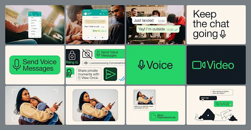
Lately, I've been pushing myself to explore what's possible with Figma Motion and see just how far I can take animations without leaving Figma.
I recently came across a really smooth WhatsApp animation and thought, why not recreate it? So I challenged myself to build it from scratch, paying close attention to the timing, easing, and micro-interactions.
It's been a fun way to learn, experiment, and sharpen my motion design skills.
How do you think it turned out? 👀
I'd love to hear your feedback!
23 voted
79%
6 voted
21%
29 votes
Closed

Animated visuals makes the user stay, while static will not attract much

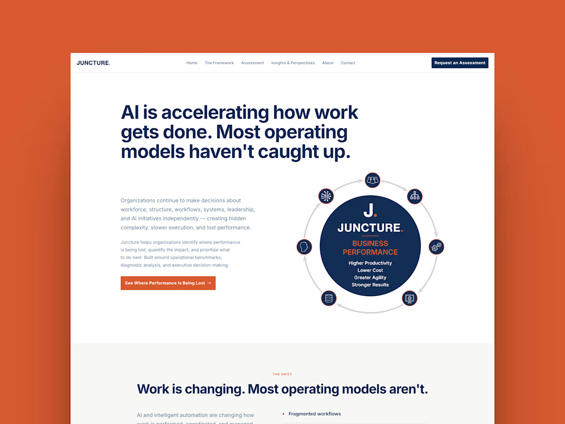
Juncture just went live 🎉
Full custom Framer build for an executive advisory firm — six pages, a custom interactive framework component, and an animated scoring system built as a native code component instead of a static graphic.
Wrote up the full case study, including the two places I pushed past the original brief and why:


Beautiful

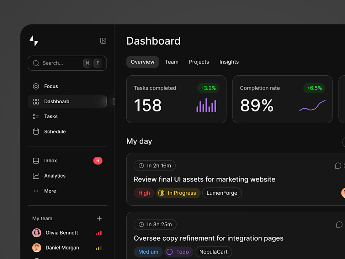
Project & Team Management Dashboard. 🚀
A dark-mode productivity dashboard designed for team collaboration and task management. It features high-level key metrics (tasks completed, completion rate, and pending reviews), a prioritized daily task list, team capacity indicators, and a real-time activity feed with recent team mentions.