The network for creativity
Join 1.25M professional creatives like you
Connect with clients, get discovered, and run your business 100% commission-free
Creatives on Contra have earned over $150M and we are just getting started
Back to feedPost

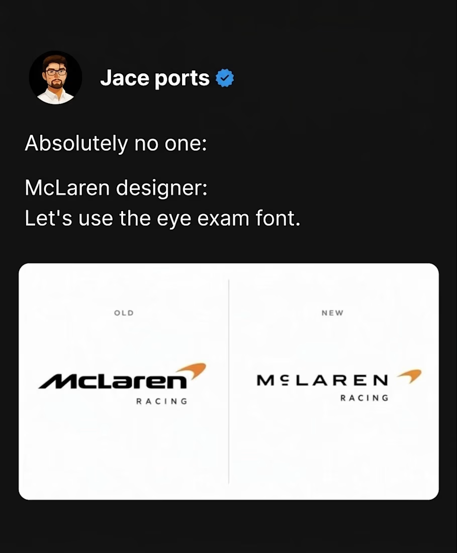
McLaren Racing: Old vs. New
Out with the italicized wordmark, in with the spaced-out, uppercase typography.
What’s your first impression of this rebrand? 🧠
#McLaren #McLarenRacing #Formula1 #F1 #LogoDesign #Rebrand #Branding #GraphicDesign #VisualIdentity #Typography #BrandIdentity #DesignCommunity #Contra:
The network for creativity
Join 1.25M professional creatives like you
Connect with clients, get discovered, and run your business 100% commission-free
Creatives on Contra have earned over $150M and we are just getting started








Related posts


One letter. Eight personalities. 🔤
I explored the letter S in 8 different directions: soft and rounded, sharp and angular, bold and blocky, and fast like a bolt.
Same letter, same white-on-black treatment. The only thing that changes is the character.
Each mark could suit a different kind of brand, from tech and sports to fintech and lifestyle.
Which S would you pick, and what kind of brand would it belong to? Drop the number below. 👇
Looking for a logo mark or a full brand identity? My services are on my profile.


S letter designs is the best ❤️
Great job Shahwaiz🔥🔥

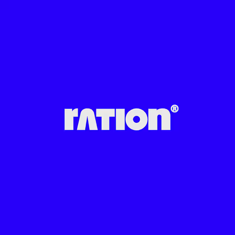
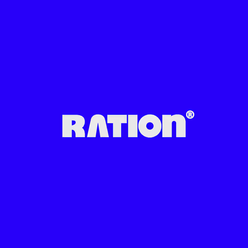
I’ve been working on a bold, modern-retro logotype and can’t decide between these two options.
🆘 Which one feels more aesthetically pleasing to you?

11 voted
26%
31 voted
74%
42 votes
Closed
CAPITAL is great but SMALL is unique great job Nawras 🔥🔥


A little excerpt from the brand guidelines for a recent project

The APS mark built from the four small symbols reads like a map legend, which suits a psychology service. Nice that the guidelines page shows it on the dark teal, most would have played it safe on white.