The network for creativity
Join 1.25M professional creatives like you
Connect with clients, get discovered, and run your business 100% commission-free
Creatives on Contra have earned over $150M and we are just getting started
Back to feedPost


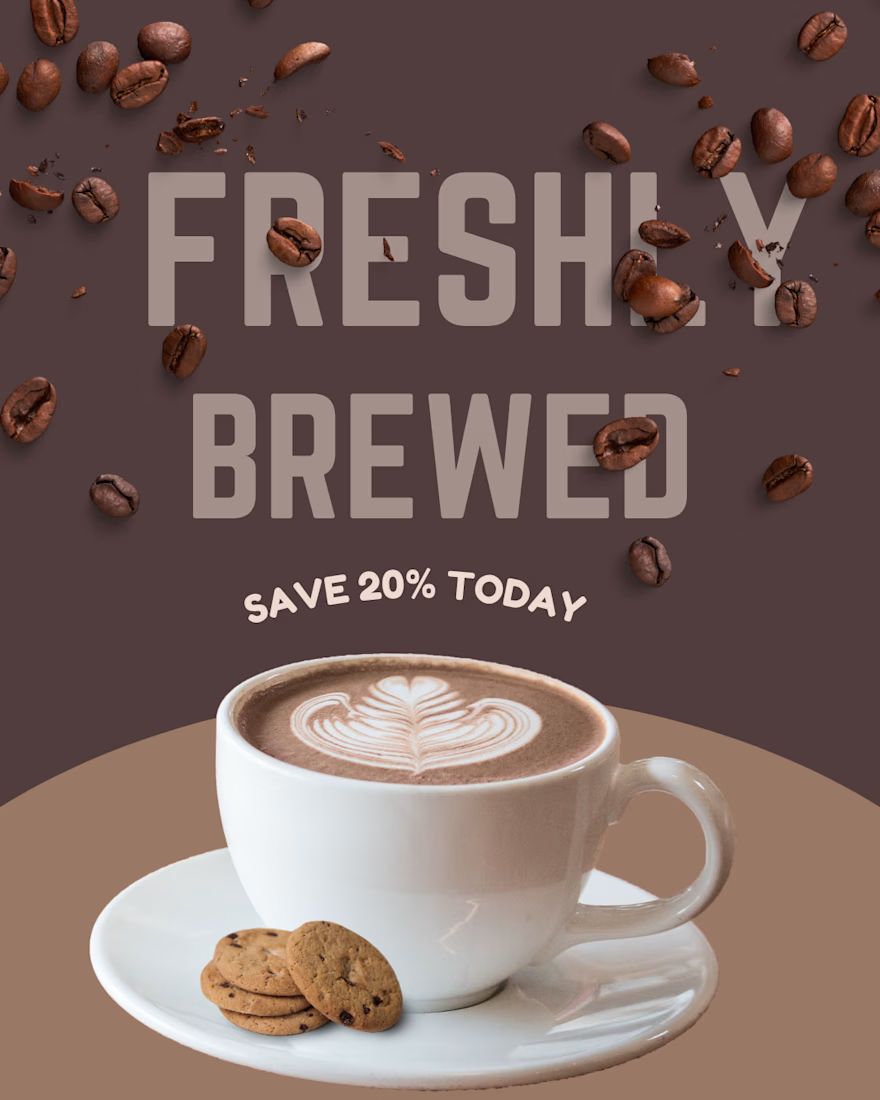
A fresh and elegant coffee design crafted with creativity in Canva.

The network for creativity
Join 1.25M professional creatives like you
Connect with clients, get discovered, and run your business 100% commission-free
Creatives on Contra have earned over $150M and we are just getting started








Related posts

From the cover to what’s inside 👀
Thank you to everyone who voted in my cover test. This time, I’m trying two short previews of DCS 654: my library of 654 dessert-inspired colors and matching textures, with ready-made palettes for your own design work.
Which video makes you more curious to explore the library: A or B?
And what made you choose that one?
You can take a closer look here: https://dcs.mariya.design/

36 voted
61%
23 voted
39%
59 votes
Closed


I’d pick B. It makes the colors and textures feel more engaging and makes me want to explore the full library.

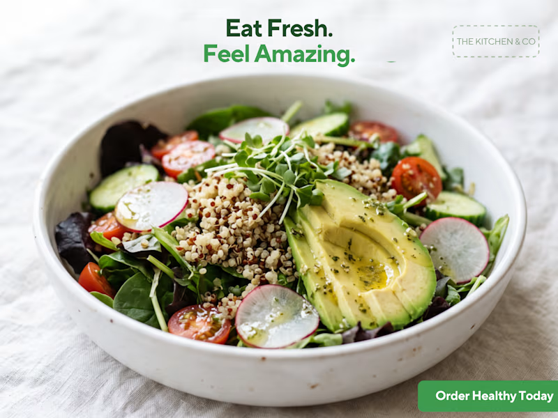
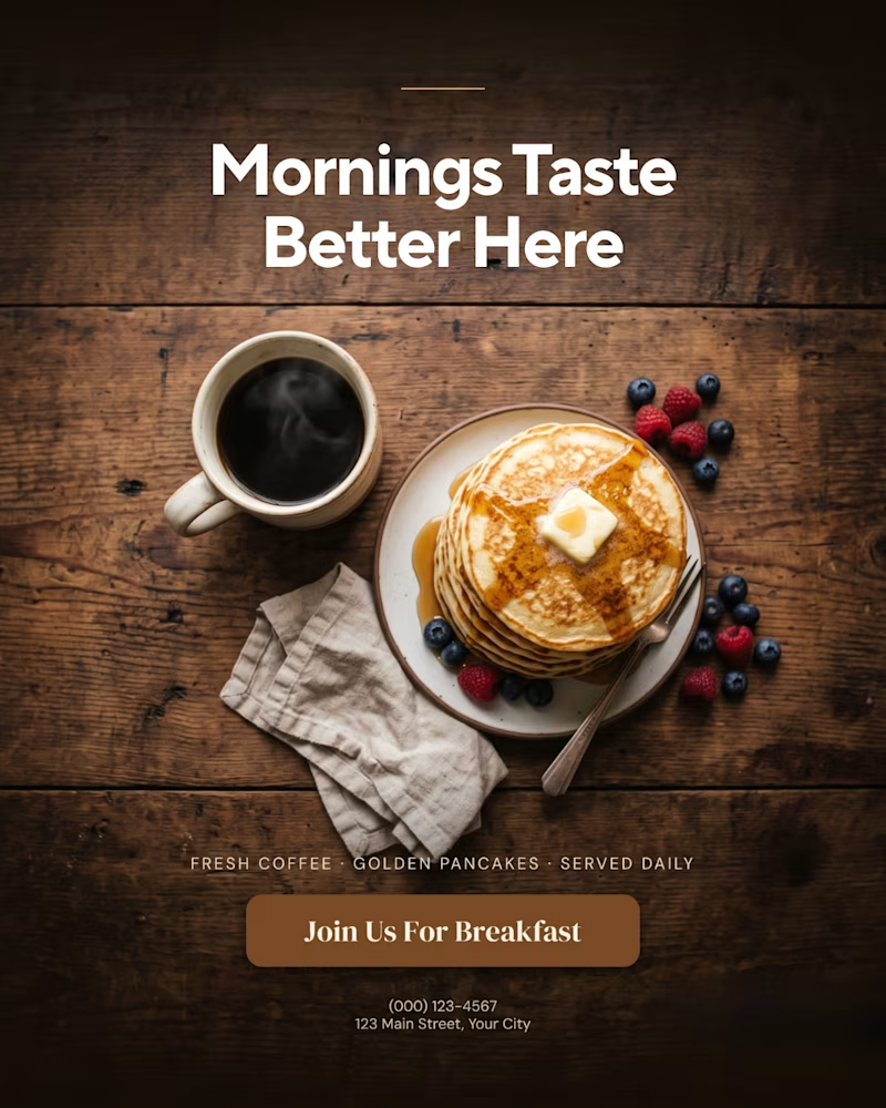
A creative food advertising design series focused on bold typography, visual hierarchy, and appetizing food photography.
The first design uses warm, rustic tones and expressive typography to create a cozy breakfast feel, while the second combines fresh green typography with a clean, modern layout for a healthy food concept.
Both designs explore how typography, color, and composition can communicate different food brand identities.
Which design do you prefer, the warm breakfast aesthetic or the fresh, minimal look?
1 voted
11%
8 voted
89%
9 votes
Closed

That is more attractive to me great job Malaika🎉🎉🎉

A product design project focused on creating a distinctive visual identity and a clear, professional presentation for the Agroxim brand.
Product and visual design
Layout and composition
Color palette and typography selection
Visual consistency and attention to detail
Preparing the final design for presentation
Tools & Software:
Adobe Illustrator · Adobe Photoshop · Adobe After Effect · Adobe Indesign
Focus:
Creating a visually appealing, professional design that communicates the brand's identity and helps the product stand out.


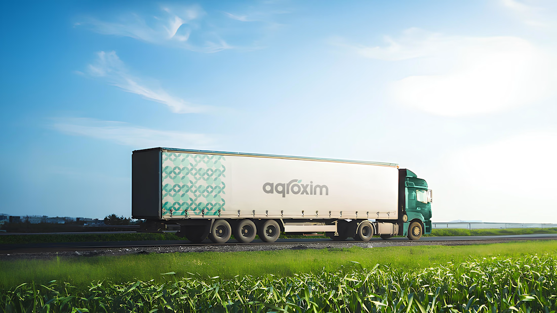
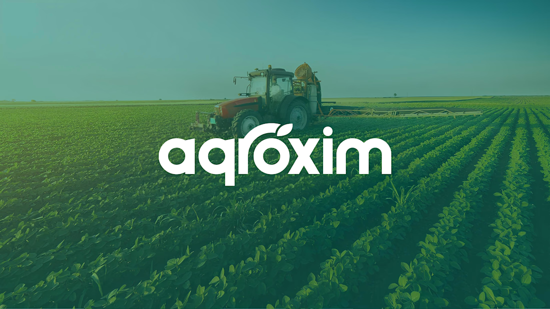

The agroxim wordmark sitting over that field photography is a lovely pairing, Sahib. Fresh greens really do the heavy lifting for an ag brand. Strong identity work.