The network for creativity
Join 1.25M professional creatives like you
Connect with clients, get discovered, and run your business 100% commission-free
Creatives on Contra have earned over $150M and we are just getting started
Back to feedPost
Taste Test
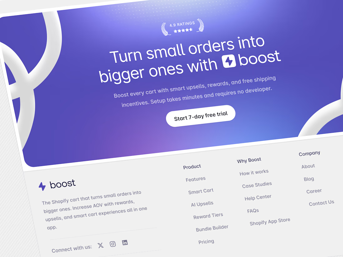
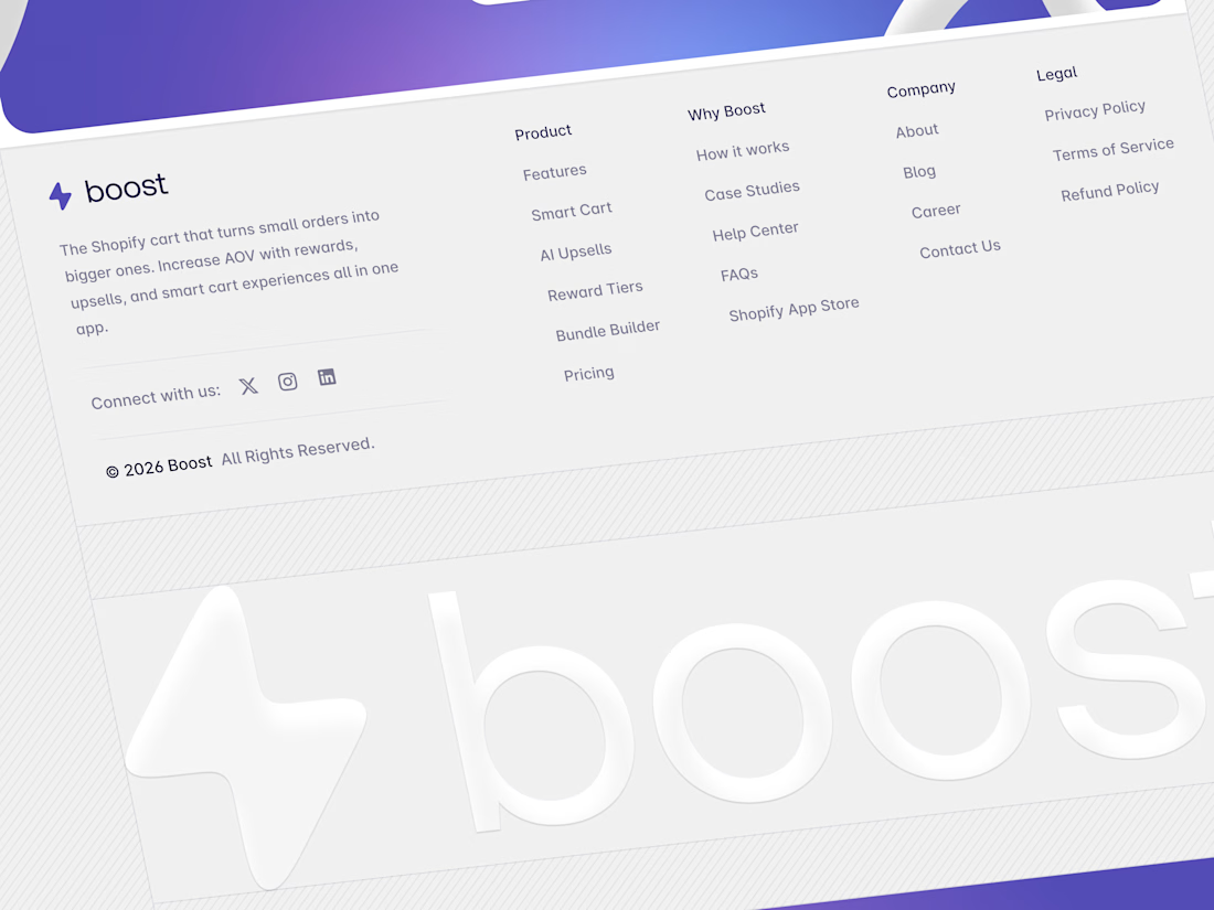
A simple upload page redesigned to an aesthetic feel . plz give your suggestions.

0 voted
0%
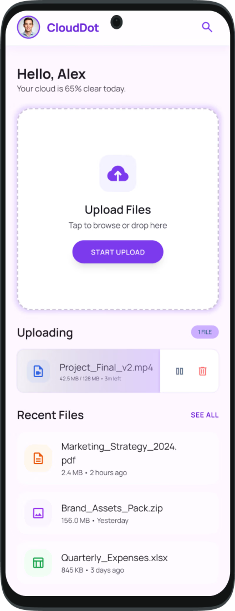
7 voted
100%
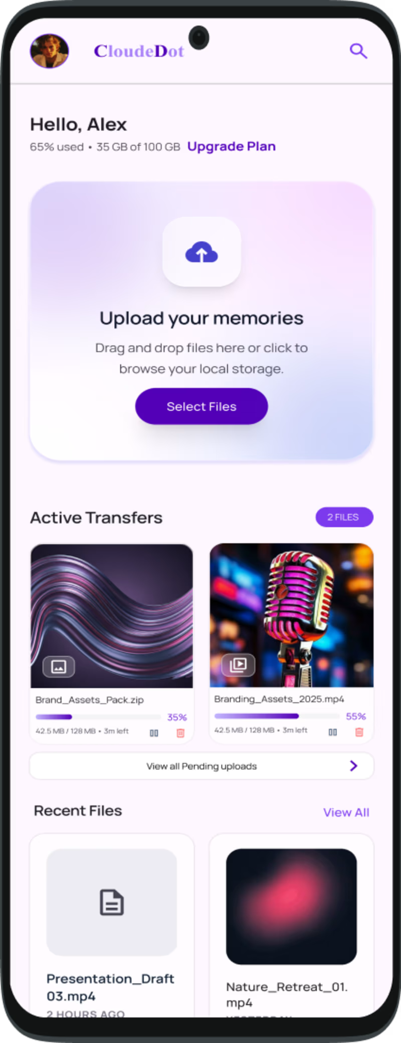
7 votes
Closed

Fresh and premium!

I like the direction of the new design—the visual hierarchy feels stronger, and the page has much more personality. My only suggestion would be to increase the spacing slightly and strengthen the contrast around the upload area so the primary action stands out immediately.

Thanks for the feedback . Will make sure to do that ☺️.
The network for creativity
Join 1.25M professional creatives like you
Connect with clients, get discovered, and run your business 100% commission-free
Creatives on Contra have earned over $150M and we are just getting started











Related posts

Poster Club turns a simple event template into your own print. I built two working Flutter versions and recorded the same editing flow in each.
Print Room: calm, editorial, with a mounted canvas and bottom tools.
Cutout Playground: bold, playful, with loose prints and tools at the edge.
Which one would you rather use?
What made the difference?
Grab it for free:
https://contra.com/products/cUHBysMu-poster-club-free-flutter-ab-ui-kit


37 voted
60%
25 voted
40%
62 votes
Closed

Print Room looks great!!


Brilliant work

looking for a great designer

