The network for creativity
Join 1.25M professional creatives like you
Connect with clients, get discovered, and run your business 100% commission-free
Creatives on Contra have earned over $150M and we are just getting started
Back to feedPost

Need inspiration for your next website?
Pure collects standout landing pages from across the web, making it easy to discover new layouts, styles, and design directions.
purelanding.page
Pure — Landing Page Design Inspiration
Daily landing page design inspiration featuring only the top designs in the industry.

The network for creativity
Join 1.25M professional creatives like you
Connect with clients, get discovered, and run your business 100% commission-free
Creatives on Contra have earned over $150M and we are just getting started





Related posts

Designed Oculus, a crypto dashboard where every tile is double-outlined, flat and unapologetically colorful.
Warm paper canvas, ink black anchors, mono micro-type, and an eye that follows your cursor.
Built with GSAP + Framer Motion. Light mode only, on purpose.
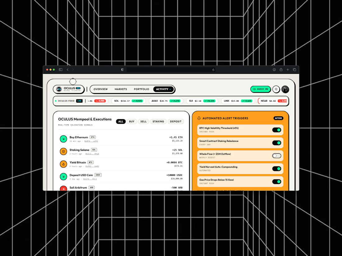
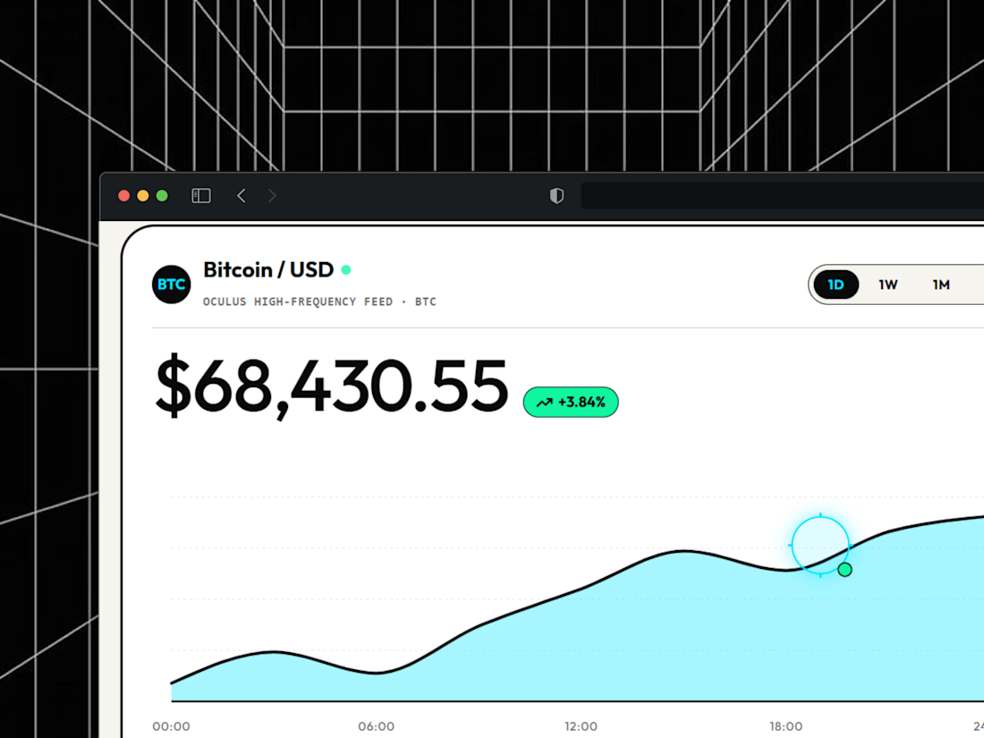
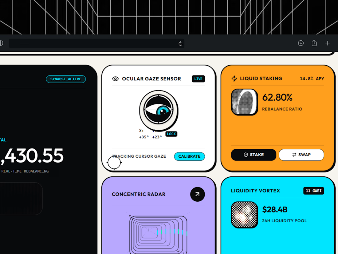

light mode only, on purpose. respect.


Badge Placement: Consistency or Visual Balance?
Even a small indicator can change how the entire interface feels
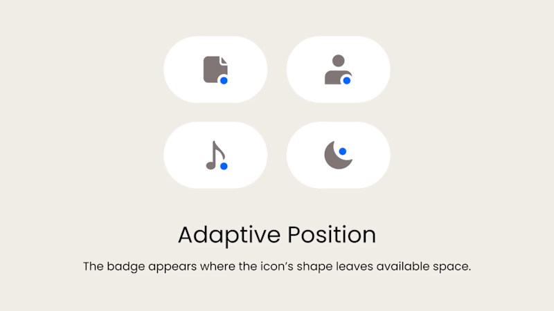
Adaptive Position
The badge placement changes depending on the icon’s shape and available space. The result feels more visually balanced but requires individual adjustments.
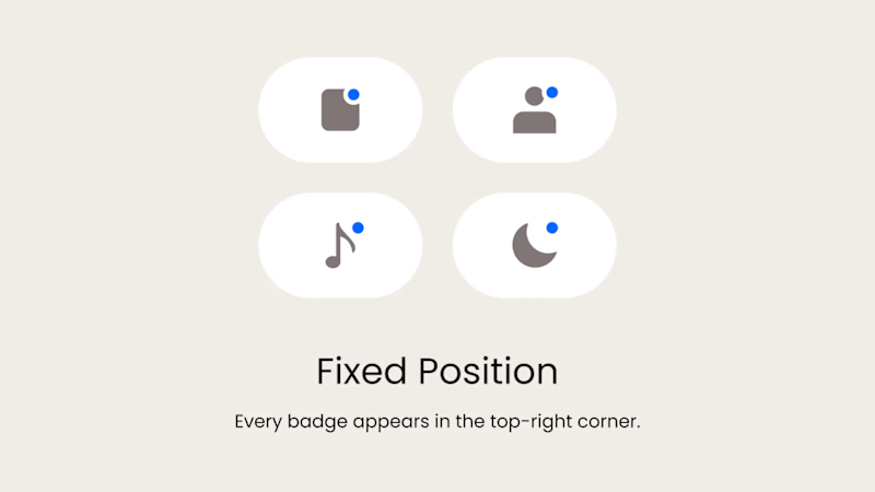
Fixed Position
The badge always appears in the top-right corner. This creates a consistent and predictable system, but on some icons it may feel disconnected or awkwardly placed.
What matters more in a design system: consistency or optical balance?
17 voted
43%
23 voted
57%
40 votes
Closed

Fixed for me. In a system, people learn where to look. I'd tweak the odd icons before breaking the rule.

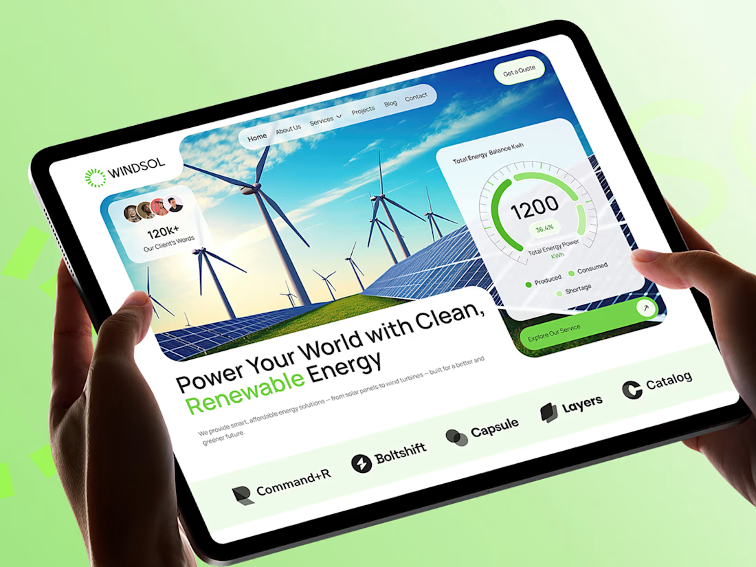
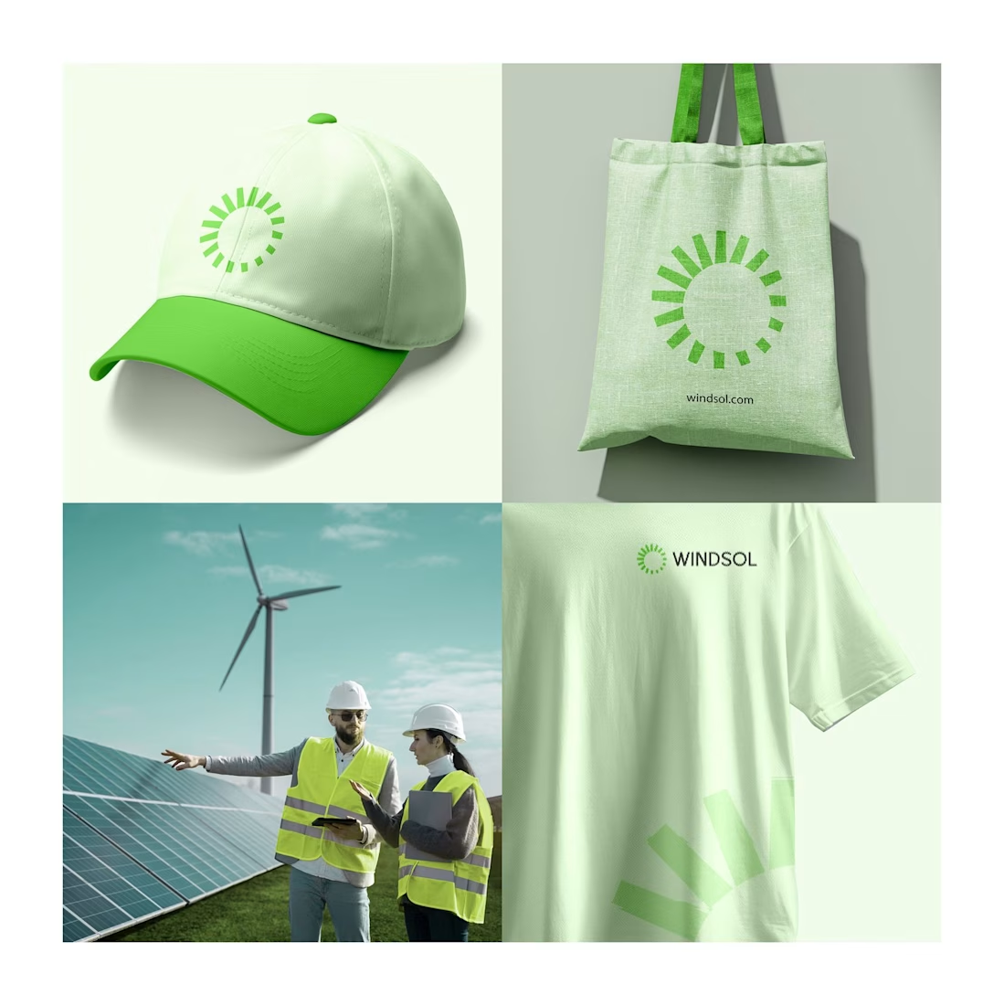
Windsol: a brand and website built to power the clean energy shift
Windsol is a renewable energy company covering solar and wind. We built the full identity and the website around one idea: clean energy should feel simple, bright and trustworthy.
The sun-ray symbol works across a cap, tote and tee, and the site turns live energy data into something people can read at a glance.
Which touchpoint do you think sells a brand best, merch or the website?