The network for creativity
Join 1.25M professional creatives like you
Connect with clients, get discovered, and run your business 100% commission-free
Creatives on Contra have earned over $150M and we are just getting started
Back to feedPost

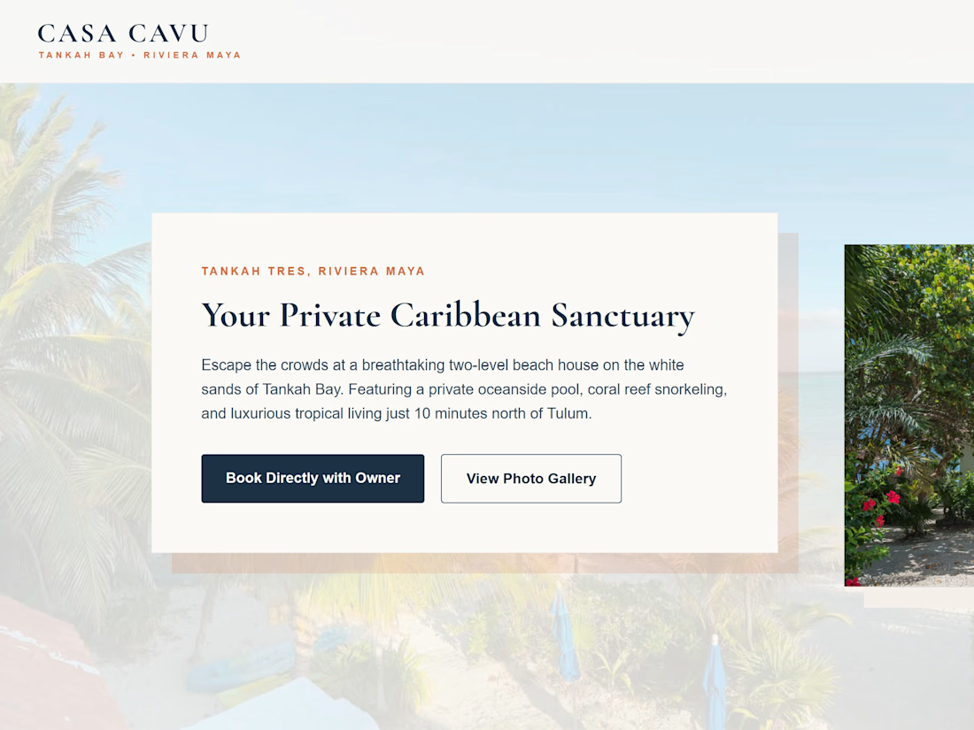
The Client Challenge An independent luxury estate owner in Tankah Bay wanted to bypass massive corporate listing fees (Airbnb/VRBO) and accept direct guest bookings. To establish trust and secure high-ticket vacation contracts, the property needed a premium digital storefront featuring a real-time reservation availability tracker that non-technical administrators could update with a single click. The Full-Stack Solution I handcrafted a custom, performance-optimized, responsive multi-page web platform from scratch, fully integrated with a cloud-based serverless relational database infrastructure.
Key features engineered:
✦ Automated Rolling Timeline Engine: Configured a side-by-side dual-month rolling calendar layout that automatically calculates the current month and year on load, dropping off historical dates automatically to remain 100% hands-free.
✦ Bulk Multi-Date Selection Matrix: Upgraded the administrative workflow so users can batch-select an infinite track of simultaneous dates concurrently, completely eliminating tedious day-by-day clicking.
✦ Parallel Promise Execution: Configured robust UI loading indicators ('Saving to Cloud...') and converted single database network requests into a highly optimized Promise.all queue to cut down bulk saving times over slow connections.
✦ Premium Non-Blocking UX: Replaced clunky native alerts with a sleek, custom-designed animated floating notification toast that glides out of view seamlessly.


The network for creativity
Join 1.25M professional creatives like you
Connect with clients, get discovered, and run your business 100% commission-free
Creatives on Contra have earned over $150M and we are just getting started


Challenges
View all


Related posts


Engaging website for a New York–based architecture and construction studio, balancing bold typography, immersive imagery and a minimal editorial layout.


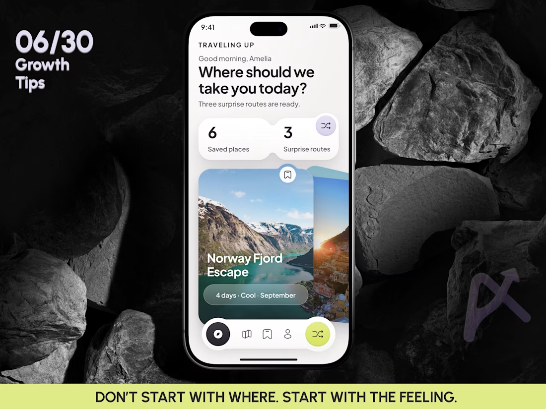
🧠 GROWTH TIP 06/30: DON’T START WITH WHERE. START WITH THE FEELING.
Most travel apps start with one question: “Where do you want to go?”
That works when the user already knows the answer. But a lot of travel discovery starts earlier, with a much less specific thought: I want to go somewhere, I just don’t know where yet.
That idea became Traveling Up, a travel randomizer concept.
Instead of asking users to work through dozens of filters, the product starts with just three signals:
🌍 how much time they have
🎭 how they want the trip to feel
☀️ what kind of climate they prefer
The destination stays a surprise.
Hypothesis: removing destination selection from the first step could move users faster from vague travel intent to genuine interest in one specific trip.
What I would test:
• Destination first search vs Mood first randomizer
• Randomize start rate
• Destination save rate
• Plan this trip CTR
• Time to first interesting destination
💡 Growth insight: in discovery products, uncertainty is not always friction. Sometimes it is exactly what creates curiosity and moves users toward the next action.
This concept came to me after a particularly inspiring trip. And I think it is the first mobile concept I have created purely for myself, rather than for a client project, in roughly three years.
So this one has a little more freedom, art direction, and product experimentation in it.
06/30 complete.
If you enjoy seeing mobile product experiments like this alongside the growth thinking behind them, follow along. And if this direction resonates, a reaction helps me understand which ideas are worth exploring deeper next.
#MobileAppDesign #TravelApp #TravelAppDesign #MobileUX #UXDesign #ProductDesign #GrowthDesign #TravelTech #InteractionDesign #UIDesign #ProductStrategy #MobileProduct #AsolDesign


Perfect

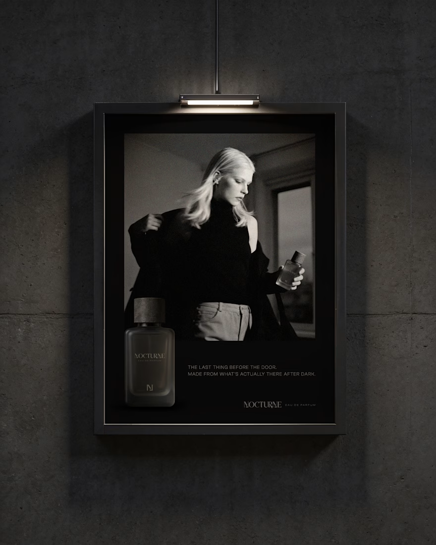
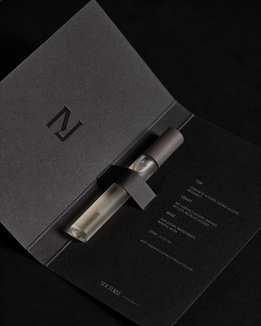
Nocturne is a self-initiated fragrance house I built from the ground up, treated with the same process I'd bring to any client: strategy first, then design.
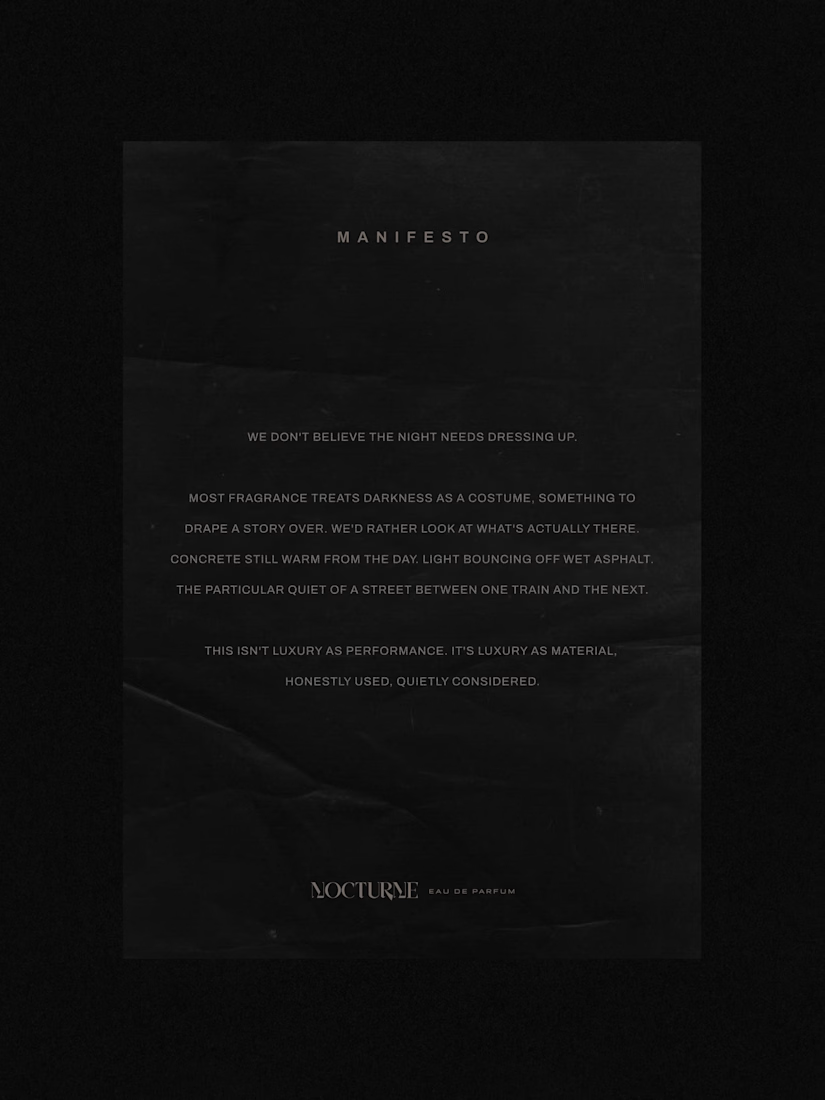
The brief was familiar: a fragrance inspired by the city after dark. Most fragrance branding solves that with common approaches such as moonlight, mystery, or gold foil details. I wanted to solve it with something more specific: what does after dark actually look like in an urban environment? Concrete, streetlight, wet pavement, the quiet stretch between one train and the next.
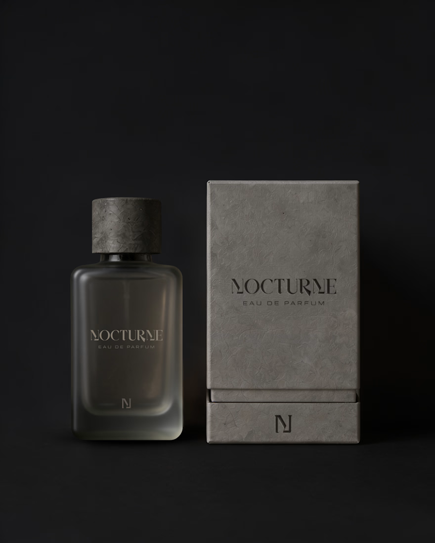
That question shaped everything downstream. An archetype chosen deliberately against category convention, Creator and Explorer rather than the more expected Lover or Magician. A material-first approach to the bottle and packaging. Sandblasted glass, a textured concrete-like cap, no gold, no ornament. And a running checklist I held every decision against throughout the project.
The case study covers the strategy behind Nocturne, not just the finished system: positioning, personality, the reasoning behind each material and typography choice, and how those decisions translated into the bottle, packaging, and campaign work.
I'd love to hear what you think, especially if you enjoy seeing the thinking behind a visual identity as much as the final result.



Good Work!