The network for creativity
Join 1.25M professional creatives like you
Connect with clients, get discovered, and run your business 100% commission-free
Creatives on Contra have earned over $150M and we are just getting started
Back to feedPost

1286 CRAFT | Design in Motion
From bold typography and experimental print textures to organic paper-cut compositions, this motion showcase explores how static graphic design transforms through movement.
Each animation brings a different visual language to life while preserving its original creative identity.
Three visual styles. One creative vision.
#1286CRAFT #MotionDesign #GraphicDesign #KineticTypography #VisualStorytelling #CreativeDirection


The paper cut compositions getting a slight bounce keeps that tactile vibe even when they move.
Thank you, Johnson! I wanted the motion to feel as tactile as the original paper-cut composition, so I kept the movement subtle and natural. Really appreciate you noticing those details!

Thank you so much! Really glad you enjoyed the paper-cut concept. Appreciate your feedback! 😊
The network for creativity
Join 1.25M professional creatives like you
Connect with clients, get discovered, and run your business 100% commission-free
Creatives on Contra have earned over $150M and we are just getting started





Related posts

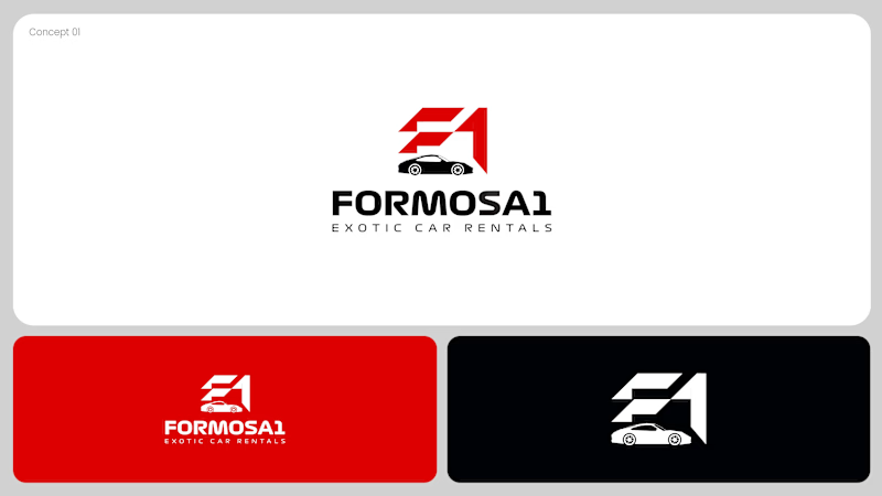
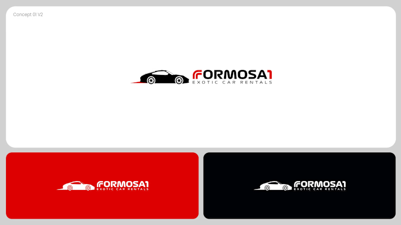
Two logo concepts for Formosa1 Exotic Car Rentals. Which one wins?
A: bold geometric F1 monogram, car tucked inside the mark. Strong and iconic.
B: car silhouette leads, red wordmark with a speed streak. Fast and clean.
Drop your vote 👇
17 voted
53%
15 voted
47%
32 votes
Closed

Both are great but I feel that was something special in the bottom one that's why I choose it❤️❤️

Another day, another inspiration. Lovely 🔥

Sharing a simple trick for transforming a video background:
Add a slow-shutter effect.
By turning the surroundings into long, curved motion streaks, you can transform an ordinary environment into a more abstract composition that adds another layer to the shot.
I applied the effect...

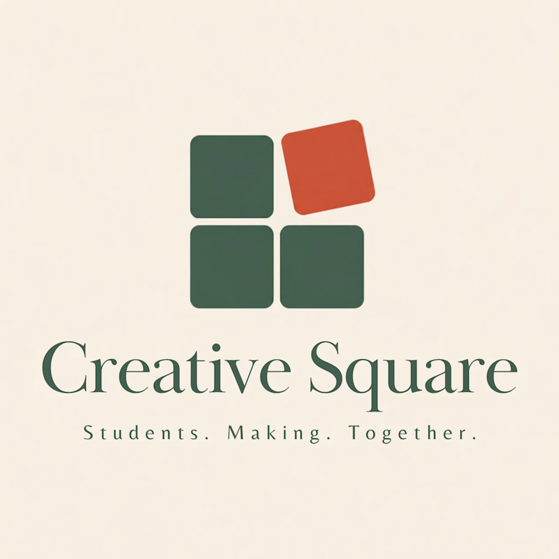
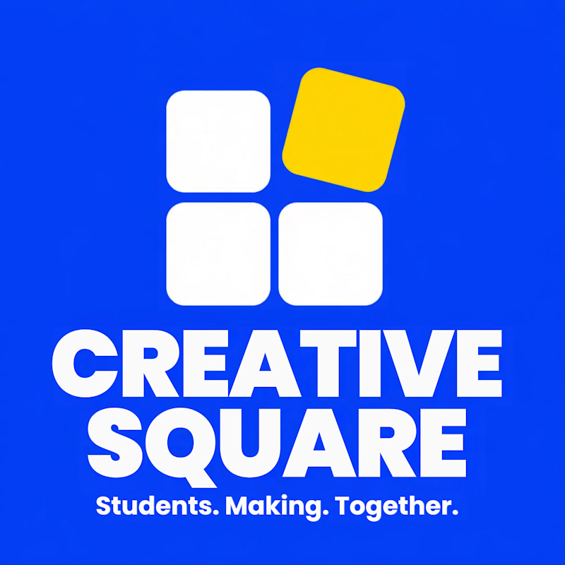
Meet Creative Square, a logo for university students. Same mark, two personalities: loud and energetic, or calm and editorial. Which one would you pick?
13 voted
48%
14 voted
52%
27 votes
Closed
The bold are so attractive that's incredible I choose it ❤️❤️