The network for creativity
Join 1.25M professional creatives like you
Connect with clients, get discovered, and run your business 100% commission-free
Creatives on Contra have earned over $150M and we are just getting started
Back to feedPost

Just finished designing “Bellori”, a cinematic web concept for an Italian restaurant focused on atmosphere, emotion, and immersive storytelling.
The idea was to create a digital experience that feels as warm and refined as the restaurant itself, blending editorial-inspired layouts, rich imagery, elegant typography, and subtle interactions to bring the brand to life.
For this project I focused on art direction with a luxury editorial feel, high-end aesthetic inspired by contemporary Italian hospitality and, most importantly, designing emotion and not just navigation in mind.
Full project: https://belloripizzeria.framer.website/
Would love to hear your thoughts! 🙌
#webdesign #uidesign #uxdesign #restaurantdesign #branding #behance #figma #webinspiration #luxurybranding #digitaldesign #artdirection #restaurantwebsite #creativeportfolio #interactiondesign #editorialdesign


The network for creativity
Join 1.25M professional creatives like you
Connect with clients, get discovered, and run your business 100% commission-free
Creatives on Contra have earned over $150M and we are just getting started



Related posts


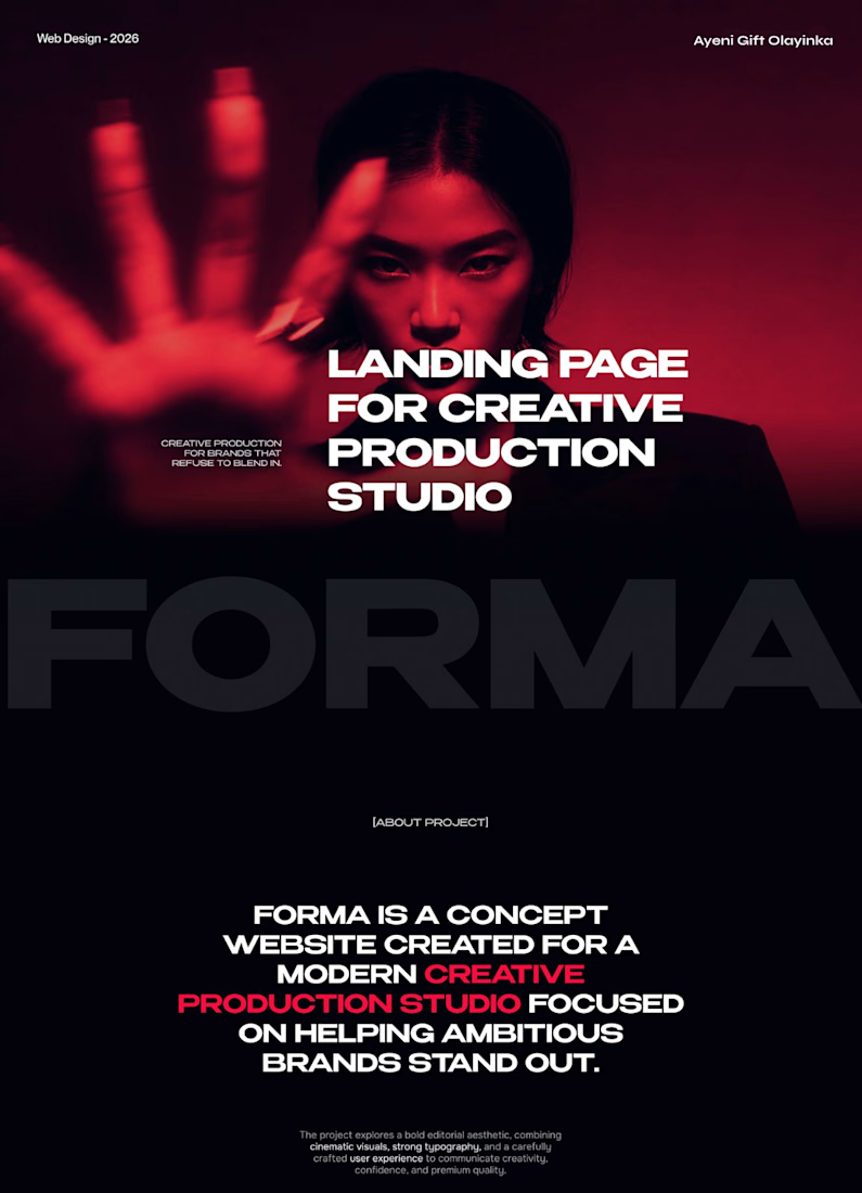
A bold, modern landing page for a creative agency, built around immersive visuals and strong typography. We’d love to hear your thoughts!


FORMA | Creative Studio Website Design
A bold, cinematic website concept for a modern creative production studio.
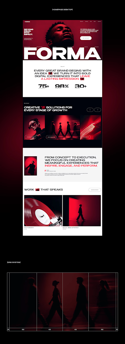
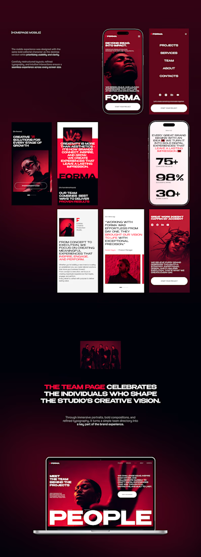
FORMA is a concept website that shows how strategy, design, and digital production come together in one immersive brand experience. The design is built on three things:
Editorial layouts that give the content room to breathe and set a confident, magazine-style rhythm
Cinematic red-lit photography that gives the brand a dramatic, memorable visual identity
Expressive typography that carries the studio’s voice and guides the eye through each section
The goal was a site that feels like the studio’s work: striking, intentional, and made to leave an impression.
My role: UI/UX Design, Visual Direction, Landing Page Design
Tools: [Figma / Photoshop / etc.]
#CreativeAgencyWebsite #CreativeStudio #LandingPage #WebDesign #WebsiteDesign #UIUX #UIDesign #EditorialDesign



Cool direction for the studio.

Photographer Portfolio Website
"Capturing light, emotion, and the moments you never want to forget." That line set the tone, and the layout follows it.
The hero is one motion-blurred portrait washed in red. The photographer's name runs across the bottom in a condensed white face, so large the screen cuts it off. The photo keeps its soft focus, and the name still reads first.
Thin grid lines split the page into narrow columns, and the small copy sits justified inside them. The loose photo gets a strict structure to lean on.
A single round red button with an arrow sits right on the letters and marks where to go next.
Designed by the Hue & Machine team.
#WebDesign #Photography #PortfolioWebsite #EditorialDesign #Typography #UIDesign #ProductDesign #CreativeDirection #ResponsiveDesign #FigmaDesign


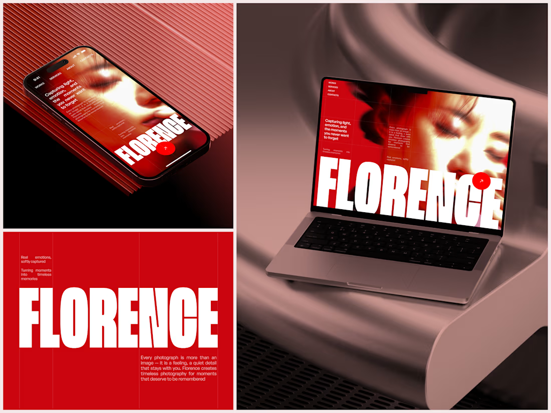

The heavy condensed white FLORENCE over the red portrait is bold, and keeping the same red across phone, laptop and type tile makes the case study read as one system. Did the red come from the photographer's own work, or was it your call?


