The network for creativity
Join 1.25M professional creatives like you
Connect with clients, get discovered, and run your business 100% commission-free
Creatives on Contra have earned over $150M and we are just getting started
Back to feedPost



Amazing product.

Thanks Yurii🫶

😍 👍

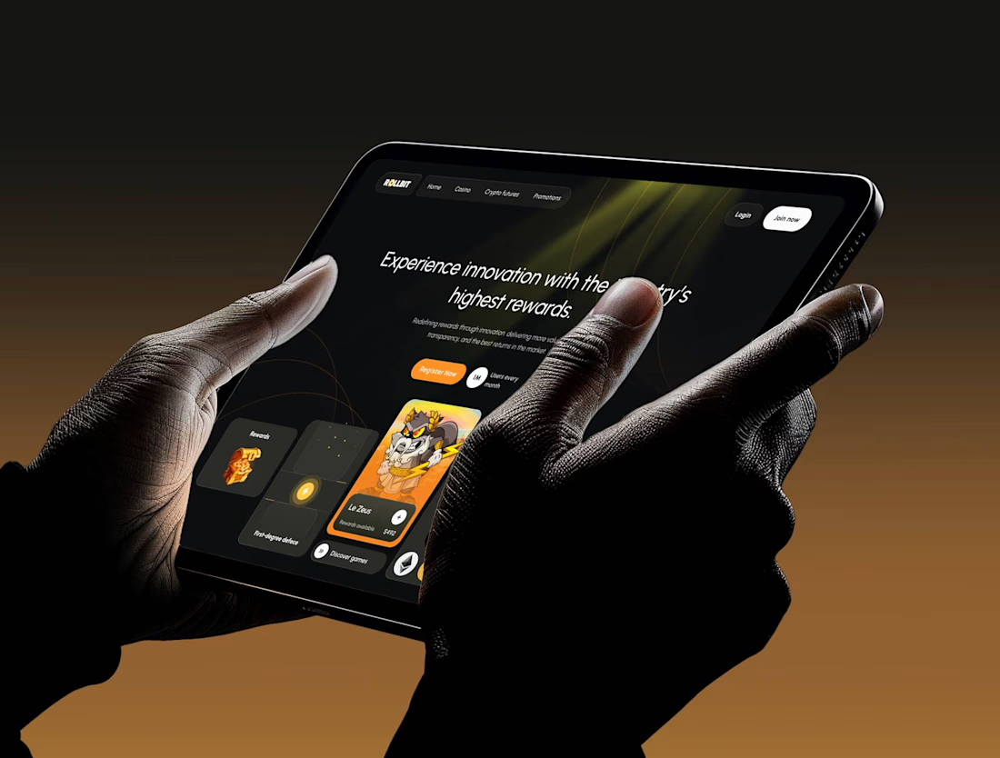
love the naturally invigorating vibe that the orange-yellow gradient accents bring into your design!
Thanks Nicolette!🫶

Nice concept, - well done!
Thanks a lot!🌸
The network for creativity
Join 1.25M professional creatives like you
Connect with clients, get discovered, and run your business 100% commission-free
Creatives on Contra have earned over $150M and we are just getting started







Related posts

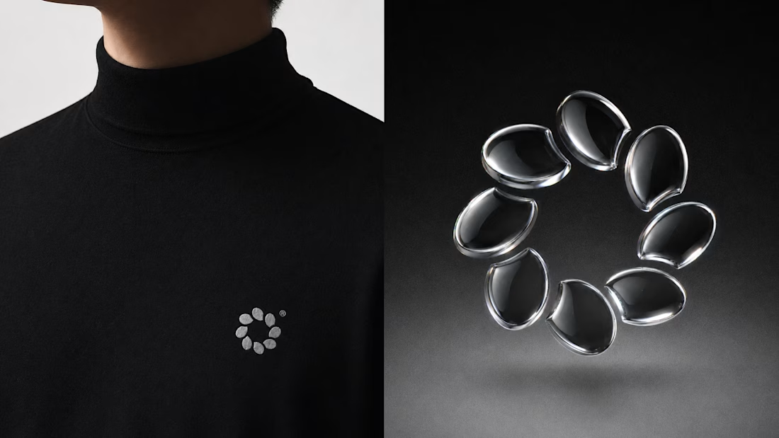
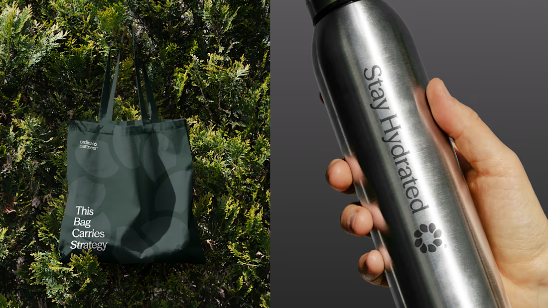
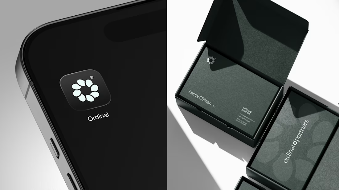
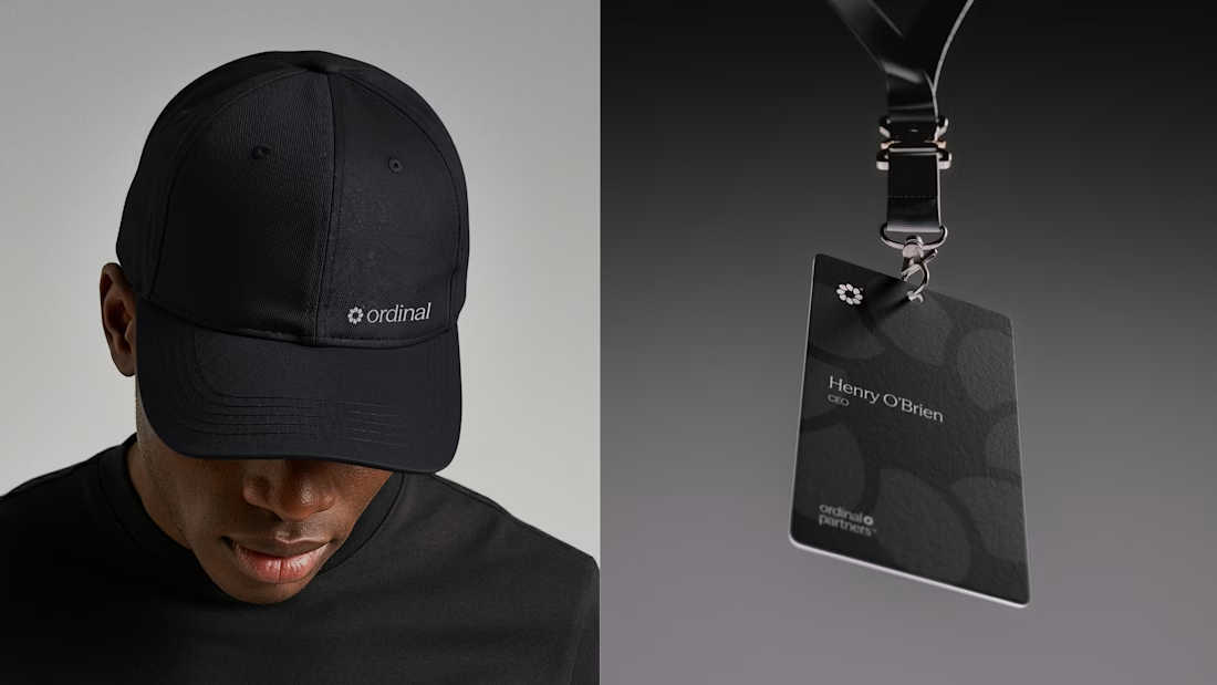
One brand, three different directions.
Sharing some of the logo exploration for Ordinal Partners.

Visually appealing 🔥


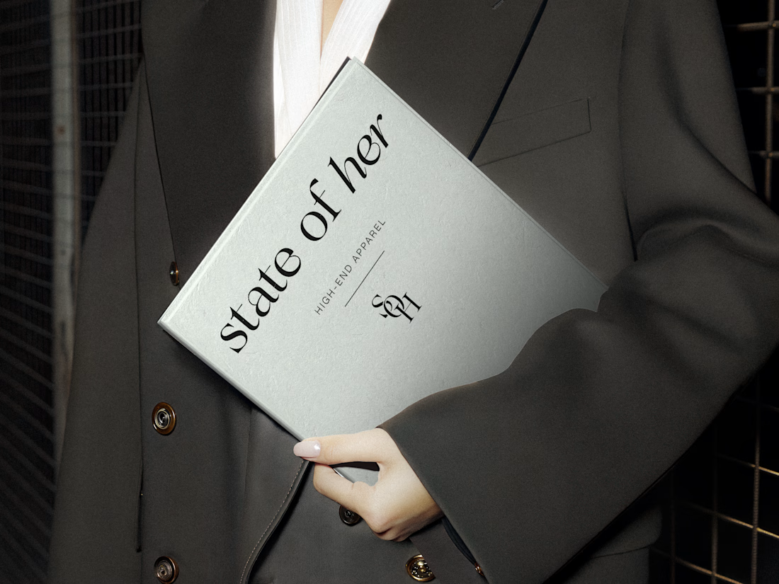
Introducing State of Her, a womenswear brand made for every state of her life.
Custom typography, sculptural monograms, and a softly grounded palette come together in an identity that balances confidence with ease.

🌸 A little more calm, a little less noise.
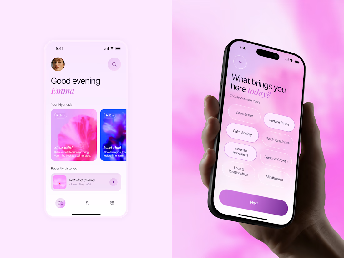
Meet Inner Bloom — a hypnosis app concept designed to help people sleep better, reduce stress, and feel more confident.
For this project, I explored a softer visual direction with dreamy pink and lilac tones, frosted glass, and floral imagery to create a calming experience that feels warm and personal.

Great concept with soft colors ❤️🎉