The network for creativity
Join 1.25M professional creatives like you
Connect with clients, get discovered, and run your business 100% commission-free
Creatives on Contra have earned over $150M and we are just getting started
Back to feedPost

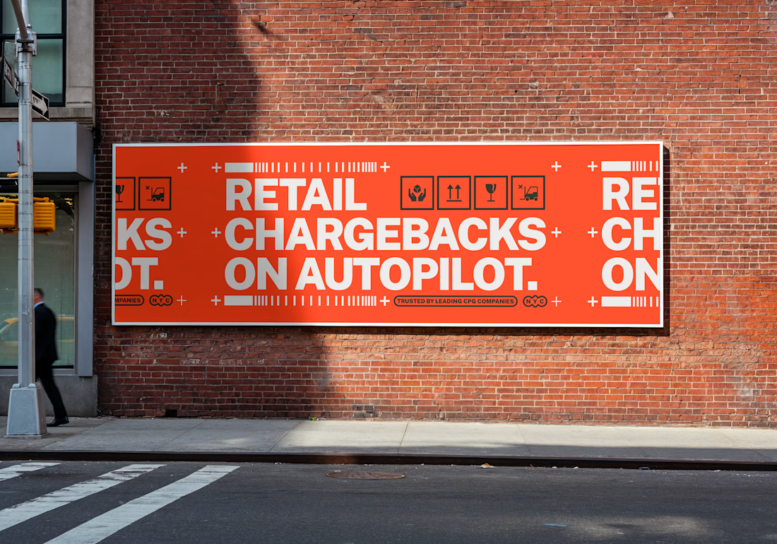
from the work we did with RetailPath.

The network for creativity
Join 1.25M professional creatives like you
Connect with clients, get discovered, and run your business 100% commission-free
Creatives on Contra have earned over $150M and we are just getting started

Challenges
View all


Related posts

How do you make a beauty Shopify store feel premium without sacrificing conversion?
That was one of the questions behind my work on BLOME Beauty.
I focused on creating a shopping experience where brand storytelling, product education, trust signals, and conversion paths work together not compete with each other.
From product discovery and visual hierarchy to CTAs, social proof, mobile responsiveness, and the path toward checkout, every section was designed with the customer journey in mind.
The goal wasn't just to make BLOME look beautiful. It was to make the experience easier to understand, navigate, and buy from.
Built with Shopify.


Beauty is the category where product education usually loses to the aesthetic. Curious how you handled ingredient/claim detail on the PDP itself, woven into the page, tucked into an expandable section, or pushed to a separate guide? That's usually the tradeoff between a store...

Hello everyone, I worked on a kid's store.
A platform where one can buy kiddie's toys and all.
The mindset was having a store that has the feel of kids.
- Colorful
- Vibrant
- Clear
- Simple
No need for extras.
What love to hear your thoughts.


The product tiles stay simple so the color can carry the kid energy. Those story stages read like a play sequence, which fits a toy shop without extra decoration.

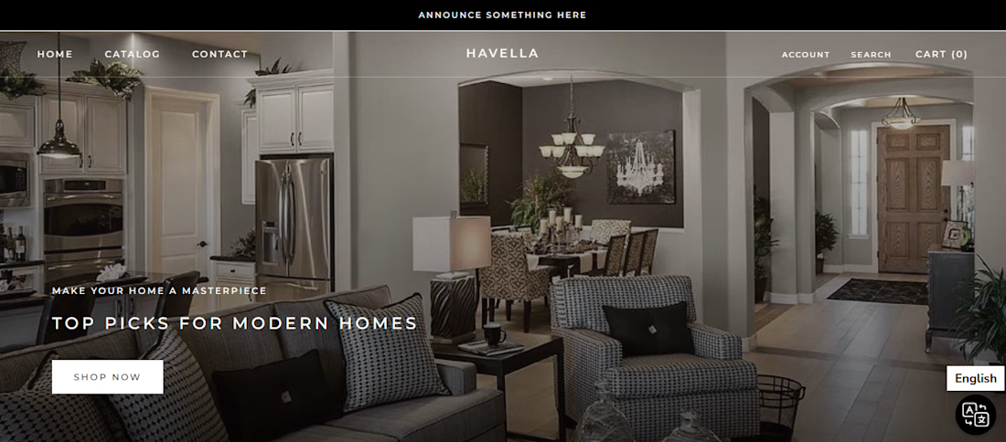
Designed and lauched a premium, responsive Shopify e-commerce storefront for a modern hoome decor and interior design brand.