The network for creativity
Join 1.25M professional creatives like you
Connect with clients, get discovered, and run your business 100% commission-free
Creatives on Contra have earned over $150M and we are just getting started
Back to feedPost

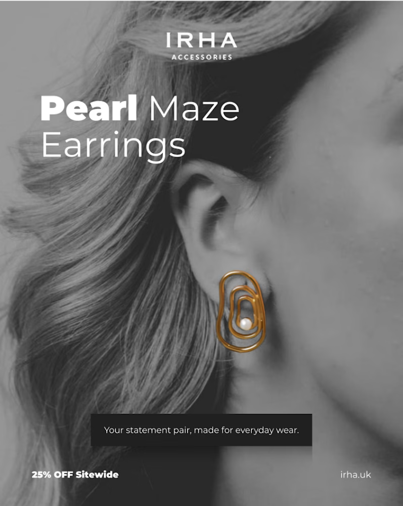
Working on this design for IRHA Accessories was a fun exercise in keeping things simple while letting the product stand out. ✨
I used black-and-white photography to create contrast, allowing the gold tones of the Pearl Maze Earrings to catch the eye. The bold typography highlights the product name, while the minimal layout keeps the focus on the jewelry.
I love how a few thoughtful design choices can give a product graphic such a distinct look.
What do you think of this black-and-white approach with a pop of gold? 💛
The network for creativity
Join 1.25M professional creatives like you
Connect with clients, get discovered, and run your business 100% commission-free
Creatives on Contra have earned over $150M and we are just getting started



Related posts


Which homepage would make you more likely to explore the platform?
HackStack features bold typography, teal gradients, and a centered layout focused on AI tools and automation. DataVistaHQ uses purple accents, a split layout, and a prominent dashboard preview to introduce its business intelligence platform.
I would like your perspective on the visual design, clarity, and first impression. Which approach communicates its value more effectively and makes you want to take the next step?
Vote for your preferred design and share what influenced your choice: the colors, headline, layout, dashboard preview, or overall presentation.
#WebDesign #AIWebsites #UIUXDesign #SaaSDesign #TransformedDesign


2 voted
17%

10 voted
83%

12 votes
Closed

Visually, I lean toward DataVistaHQ, but the cognitive load is really high. The value proposition and the stats feel like they're competing for attention.
On the other hand, HackStack has a much better visual hierarchy. The value proposition and CTA group immediately give me a...

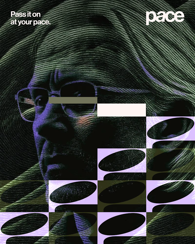
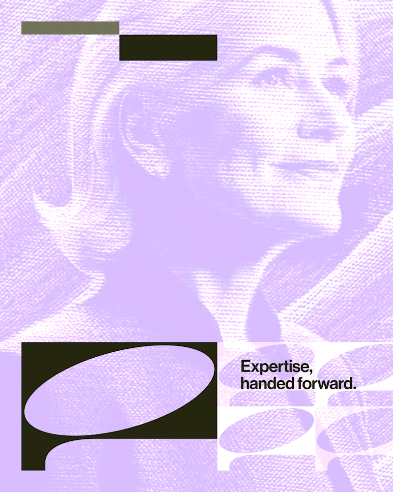
Experimental layouts for Pace. Which one do you like?
23 voted
52%
21 voted
48%
44 votes
Closed

Looks cool.

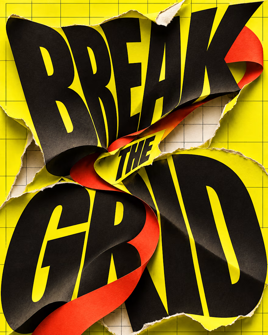
What happens when typography refuses to stay inside the grid?
BREAK THE GRID — an AI-generated visual experiment combining oversized lettering, torn-paper textures and bold colour. The words become the action: bending, tearing and breaking through the layout.
Controlled structure or creative chaos—which draws you in?