The network for creativity
Join 1.25M professional creatives like you
Connect with clients, get discovered, and run your business 100% commission-free
Creatives on Contra have earned over $150M and we are just getting started
Back to feedPost
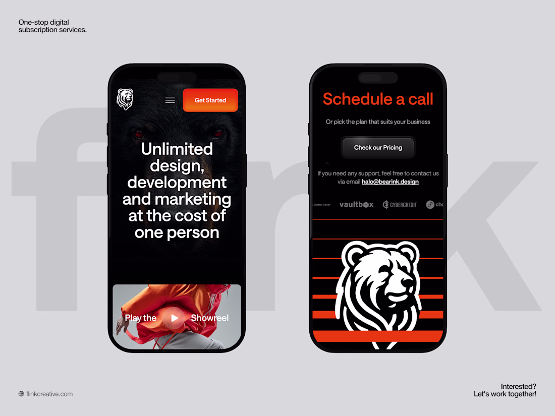
Flink Creative - Mobile Responsive
The mobile experience is crafted to feel premium yet effortless, with a bold hero, clear typography, and flow optimized for thumbs. Navigation tucks neatly into a compact menu, while primary CTAs stay highly visible, making it easy for busy founders to explore unlimited design, development, and marketing services on the go.
The layout keeps the signature branding and strong contrast intact, ensuring the visual identity remains instantly recognizable even on smaller screens.
The network for creativity
Join 1.25M professional creatives like you
Connect with clients, get discovered, and run your business 100% commission-free
Creatives on Contra have earned over $150M and we are just getting started
Related posts
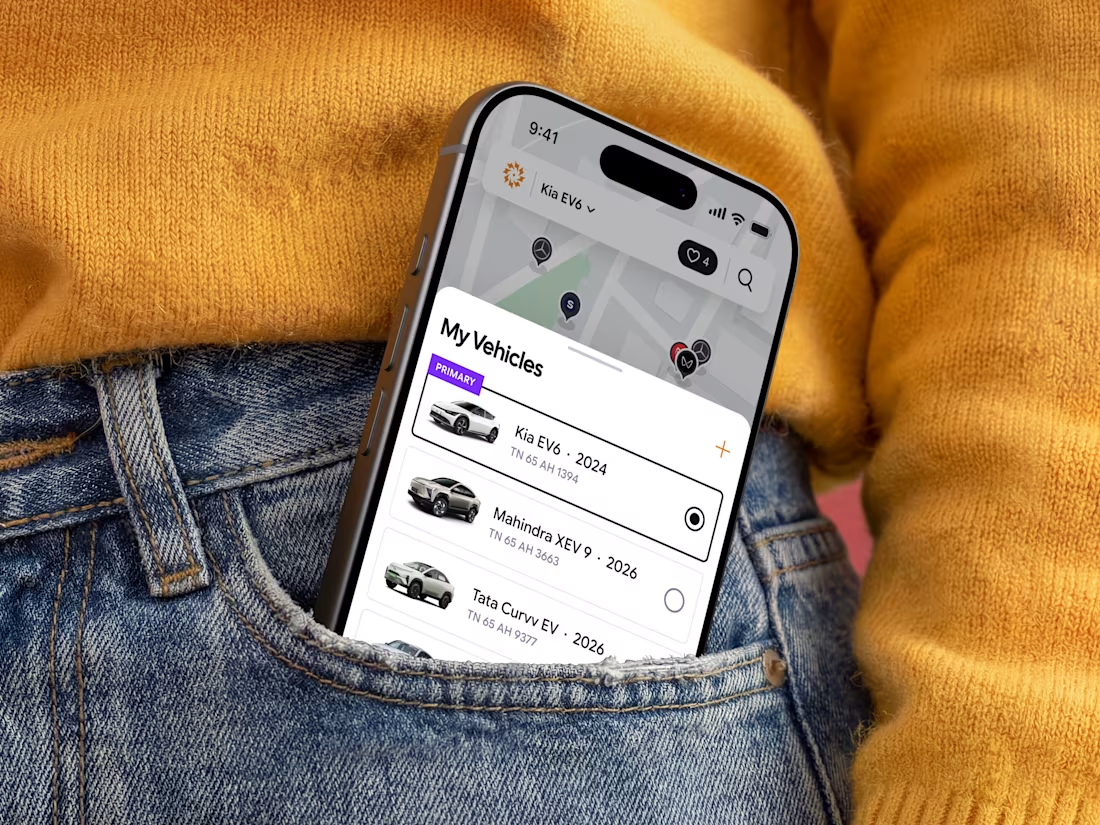
⚡ Just published my latest case study: ChargeIndia.
Branding and Mobile app for an EV charging platform focused on creating a seamless, scalable, and user-friendly charging experience.
Proudly made for the Indian market.
Amazing work!
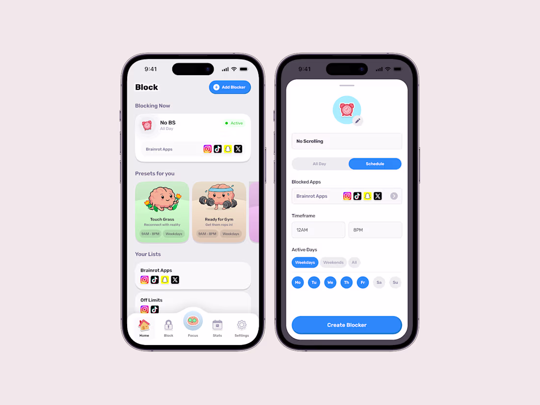
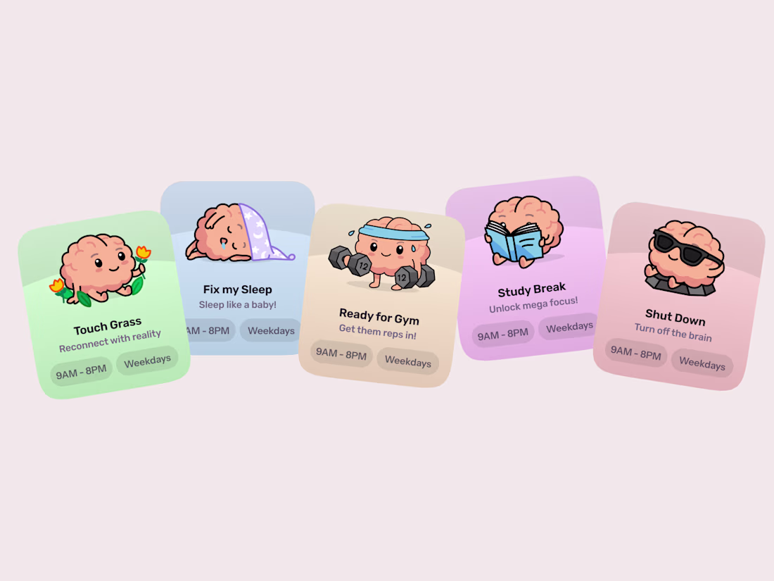
No screentime app could exist without a few blockers! Brainrot lets you pick preselected blockers, each provided with a cute brain, or make your own ones!
Nice
Another project wrapped up! 🙌
I recently designed this homepage with a focus on simplicity, clarity, and creating an engaging user experience. It's always exciting to see ideas evolve into polished interfaces.
Would love to hear your thoughts!
Trending
Claude
Claude has entered the design space. How are you using Claude Design?
Contra University
Learn from expert creatives how to earn more using next-gen AI tools.
creativeaiflow
Creative AI workflows are evolving. What tools do you use, and what are their strengths and weaknesses?
freelancerlife
Freelancer life is wins, pivots, and everything in between. What’s yours right now?