The network for creativity
Join 1.25M professional creatives like you
Connect with clients, get discovered, and run your business 100% commission-free
Creatives on Contra have earned over $150M and we are just getting started
Back to feedPost
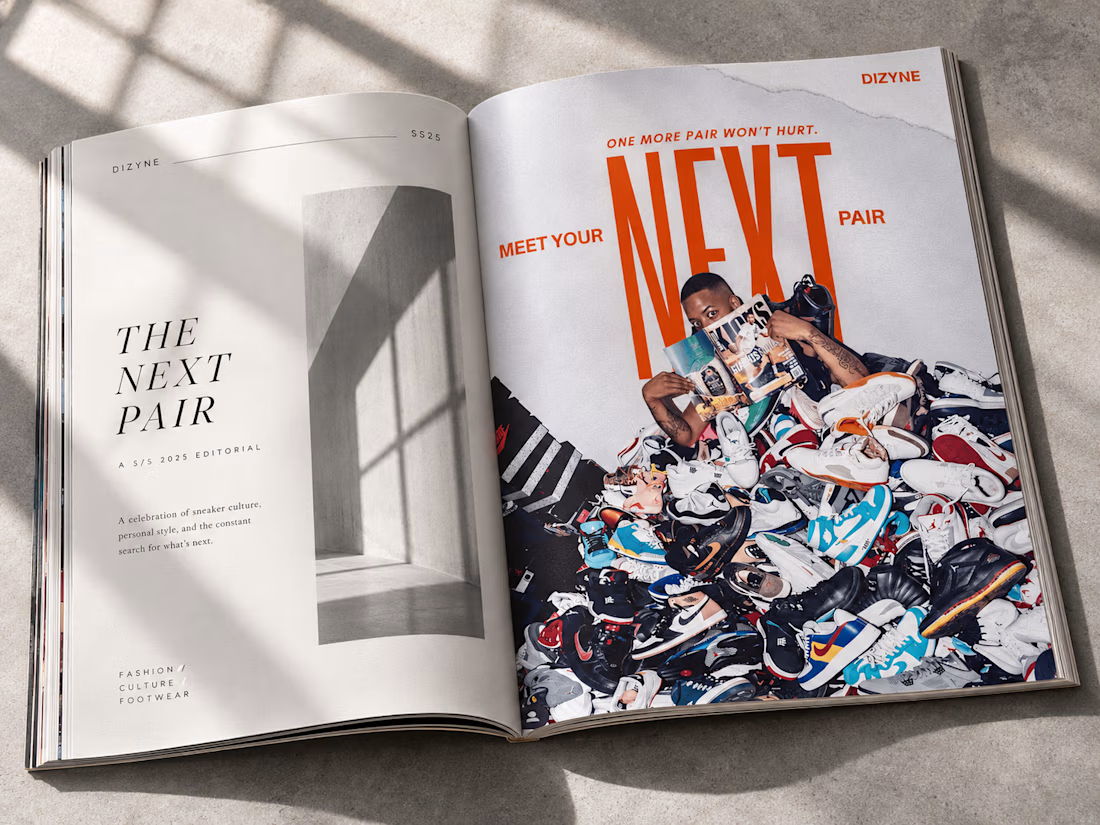
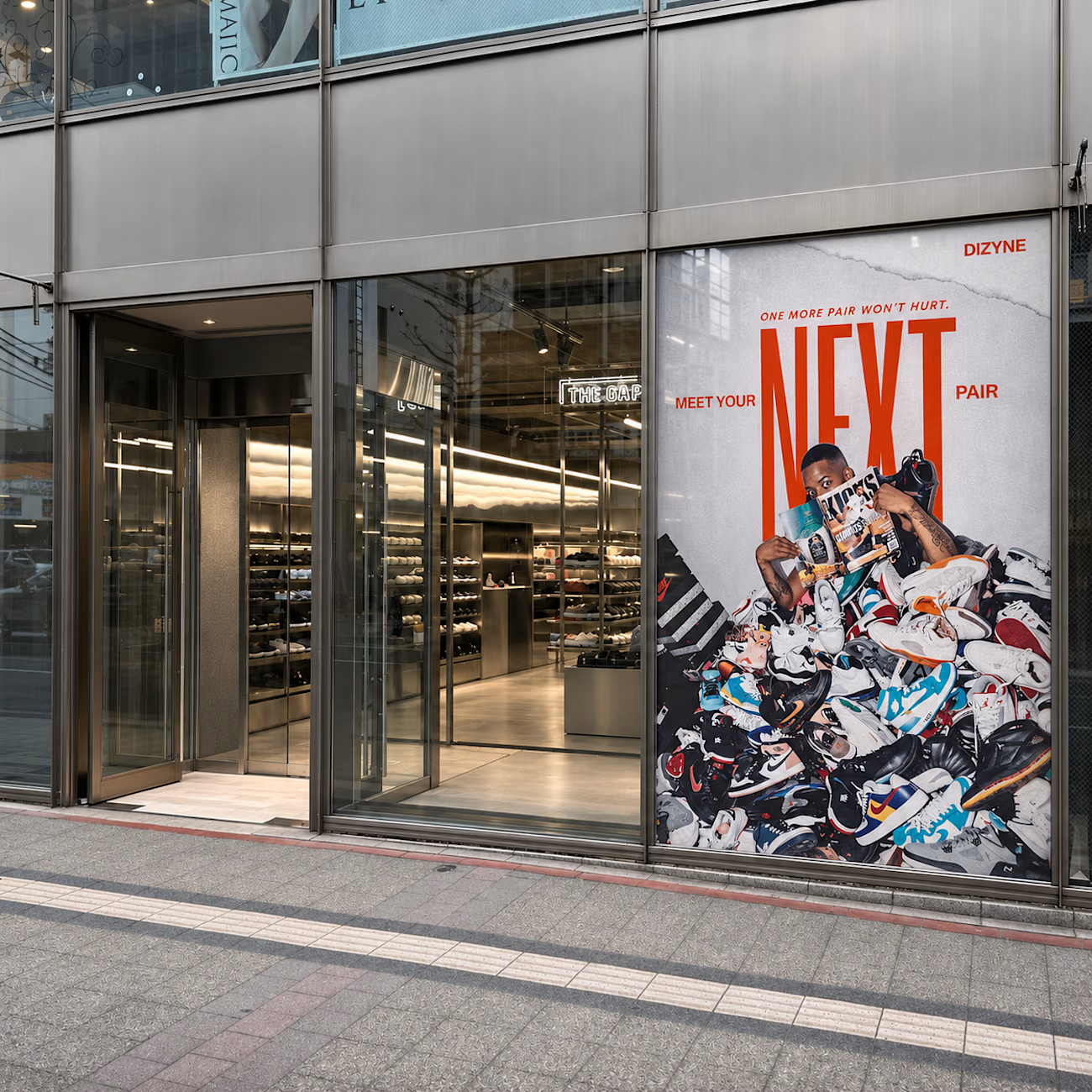
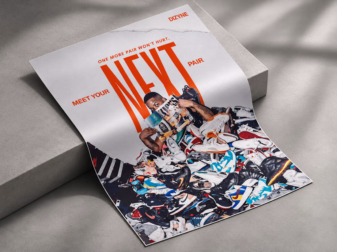
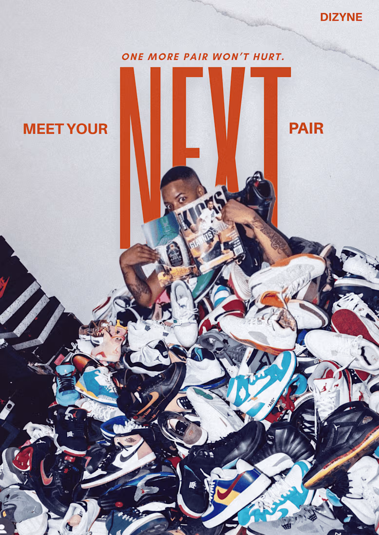
This week I designed my first ever typography poster.
I have been experimenting a lot with typography recently and really loved how this turned out.
I have had this on my mind ever since I started reading In progress by Jessica Hische.
What do you think?
See you tomorrow!!


This is freaking DOPE!
Well done you <3

thankyou so much!!
The network for creativity
Join 1.25M professional creatives like you
Connect with clients, get discovered, and run your business 100% commission-free
Creatives on Contra have earned over $150M and we are just getting started
Related posts

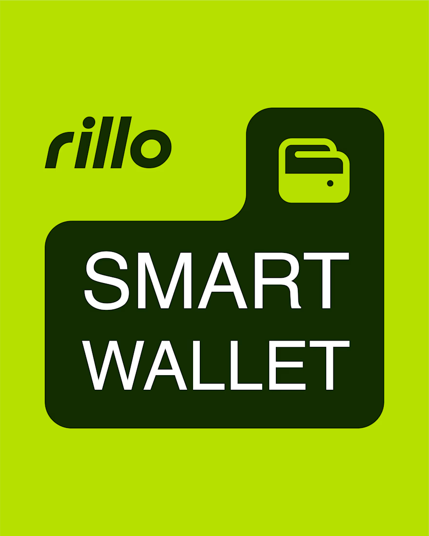
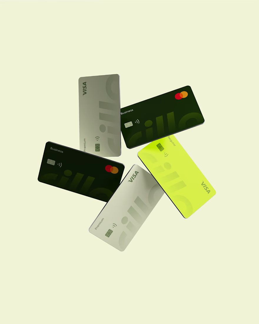
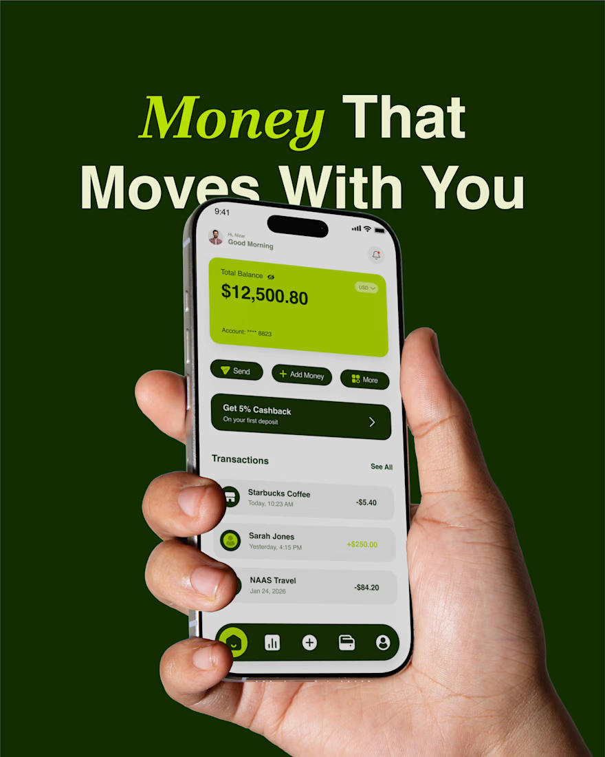
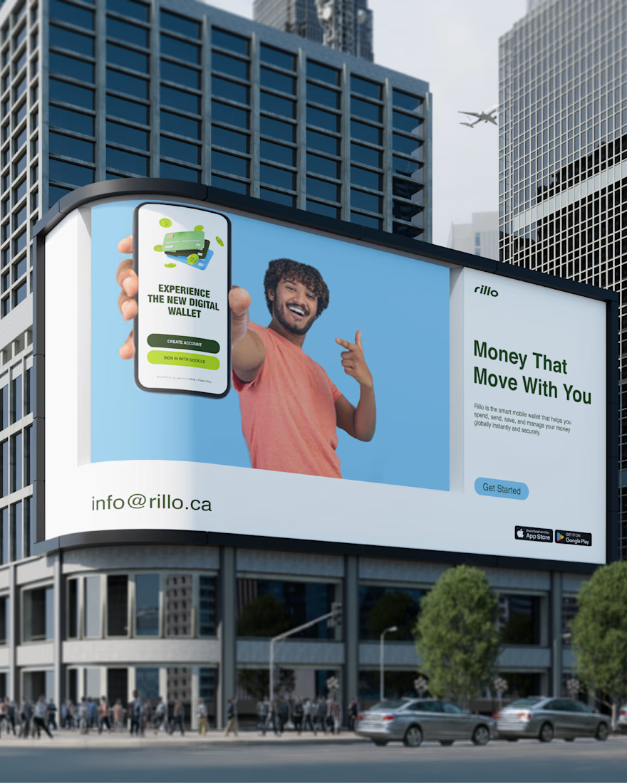
Rillo — A Modern Fintech Brand Identity
Exploring lime green, geometric typography, and a connected visual system across cards, interfaces, and everyday brand touchpoints.
A self-initiated fintech brand concept.
Explore the full case study:
https://contra.com/p/ce7sY6kZ-rillo-fintech-brand-redesign

Great work

Okay, so I actually made this poster because I needed something to post on Contra lol. It's kinda hard to build trust when you're just starting out, right?
Anyway, I've been into sneakers lately, so I thought, why not make something around that? The image is from Pinterest, the poster design is mine, and I used AI for the mockups. Just being honest about it .
And yeah, I'm open for work, so if you've got an idea or need a poster, feel free to reach out. We can't really expect opportunities to come our way without knocking on a few doors, right?
Anyway, what should I try designing next? I'm open to suggestions!



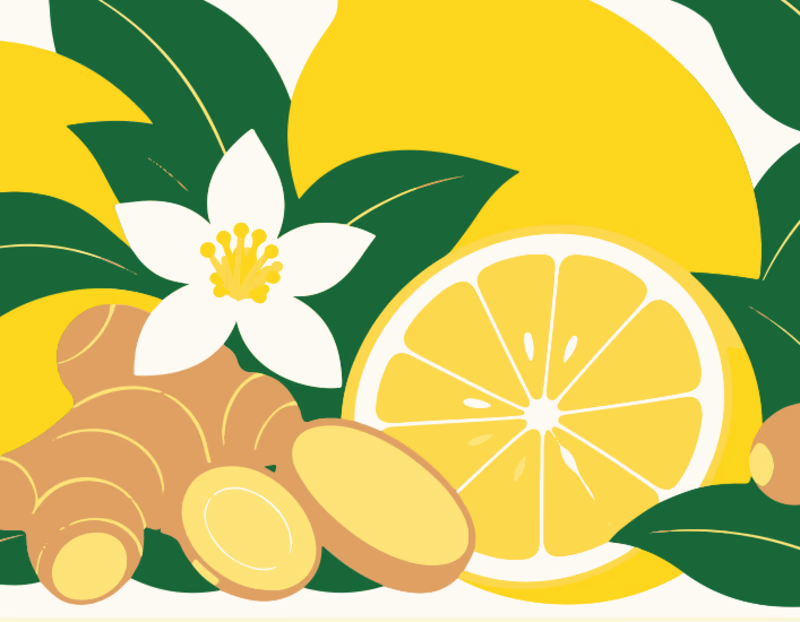
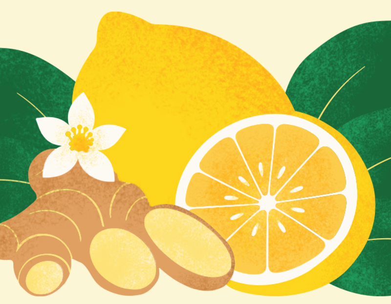
From AI-generated artwork to a more polished vector illustration.
I tested Ideogram Vector by generating an illustration for a lemon ginger tea packaging.
The raw output was a good starting point, but it still needed some work.
So I converted it into an editable SVG, refined the shapes, rearranged and resized the elements, and added a bit of texture to give the illustration more depth.
Here's a look at the before and after!
What do you think? 🍋

4 voted
9%
41 voted
91%
45 votes
Closed

After is absolutely better it focus on the main image🎉🎉