The network for creativity
Join 1.25M professional creatives like you
Connect with clients, get discovered, and run your business 100% commission-free
Creatives on Contra have earned over $150M and we are just getting started
Back to feedPost

Designed for the Moments You Can’t Afford to Look Away.
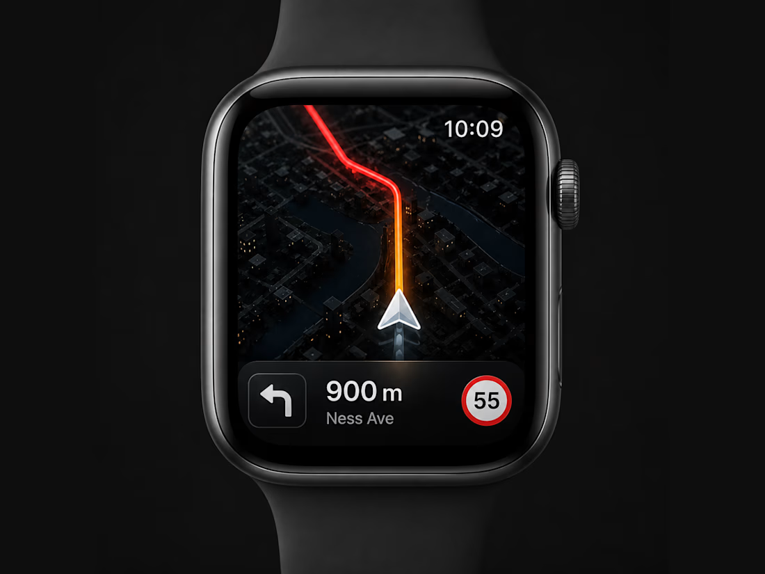
A smartwatch navigation experience has only one job: deliver the right information in the shortest possible time. Every interaction should reduce distraction, not increase it.
For this concept, I designed the interface around three UX principles:
Glance-first navigation. The route dominates the display, while distance, turn direction, and speed limit remain instantly visible without competing for attention.
Clear visual hierarchy. A monochrome interface with a single orange accent directs the eye to the active route. Colour is treated as functional feedback, not decoration.
Designed for movement. Large touch targets, bold typography, and high contrast improve readability whether you're walking, cycling, or driving.
The goal wasn't to fit more information onto a small screen. It was to remove everything that doesn't help users make their next decision.
Every pixel serves a purpose, making navigation feel faster, cleaner, and effortless.



The network for creativity
Join 1.25M professional creatives like you
Connect with clients, get discovered, and run your business 100% commission-free
Creatives on Contra have earned over $150M and we are just getting started
Trending

Claude
Claude has entered the design space. How are you using it?

Contra University
Learn from expert creatives how to earn more using next-gen AI tools.
Brand Design
The best brand designers are on Contra. Scroll to see what's trending in brand design. What are you building?
creativeaiflow
Creative AI workflows are evolving. What tools do you use, and what are their strengths and weaknesses?
freelancerlife
Freelancer life is wins, pivots, and everything in between. What’s yours right now?
Related posts


The way the watch rotates as the collateral piece is a smart touch, it makes the loan feel tied to a real object instead of just a number on a screen. What's the fallback for items that don't photograph as well as a watch?

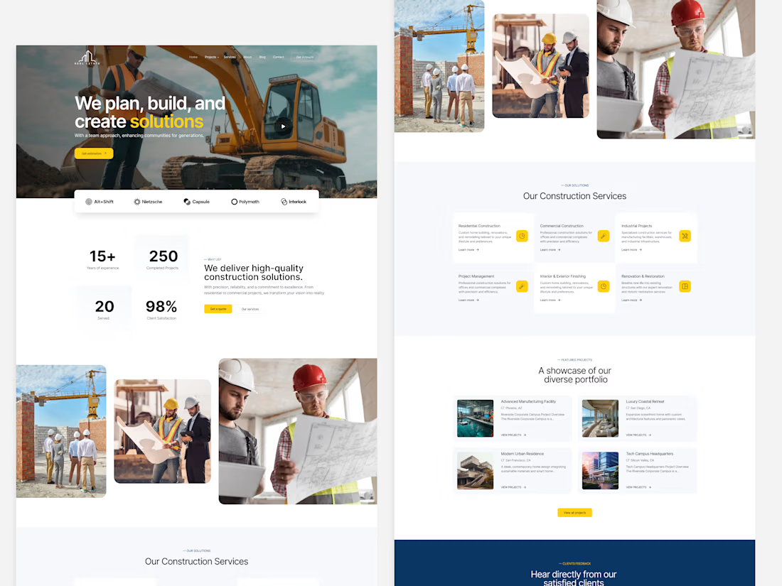
Modern Construction Company Website Landing Page UI Design. 👇
A clean and professional construction company website designed with a modern layout, bold visuals, and a conversion-focused user experience. The design includes a dynamic hero section, company highlights, service showcase, project portfolio, client testimonials, streamlined work process, and an inquiry form—creating a strong digital presence for construction, engineering, and infrastructure businesses.

Beautiful


Small UX decisions often make the biggest difference. Which approach would you choose for an FAQ section?
✔️Ready-made answers to common questions.
✔️The option to ask a question via email or a contact form.
Or is a combination of both the better solution?

12 voted
67%
6 voted
33%
18 votes
Closed

Impressive design. The branding feels strong and consistent.