The network for creativity
Join 1.25M professional creatives like you
Connect with clients, get discovered, and run your business 100% commission-free
Creatives on Contra have earned over $150M and we are just getting started
Back to feedPost

a cinematic web experience built with Figma Make.
Type your name. Get a 1999 Geocities page that was always yours. Watch it dissolve into a 2025 liquid glass profile. Same person. Different internet.
The network for creativity
Join 1.25M professional creatives like you
Connect with clients, get discovered, and run your business 100% commission-free
Creatives on Contra have earned over $150M and we are just getting started



Related posts

One skincare brand. Two different hero experiences.
I designed two homepage hero concepts for **Verlia**, a premium skincare brand, exploring how visual storytelling can shape a brand's first impression.
Both concepts use a warm, neutral palette and minimal luxury aesthetic, but each has its own personality.
Option 1 — Minimal & Product-Focused. A clean, framed layout that puts the products and shopping experience in the spotlight.
Option 2 — Editorial & Immersive. A bold brand introduction paired with rich product photography and a more expressive visual composition.
Which hero design would you choose for a luxury skincare website?
Vote for Opt. 1 or Opt. 2, and share what made you choose it in the comments.


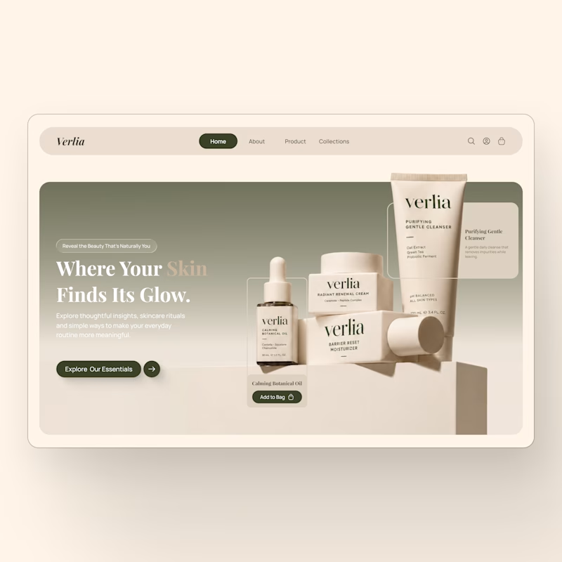
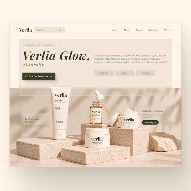
7 votes
Ends in 12h


A website hero and motion identity concept for Cycle.
The experience takes the viewer through seven historical eras in one continuous forward journey, while the logo, camera path and core composition remain consistent.
The concept explores how a static identity can become a living digital experience through motion, environment and interaction.
Workflow included Spline, Claude via MCP, Midjourney and SeaDance.
Available for brand identity, motion and digital design projects.


I fall in love, It is like Encarta, but 1000% better

New case study for the brand and digital work we did for Seeper Studios.
Go Check it out


Evolving a brand with almost 30 years of history is the hard version of brand work. You have to keep what people already trust while making it feel current. Nice job balancing both.


